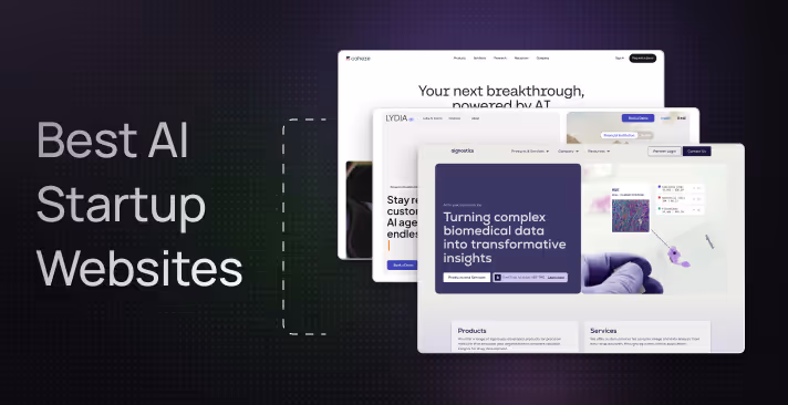
Best AI Startup Websites (2026 Examples & Design Insights)
Rajat Kapoor
January 23, 2026
8
min
Key Takeaways
An AI startup website acts as the first product demo, not a brochure.
Buyers disengage when AI websites hide behind vague promises or early technical depth.
Strong AI websites lead with outcomes and real problems, not models or buzzwords.
Clear structure and progressive disclosure help buyers navigate complexity without feeling overwhelmed.
Trust signals like validation, security, and limitations are essential for AI adoption.
The best AI websites guide buyers forward based on readiness instead of forcing demos too early.
Most AI startup websites are built as if the real conversation starts after the demo. But in reality, the website is the first demo.
Buyers don’t want to decode your product. They want to know quickly whether it fits their problem, their team, and their risk tolerance. When AI websites hide behind vague promises or dive into technical depth too early, buyers disengage long before sales ever enter the picture.
This challenge is amplified in AI. Unlike traditional SaaS, AI products introduce uncertainty by default around accuracy, security, explainability, and real-world impact. If a website doesn’t address those questions proactively, it silently erodes trust.
The strongest AI startup websites understand this reality. They don’t just describe technology; they guide buyers through it. They explain how the product works without overwhelming, show proof without over-claiming, and create clarity before asking for commitment.
This list highlights AI startup websites that get that balance right sites that treat the website as a critical part of the buyer journey, not an afterthought.
What Makes an AI Startup Website Great?
Most AI teams know their product inside out. That’s exactly why their websites struggle.
What feels obvious internally often feels confusing to buyers. Without deliberate messaging and structure, AI startup websites drift into being technically impressive but practically unclear. And when clarity is missing, trust breaks down fast.
A great AI startup website bridges that gap. It translates complex technology into buyer-relevant outcomes and makes adoption feel possible, not risky. The best ones get a few critical things right.
1. Clear Messaging That Explains the Outcome (Not the Model)
Visitors should immediately understand the problem the AI solves and the outcome it delivers. Strong AI websites lead with business impact, not technical depth.
Instead of vague claims like “Powered by next-generation intelligence,” the best sites say something specific, such as “Automatically flags high-risk transactions before they become losses.”
A clear headline, a short supporting explanation, and a focused primary CTA help buyers understand value within seconds.
2. A Homepage That Teaches, Not Just Describes
AI products often require education, but great websites do this visually and progressively, not through long blocks of text.
The strongest AI startup websites use:
Simple diagrams, product visuals, or short videos
Plain-language explanations tied to real workflows
Concrete examples instead of exhaustive feature lists
Rather than explaining everything upfront, they show how the product works in practice and let users go deeper only when they’re ready.
3. Structure That Guides Buyers Through Complexity
AI websites fail when they overwhelm visitors with information all at once. The best ones guide users through complexity in a deliberate sequence.
This usually means:
Clear hierarchy (what it does, how it works, proof, details)
Predictable navigation with obvious next steps
Progressive disclosure instead of information dumps
Good structure helps buyers feel oriented, even when the product itself is complex.
4. Trust Signals That Address AI-Specific Risk
Trust matters more for AI than almost any other category. Buyers worry about accuracy, reliability, security, and edge cases and great websites don’t ignore those concerns.
Strong AI websites build confidence through:
Customer logos and real-world use cases
Benchmarks, demos, or performance indicators
Security and data-handling transparency
Honest framing of limitations, not just strengths
Reducing perceived risk is just as important as showcasing capability.
5. Clear Positioning for Who the Product Is (and Isn’t) For
AI startups often try to appeal to everyone and end up resonating with no one. The best websites are explicit about who they serve.
This shows up as:
Pages tailored to specific teams or industries
Use cases framed around real buyer contexts
Messaging that filters out bad-fit users early
Clear positioning improves understanding and shortens the sales cycle.
6. Calls-to-Action That Respect Buyer Readiness
Not every visitor is ready to “Book a Demo.” The best AI websites offer CTAs that match different stages of buyer intent.
Effective AI CTAs include:
“See how it works” or “View example outputs”
“Explore use cases” or “Watch a short demo”
A consistent primary action repeated across key pages
The goal isn’t to rush commitment, it’s to guide buyers forward without friction.
Best AI Startup Websites in 2026 (Ranked & Reviewed)
Most AI startup websites look impressive at first glance. But after a few seconds, visitors still don’t know what the product actually does, whether it applies to their team, or if it’s safe to use in the real world.
That’s the gap the best AI websites close. They don’t just explain the technology, they help buyers understand where the AI fits, what problem it solves, and whether it can be trusted in production.
Below, we look at some of the best AI startup websites and break down what each product does and why their website works so well for the way they sell.
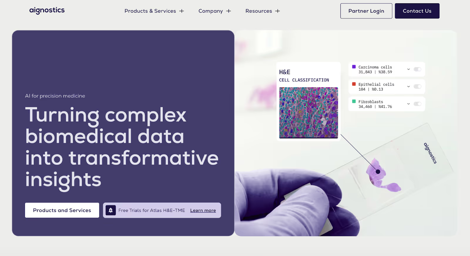
1. Aignostics
Aignostics is a clinical AI company that uses machine learning to analyze complex biomedical data, particularly in pathology and molecular diagnostics to support faster, more accurate clinical and research decisions.
Why it works:
Immediate clarity in a highly complex domain Healthcare AI is notoriously difficult to explain, but Aignostics’ website does a strong job of grounding its messaging in real clinical and research outcomes rather than abstract AI claims. Visitors quickly understand where the AI is applied and why it matters.
Credibility and trust are front and center The site emphasizes scientific rigor, clinical validation, and partnerships early on, critical for a category where trust, accuracy, and compliance are non-negotiable.
Clear separation between science and application Instead of overwhelming visitors with technical or medical depth, the website structures content to explain the application first, with deeper scientific detail available for those who want it.
Takeaway:
Aignostics website works because it respects its audience’s caution. By prioritizing credibility, clarity, and real-world application, it shows how AI websites in regulated industries can build trust without oversimplifying the technology.
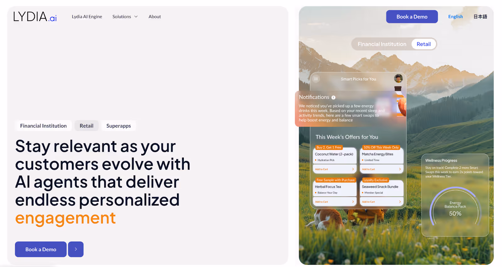
2. Lydia
Lydia is an AI-powered risk assessment platform for insurers that helps underwriting and claims teams make faster, more consistent decisions by combining external data sources with explainable machine learning models.
Why it works:
Clear problem framing for a conservative industry Insurance is a trust-heavy, risk-averse category, and Lydia’s website reflects that. Instead of selling “AI innovation,” it leads with familiar insurance problems: risk evaluation, consistency, and speed making the product immediately relevant.
Explainability over black-box positioning Lydia’s website emphasizes transparency and explainable AI, which is critical for regulated industries. This helps reduce skepticism and reassures buyers that decisions aren’t being made by an opaque system.
Focused messaging for a specific buyer persona The site speaks directly to insurers and underwriting teams, avoiding broad or generic AI language. This tight positioning makes it clear who the product is for and who it isn’t.
Takeaway:
Lydia’s website works because it aligns with buyer reality. By prioritizing clarity, explainability, and trust over hype, the site shows how AI startups in regulated industries can communicate value without triggering resistance.
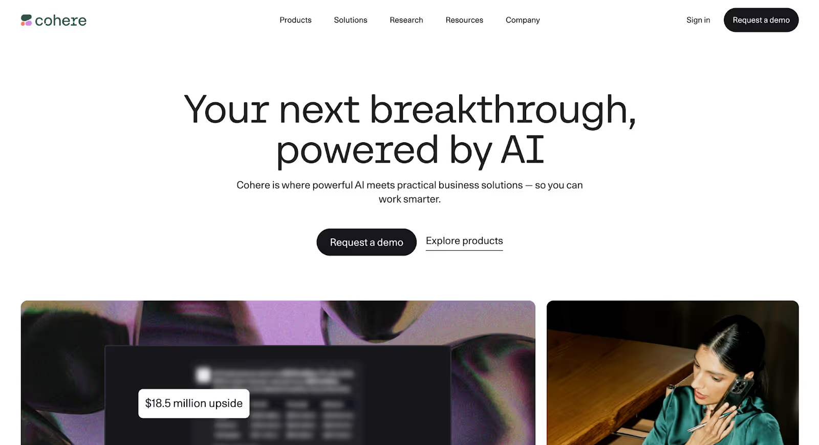
3. Cohere
Cohere is an enterprise AI platform that helps companies build, deploy, and run large language models with a strong emphasis on data privacy, security, and deployment control making it well suited for organizations operating in regulated environments.
Why it works:
Clear, enterprise-focused messaging Cohere avoids vague AI hype and instead frames its value around real business use cases, secure deployment, and control, key concerns for enterprise buyers evaluating AI adoption.
Trust-building signals appear early The website surfaces information around security, privacy, and enterprise readiness upfront, reducing uncertainty before visitors dive deeper into the product.
Structured explanation for a complex product Rather than overwhelming users with technical depth, the site guides visitors through what Cohere does, how it works, and who it’s for using a clean, predictable layout.
Takeaway:
Cohere’s website succeeds by prioritizing clarity and trust over flash. It shows how AI startups can communicate serious, enterprise-grade capability without overwhelming buyers or over-selling the technology.
4. Scale AI
Scale AI is a data platform that helps companies build, train, and deploy AI models by providing high-quality labeled data, evaluation tools, and infrastructure powering AI systems used in production across enterprises and government organizations.
Why it works:
Problem-first messaging that anchors the product Scale AI doesn’t start by talking about models or datasets in abstract terms. The website leads with the real bottleneck most AI teams face: getting reliable, production-ready data at scale. This immediately grounds the product in a problem buyers recognize.
Credibility and scale are established early From enterprise and government use cases to large-scale deployments, the site makes it clear that Scale operates at serious volume. This helps reassure buyers that the platform is built for real-world AI systems not experimentation.
Clear segmentation by use case and industry The website does a strong job of breaking down a complex offering into understandable paths, whether a visitor is building autonomous systems, generative AI, or enterprise applications. This reduces cognitive load and helps different buyers find relevance quickly.
Takeaway:
Scale AI’s website works because it frames AI through execution, not experimentation. By focusing on data quality, scale, and real-world deployment, the site builds confidence with buyers who care less about novelty and more about whether AI will actually work in production.
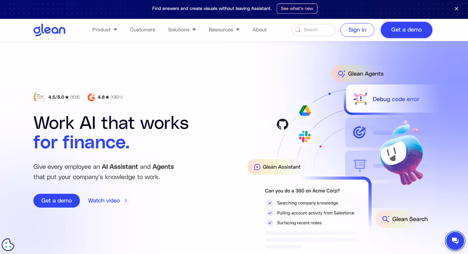
5. Glean
Glean is an enterprise AI search platform that helps employees find information across workplace tools like Slack, Google Drive, Confluence, and Jira using AI to surface the right answers in context, not just keyword matches.
Why it works:
Instant clarity on the core problem Glean’s website immediately addresses a frustration most teams recognize: information scattered across too many tools. The messaging focuses on outcomes, finding answers faster at work rather than explaining search algorithms or AI techniques.
Strong relevance through real workplace scenarios Instead of abstract AI claims, the site shows how Glean fits into everyday workflows. Examples are framed around how employees actually search for information, making the value feel practical and easy to grasp.
Trust and enterprise readiness are clearly communicated Glean emphasizes security, permissions, and enterprise controls early on, which is critical for buyers evaluating AI products that sit on top of sensitive internal data.
Takeaway:
Glean’s website works because it makes AI feel immediately useful. By grounding the product in familiar workplace problems and clearly addressing trust concerns, the site helps buyers understand value quickly without needing a technical background.
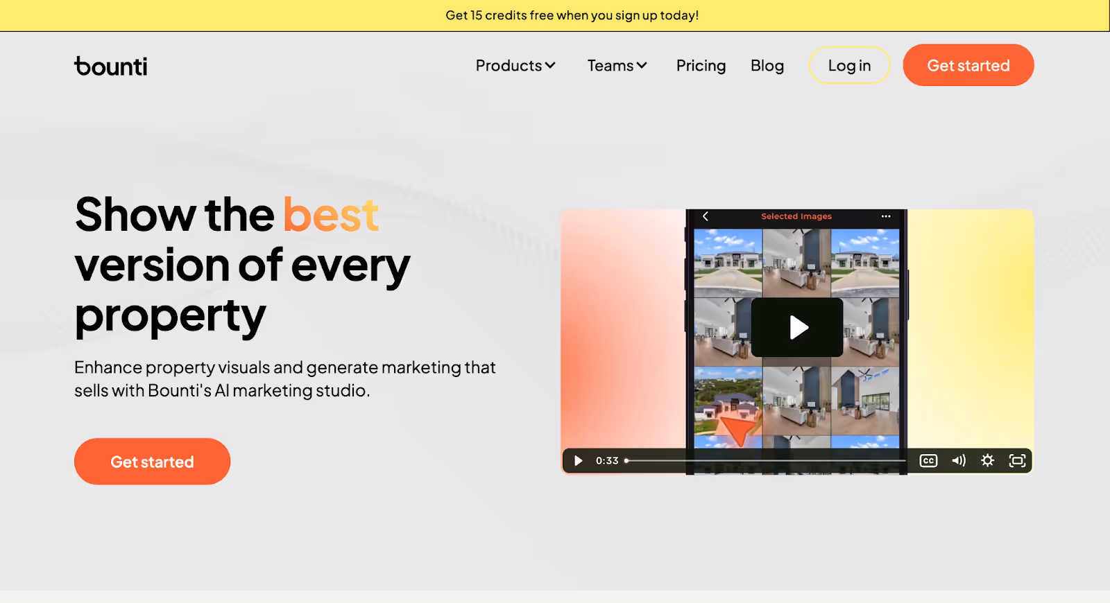
6. Bounti
Bounti is an AI-powered sales intelligence platform that helps go-to-market teams identify high-intent accounts and prioritize outreach by analyzing buying signals across multiple data sources.
Why it works:
Clear articulation of buyer value Bounti’s website focuses on a problem sales teams immediately recognize: knowing who to reach out to and when. Instead of positioning itself as generic “AI for sales,” the messaging centers on prioritization and timing outcomes that matter to revenue teams.
Strong alignment with how sales teams think The site frames the product around real GTM workflows rather than abstract AI capabilities. This makes the value feel practical and easy to map to existing sales processes.
Simple explanation of a data-heavy product While the underlying product relies on complex data and modeling, the website avoids overwhelming visitors. It keeps explanations high-level and outcome-focused, with deeper detail available for those who want it.
Takeaway:
Bounti’s website works because it keeps the focus on decision-making, not data science. By framing AI as a tool that helps sales teams act smarter and faster, the site makes a complex product feel immediately useful and easy to evaluate.
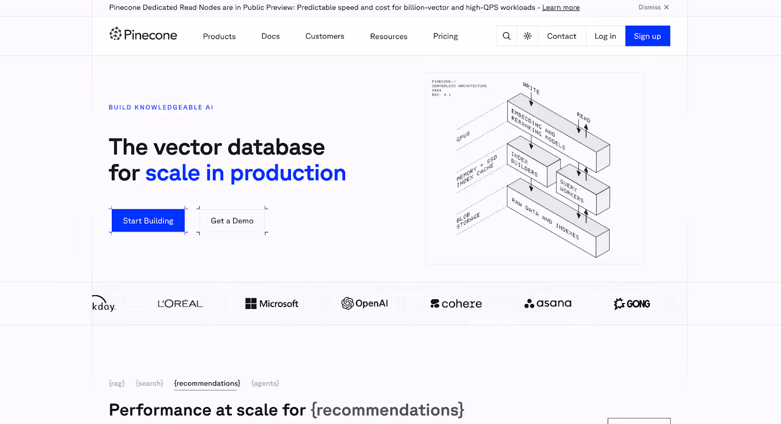
7. Pinecone
Pinecone is a vector database platform that helps teams build and scale AI applications by enabling fast, reliable search over high-dimensional data powering use cases like semantic search, recommendation systems, and retrieval-augmented generation (RAG).
Why it works:
Clear framing of a technical product Pinecone’s website does a strong job of explaining a highly technical concept without overwhelming visitors. Instead of leading with database internals, it anchors the product around common AI use cases teams already care about.
Use-case-led navigation The site organizes content around what teams are building search, recommendations, RAG making it easier for buyers to quickly see where Pinecone fits into their stack.
Strong signals of reliability and scale Performance, uptime, and production-readiness are emphasized throughout the site, which is critical for infrastructure buyers who care less about novelty and more about consistency.
Takeaway:
Pinecone’s website works because it turns complex infrastructure into something approachable. By focusing on use cases and reliability rather than raw technical depth, the site makes it easier for teams to understand why Pinecone belongs in production AI systems.
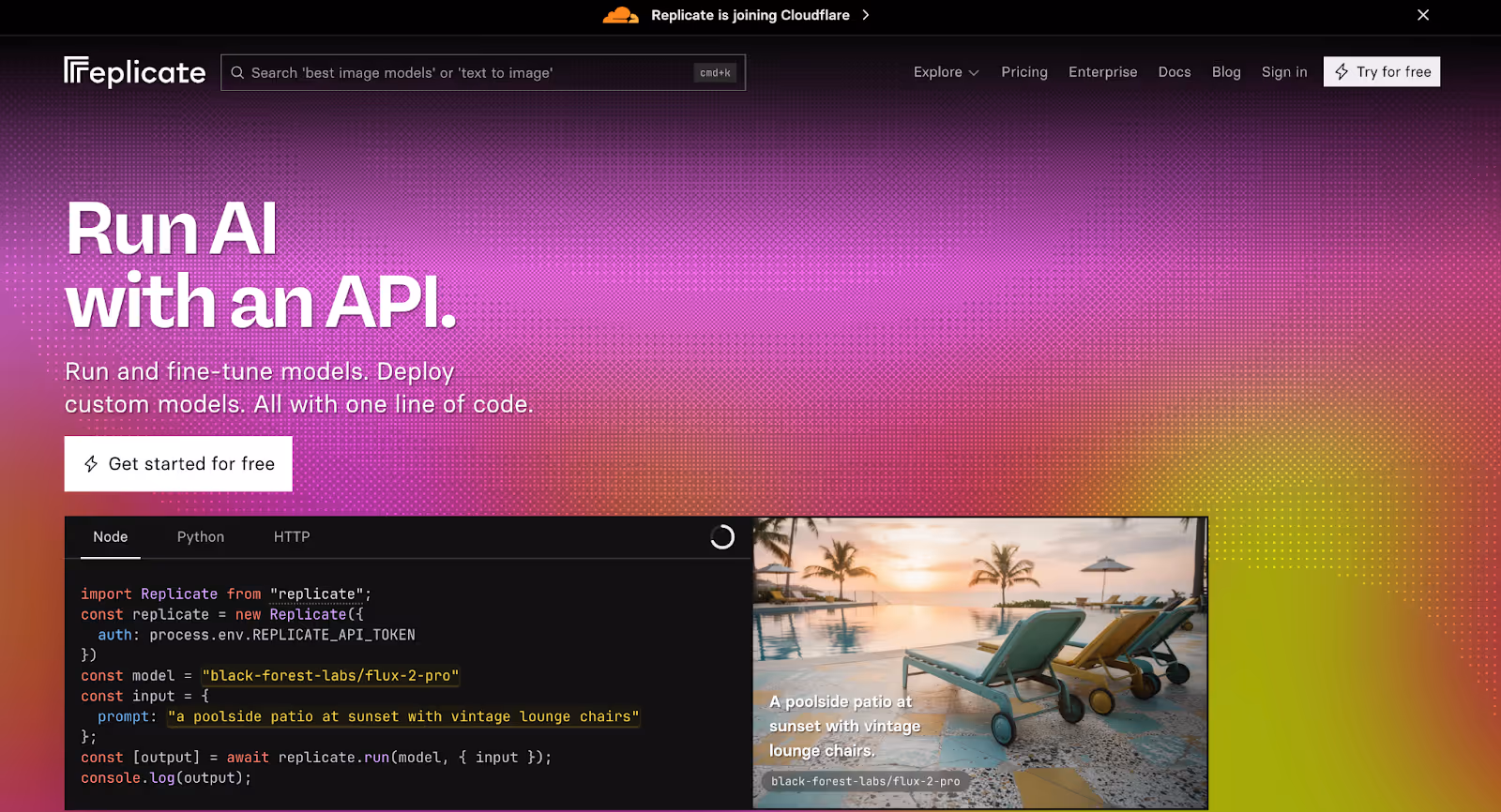
8. Replicate
Replicate is an AI model hosting platform that lets developers run open-source machine learning models via simple APIs making it easier to experiment with, deploy, and integrate models into real applications without managing infrastructure.
Why it works:
Immediate clarity on what the product does Replicate’s website gets straight to the point. Within seconds, visitors understand that this is about running machine learning models easily via an API, no abstract positioning or unnecessary explanation.
Developer-first experience that matches buyer intent Instead of marketing-heavy pages, the site leans into examples, code snippets, and real model outputs. This aligns perfectly with how its audience evaluates tools: by seeing how quickly they can get something working.
Low-friction path from interest to action The website minimizes barriers between curiosity and usage. Clear documentation, simple onboarding cues, and visible examples encourage hands-on exploration without forcing a demo or sales conversation.
Takeaway:
Replicate’s website works because it respects its audience’s time. By prioritizing clarity, real examples, and fast experimentation, the site supports a product that’s meant to be tried not explained endlessly.
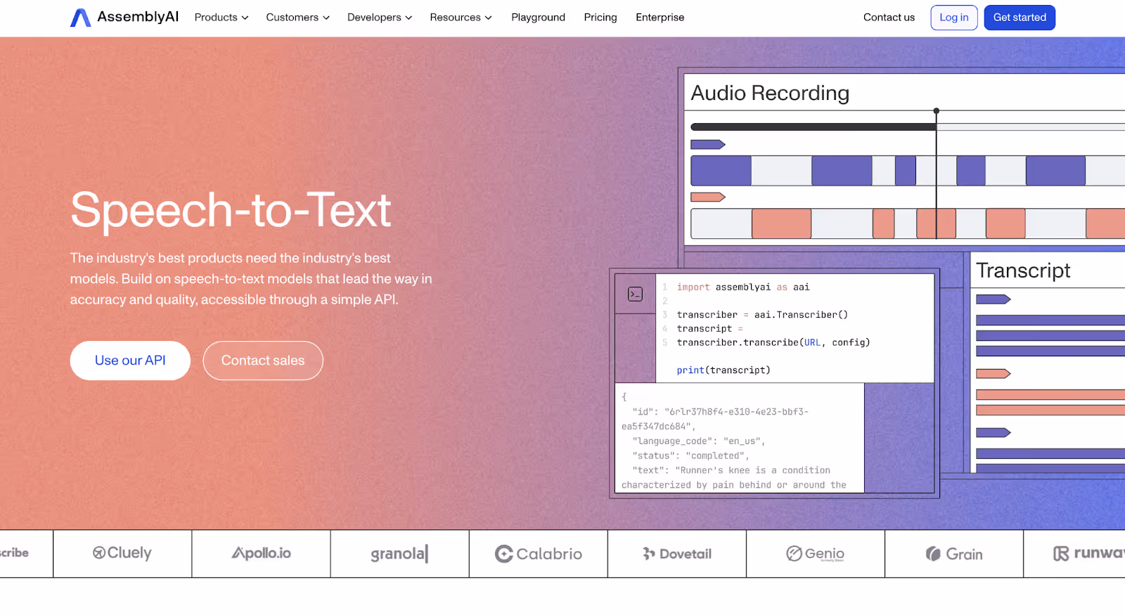
9. AssemblyAI
AssemblyAI is a speech-to-text API that helps developers convert audio into structured, searchable data powering use cases like transcription, summarization, content moderation, and audio intelligence inside applications.
Why it works:
Clear articulation of a specific AI capability AssemblyAI’s website is very explicit about what the product does. There’s no ambiguity or layered positioning, the focus is squarely on turning audio into usable data through a reliable API.
Strong balance between marketing and documentation The site does a good job of serving both decision-makers and developers. High-level pages explain outcomes and use cases, while documentation and examples are easy to access for hands-on evaluation.
Use-case-driven framing Rather than listing API features in isolation, AssemblyAI frames its offering around what teams can build making the value feel concrete and immediately applicable.
Takeaway:
AssemblyAI’s website works because it keeps the scope tight. By clearly defining what the product does and backing it up with accessible examples and documentation, the site builds confidence without unnecessary complexity.
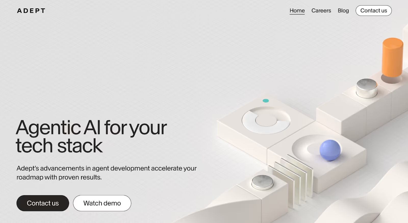
10. Adept
Adept is an AI startup building agents that can take actions across software tools helping teams automate complex, multi-step tasks by letting AI interact directly with existing applications.
Why it works:
Clear articulation of a new interaction model Adept’s website introduces a relatively new idea, AI that can act inside software, not just generate outputs without overcomplicating the explanation. The messaging focuses on what the agent can do in real workflows, making the concept easier to grasp.
Strong use of demonstrations over descriptions Instead of relying on heavy technical explanations, the site uses examples and visual cues to show the AI operating across tools. This helps visitors understand capability through observation, not abstraction.
Positioning that balances ambition with restraint While the vision is bold, the website avoids exaggerated claims. It frames Adept as enabling practical automation rather than replacing entire roles, which helps maintain credibility.
Takeaway:
Adept’s website works because it introduces a complex, emerging category in a grounded way. By showing how AI agents fit into real workflows and keeping claims measured, the site helps buyers understand a powerful idea without feeling overwhelmed.
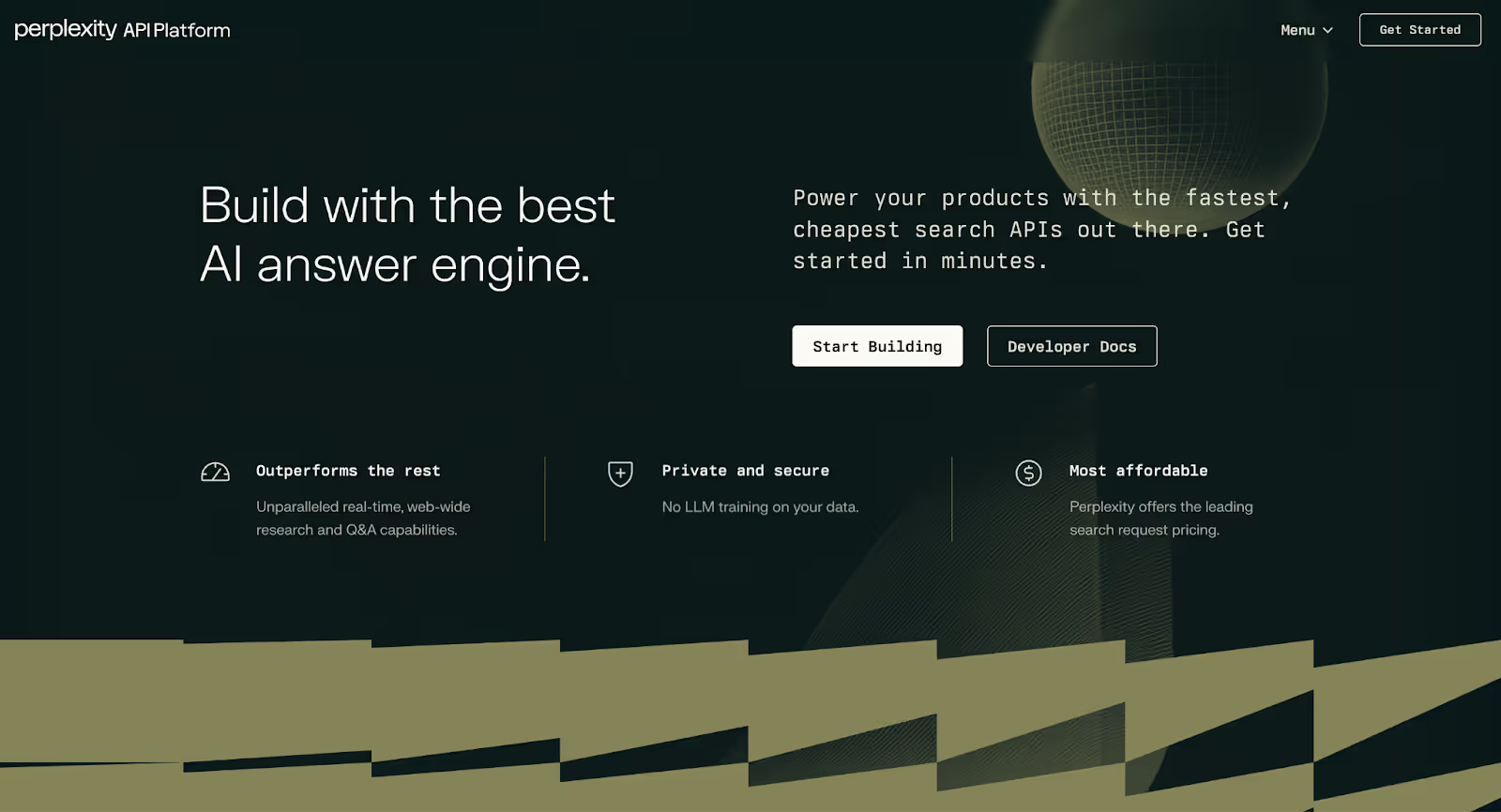
11. Perplexity
Perplexity is an AI-powered search platform that provides direct, cited answers instead of traditional search results, helping users and teams research topics faster without sifting through links.
Why it works:
Immediate understanding of the core value Perplexity’s website makes its promise clear within seconds: ask a question and get a direct, trustworthy answer. There’s no ambiguity about what the product does or how it’s different from traditional search.
Product-first experience The interface itself does most of the talking. By putting the search experience front and center, the website lets visitors understand the product by using it, removing friction from evaluation.
Credibility through transparency Cited sources, visible references, and clear answer formatting help build trust quickly, which is especially important for AI products positioned around information accuracy.
Takeaway:
Perplexity’s website works because it minimizes explanation and maximizes experience. By letting the product demonstrate value immediately and reinforcing trust through transparency, the site makes AI search feel both useful and dependable.
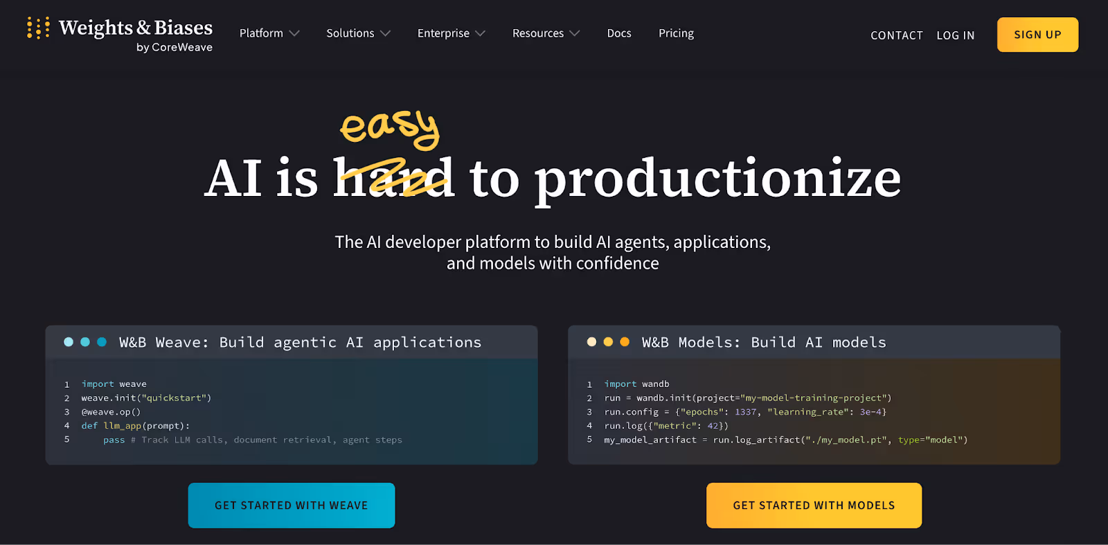
12. Weights & Biases
Weights & Biases is an MLOps platform that helps machine learning teams track experiments, manage models, and monitor performance making it easier to move from experimentation to reliable production workflows.
Why it works:
Clear positioning for a technical audience The website is unapologetically built for ML practitioners. It doesn’t over-simplify the problem; instead, it clearly states what teams can manage, track, and improve using the platform, which resonates with experienced buyers.
Strong emphasis on real workflows Rather than abstract promises, the site focuses on how ML teams actually work, experiment tracking, collaboration, versioning, and monitoring. This makes the value immediately recognizable to its core audience.
Proof through community and adoption Open-source credibility, community usage, and widespread adoption are highlighted across the site, reinforcing that this is a trusted tool used in real production environments.
Takeaway:
Weights & Biases’ website works because it speaks directly to its audience. By aligning closely with real ML workflows and reinforcing trust through community and adoption, the site supports a product that’s deeply embedded in how modern AI teams operate.
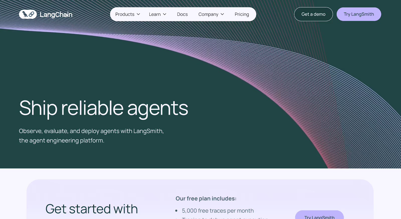
13. LangChain
LangChain is an LLM orchestration framework that helps developers build applications powered by large language models connecting prompts, tools, memory, and external data into structured, production-ready workflows.
Why it works:
Clear framing of a new technical category LangChain’s website does a solid job of explaining a relatively new concept without overcomplicating it. Instead of positioning itself as “just another AI tool,” it clearly shows how LangChain fits into the process of building real LLM-powered applications.
Documentation-led credibility The site leans heavily into clear documentation, examples, and use cases, which aligns with how its audience evaluates tools. Developers can quickly understand what’s possible and how to get started.
Strong ecosystem signaling Integrations, templates, and community adoption are made visible throughout the site, reinforcing that LangChain is not an isolated framework but part of a broader, evolving ecosystem.
Takeaway:
LangChain’s website works because it prioritizes clarity and enablement over marketing polish. By focusing on real developer needs and showing how complex AI workflows can be structured, the site supports rapid adoption without unnecessary friction.
Best AI Startup Website Design Trends in 2026
As AI startup websites evolve, the focus isn’t just on looking cutting-edge; it’s about helping buyers understand complex products faster and trust them sooner. The best AI websites in 2026 prioritize clarity, product-led experiences, and trust-building, ensuring every design decision reduces confusion instead of adding to it.
Here are the top design trends shaping AI startup websites this year:
1. Product-First Experiences Instead of Marketing-Heavy Pages
AI buyers want to see what the product actually does before reading lofty positioning statements. As a result, more AI startup websites are leading with the product itself through live demos, playgrounds, or interactive examples right on the homepage.
What this looks like: A homepage where visitors can immediately try a search query, run an example prompt, or explore sample outputs without signing up or booking a demo.
2. Progressive Disclosure for Complex AI Products
AI products are inherently complex, but dumping everything upfront overwhelms buyers. The best AI websites now reveal information gradually starting with outcomes and only introducing technical depth when visitors choose to go deeper.
What this looks like: High-level explanations first, followed by expandable sections or separate paths for technical users who want details on models, architecture, or APIs.
3. Trust-Led Design Becomes a Core Requirement
In 2026, trust is no longer a secondary consideration for AI websites, it’s a primary design objective. Buyers want to understand how data is handled, how reliable the system is, and what safeguards are in place.
What this looks like: Security, compliance, and data-handling information surfaced early on the site often alongside product messaging rather than buried in footer links.
Instead of organizing websites around features or components, AI startups are increasingly structuring their sites around real-world use cases and outcomes. This helps buyers quickly see whether the product applies to their situation.
What this looks like: Navigation sections like “For Customer Support,” “For Research Teams,” or “For Enterprise Search” instead of long feature menus.
5. Clear Separation Between Buyer and Developer Journeys
AI websites no longer try to speak to everyone at once. The strongest sites clearly separate messaging for business buyers and technical users, ensuring each audience gets what they need without friction.
What this looks like: A clear split between product/value pages and documentation or API sections without mixing technical jargon into buyer-facing messaging.
6. Fewer Pages, Stronger Narrative Flows
Rather than sprawling websites with dozens of loosely connected pages, AI startups are consolidating content into fewer, more intentional journeys that guide visitors step by step.
What this looks like: Focused landing pages with a clear progression from problem, to solution, to proof, to next step, rather than endless navigation rabbit holes.
7. Calm, Credible Visual Design Over “Futuristic” Aesthetics
The overly futuristic, abstract “AI look” is fading. In its place, AI startups are adopting calmer, more restrained visual systems that emphasize credibility and reliability.
What this looks like: Clean typography, neutral color palettes, minimal motion, and purposeful visuals that support understanding rather than distract from it.
The best AI startup website design trends in 2026 are less about standing out visually and more about making complex products easier to understand and safer to adopt. As AI buyers become more informed and more cautious, websites that prioritize clarity, trust, and product-led experiences will outperform those chasing novelty.
Final Thoughts
Think about the last time you landed on an AI startup website. You probably thought, “This looks interesting,” scrolled for a bit and still couldn’t explain what the product actually does without rereading the page.
That moment is where most AI websites lose people.
The best AI startup websites don’t assume patience or technical context. They explain the product in a way that makes sense to someone seeing it for the first time. They show how the AI fits into real workflows, surface trust signals early, and remove the feeling that adopting the product is a risk.
The examples in this list work because they respect the buyer’s time and skepticism. They don’t rely on buzzwords or visual flair to carry the message. Instead, they guide visitors step by step until the product feels understandable and therefore usable.
If you’re building or redesigning an AI startup website, the goal isn’t to impress visitors with intelligence. It’s to help them leave knowing exactly what you do, why it matters, and whether they can trust it. When that happens, everything else, demos, conversations, conversions gets easier.
Need an AI startup website that actually works?
At Amply, we design and build websites for AI-first startups. Whether you’re launching a new AI product or fixing a website that isn’t converting, we help turn complex technology into clear, high-performing websites built to educate buyers, build trust, and drive action.


.png)
.png)


.avif)