13 Best VC Firm Websites (2026 Examples & Design Insights)
Rajat Kapoor
January 26, 2026
9
min
Key Takeaways
VC websites are evaluated in seconds, so clarity matters more than completeness.
Strong VC websites help visitors quickly understand focus, relevance, and point of view.
Clear positioning reduces ambiguity and helps founders self-select faster.
Structure and hierarchy matter more than visual flair on VC firm websites.
The best VC websites show how the firm thinks, not just what it has invested in.
Intentional restraint builds more trust than trying to say everything at once.
Specialised venture capital web design agency doesn’t just improve your website. It improves founder perception and your inbound deal flow.
Most VC websites are judged in seconds, not minutes.
Founders don’t carefully read every page. They scan, scroll, and make a quick call on whether a firm feels relevant, credible, or worth engaging with further. That judgment often happens before they’ve clicked beyond the homepage.
The problem isn’t a lack of effort. Many venture firms invest heavily in design, branding, and copy. But too often, the website tries to say everything at once, about stages, sectors, values, portfolio companies, and philosophy without guiding the visitor toward a clear understanding.
When that happens, the site becomes noisy instead of informative. The firm may look established, but its point of view remains unclear. For founders, operators, and even prospective hires, that ambiguity creates friction rather than confidence.
The strongest VC websites are intentional. They prioritise clarity over completeness, structure over sprawl, and signal how the firm thinks, not just what it owns or claims to support.
This article curates venture capital websites that strike that balance well, offering concrete inspiration for teams evaluating what a modern, effective VC website should actually do.
What Makes a VC Firm Website Great?
A great VC website isn’t defined by bold visuals or clever copy. It’s defined by how quickly it helps the right people understand whether the firm is relevant to them.
At its core, a strong VC website does three things well: it communicates clarity, signals credibility, and guides decision-making without trying to impress everyone.
1. Clear Positioning, Fast
Within the first scroll, a visitor should understand:
What the firm focuses on
Who they’re best suited for
How they think about investing
When positioning is vague or overly broad, visitors are left guessing and most won’t stick around to figure it out.
2. Structure That Reduces Cognitive Load
Great VC websites don’t overload visitors with information. They prioritise hierarchy, whitespace, and flow so the site feels easy to navigate even when the content is substantial.
This isn’t about minimalism for aesthetics. It’s about helping people find what matters to them without friction.
3. Substance Beyond a Portfolio Grid
Logos alone don’t build trust.
The strongest VC websites explain:
How the firm supports founders beyond capital
What value they consistently add
How their platform, network, or expertise shows up in practice
This depth is what turns a website from a brochure into a signal of seriousness.
4. A Confident, Consistent Brand Voice
Whether understated or bold, the tone should feel intentional.
Strong VC sites avoid buzzwords and generic claims. Instead, they communicate conviction through clear language, thoughtful content, and consistency across pages.
5. Designed for Scanning, Not Studying
Most visitors skim. Great VC websites are built with that reality in mind.
Headings, layout, and content blocks are structured so someone can understand the firm quickly, even if they don’t read every word.
The websites featured in this list stand out because they execute on these fundamentals consistently. They don’t try to do everything. They focus on doing the important things well.
Best VC firm websites in 2026
The best VC websites earn their status by doing one thing exceptionally well: making it clear, fast, why the firm matters.
These firms don’t rely on polished visuals or broad claims. Their websites communicate focus, conviction, and credibility within seconds. You understand how they think, who they’re right for, and what differentiates them without having to dig.
That level of clarity is intentional. Every page exists to reduce ambiguity, not add to it. In 2026, that’s what separates the best VC websites from the rest.
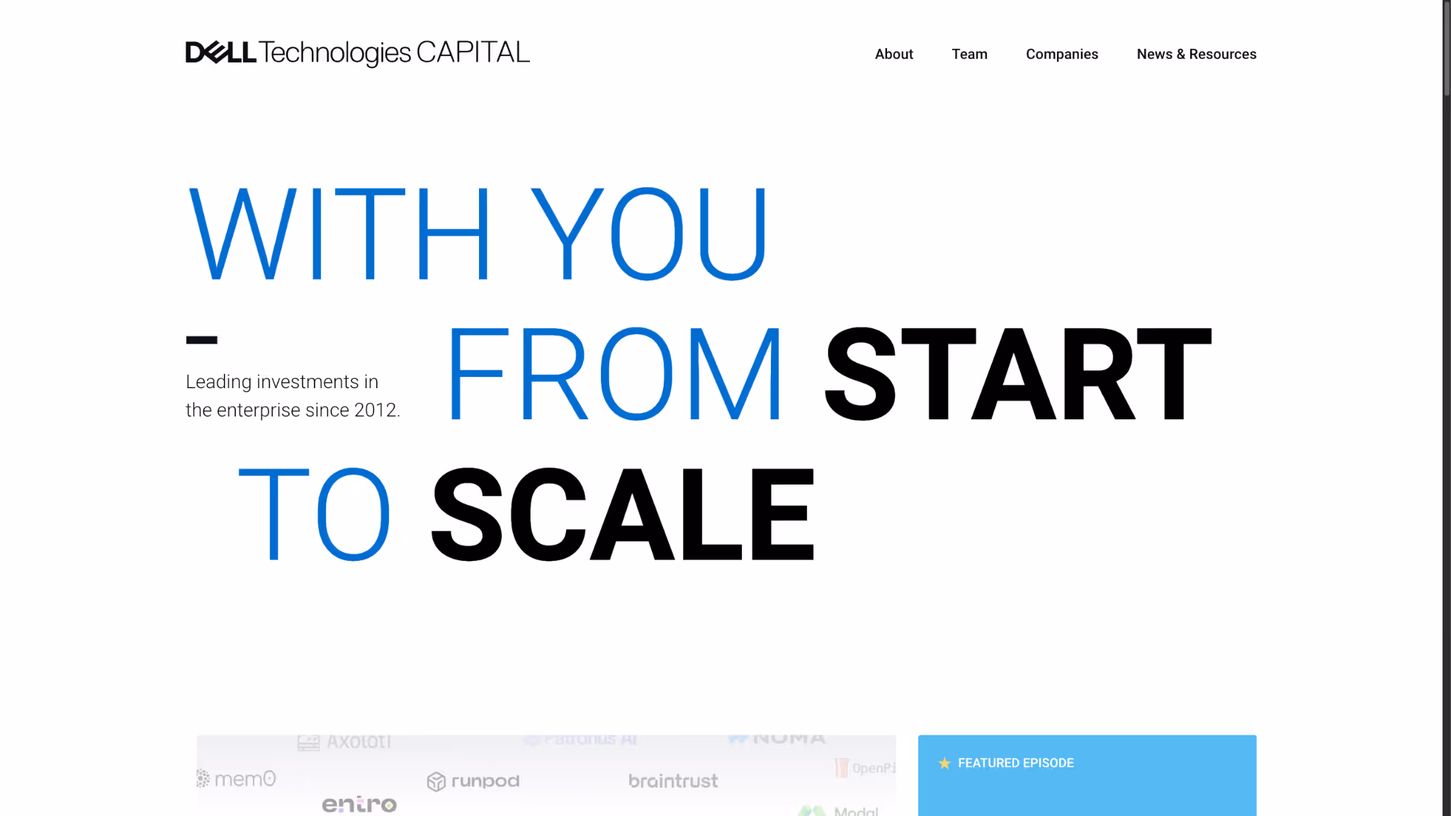
1. Dell Technologies Capital
Dell Technologies Capital (DTC) is the venture capital arm of Dell Technologies, investing in enterprise-focused startups across infrastructure, data, AI, security, and cloud, with a strong emphasis on helping companies scale into global enterprises.
Why it works:
Clear enterprise-first positioning The website immediately signals its focus on enterprise technology and long-term scale. Founders quickly understand that DTC is built for companies aiming to sell into large, complex organizations, not early experimentation alone.
Strong sense of operational backing beyond capital DTC’s positioning consistently reinforces access to deep technical expertise, operational knowledge, and customer connections through the broader Dell ecosystem. This makes the value proposition tangible rather than abstract.
Calm, structured design that supports credibility The layout is restrained and confident, with clear hierarchy and generous whitespace. Nothing feels rushed or promotional, which aligns well with how enterprise founders evaluate long-term partners.
Clear separation of insight, portfolio, and firm identity Content is well-organized across investments, resources, and perspective. Visitors can quickly scan for relevance or go deeper without feeling overwhelmed by information.
Subtle proof through scale and consistency Instead of aggressive claims, the site lets scale do the work, highlighting long-term investment activity, portfolio depth, and continuity without over-explaining.
Takeaway: Dell Technologies Capital’s website works because it mirrors how enterprise-focused founders think about growth. By prioritising clarity, restraint, and operational credibility, it communicates exactly what kind of partner DTC is, without needing to over-sell it.
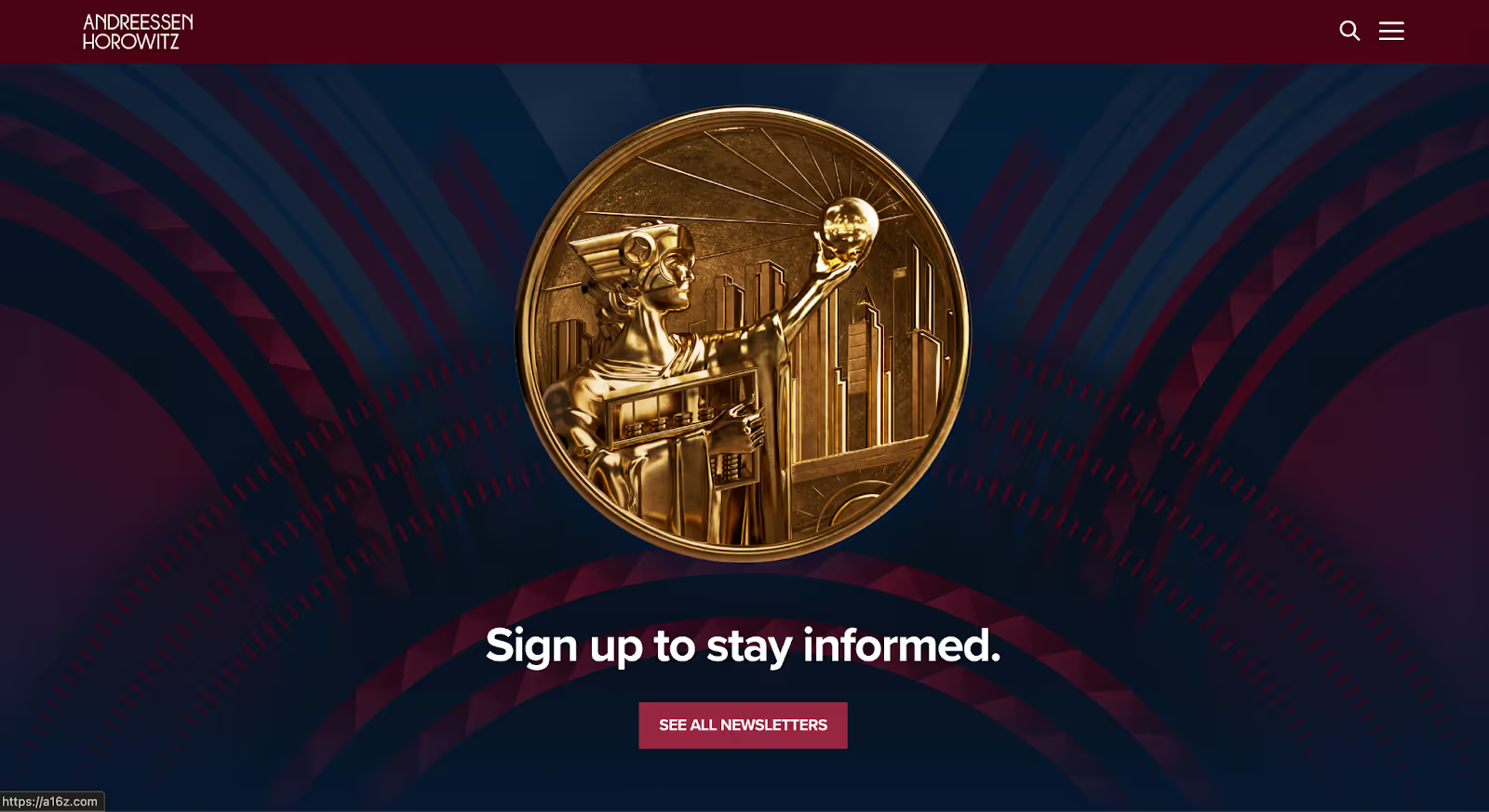
2. Andreessen Horowitz
Andreessen Horowitz is a multi-stage venture capital firm that positions itself not just as an investor, but as a platform using content, research, and community to shape how founders, operators, and the broader ecosystem think about technology and company building.
Why it works:
Immediate clarity on what the firm stands for The website makes it clear early on that this isn’t a traditional VC firm. Through its structure and content depth, visitors quickly understand that a16z operates with a strong point of view and an active role beyond capital.
Content as proof, not decoration Instead of relying on abstract positioning statements, the site shows how the firm thinks through essays, podcasts, research, and editorial content. This turns the website into living evidence of conviction rather than a static brand page.
Clear paths for different audiences Founders, operators, talent, and media are all guided to relevant sections without fragmenting the experience. The navigation reflects how different stakeholders engage with the firm, reducing friction and confusion.
Designed for scanning and depth At a glance, the site communicates credibility and scale. For those who want more, it rewards deeper exploration without feeling cluttered or overwhelming by default.
Takeaway: Andreessen Horowitz’s website works because it treats the site as an extension of how the firm operates, not just how it presents itself. By leading with clarity and backing it up with substance, it sets a benchmark for VC websites that want to communicate authority without relying on hype.
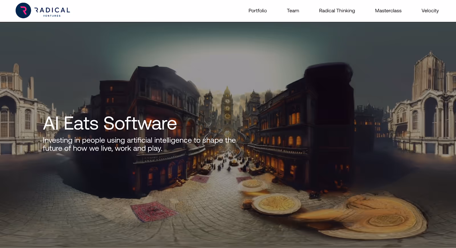
3 .Radical Ventures
Radical Ventures is an early-stage venture capital firm that presents itself with restraint and precision using its website to communicate focus, credibility, and long-term intent rather than scale or noise.
Why it works:
Clarity without over-explaining The website is concise and deliberate. Visitors quickly understand what the firm is about, what types of companies it backs, and the level at which it operates without wading through excessive copy or layered messaging.
Design that reinforces trust The visual system is minimal, calm, and consistent. Instead of flashy interactions, the site uses typography, spacing, and tone to convey seriousness and confidence, which aligns well with how founders evaluate long-term partners.
Selective use of content Rather than publishing everything, the site highlights only what strengthens credibility: key portfolio companies, people, and perspective. This selectiveness signals discipline and focus.
Founder-centric navigation Information is organised around what founders actually care about: who the firm is, what it backs, and how it engages. There’s no unnecessary detours or distracting sections.
Takeaway: Radical Ventures’ website works because it knows exactly what it doesn’t need to say. By prioritising clarity, restraint, and trust signals, it shows how a VC website can feel confident and differentiated without being loud or content-heavy.
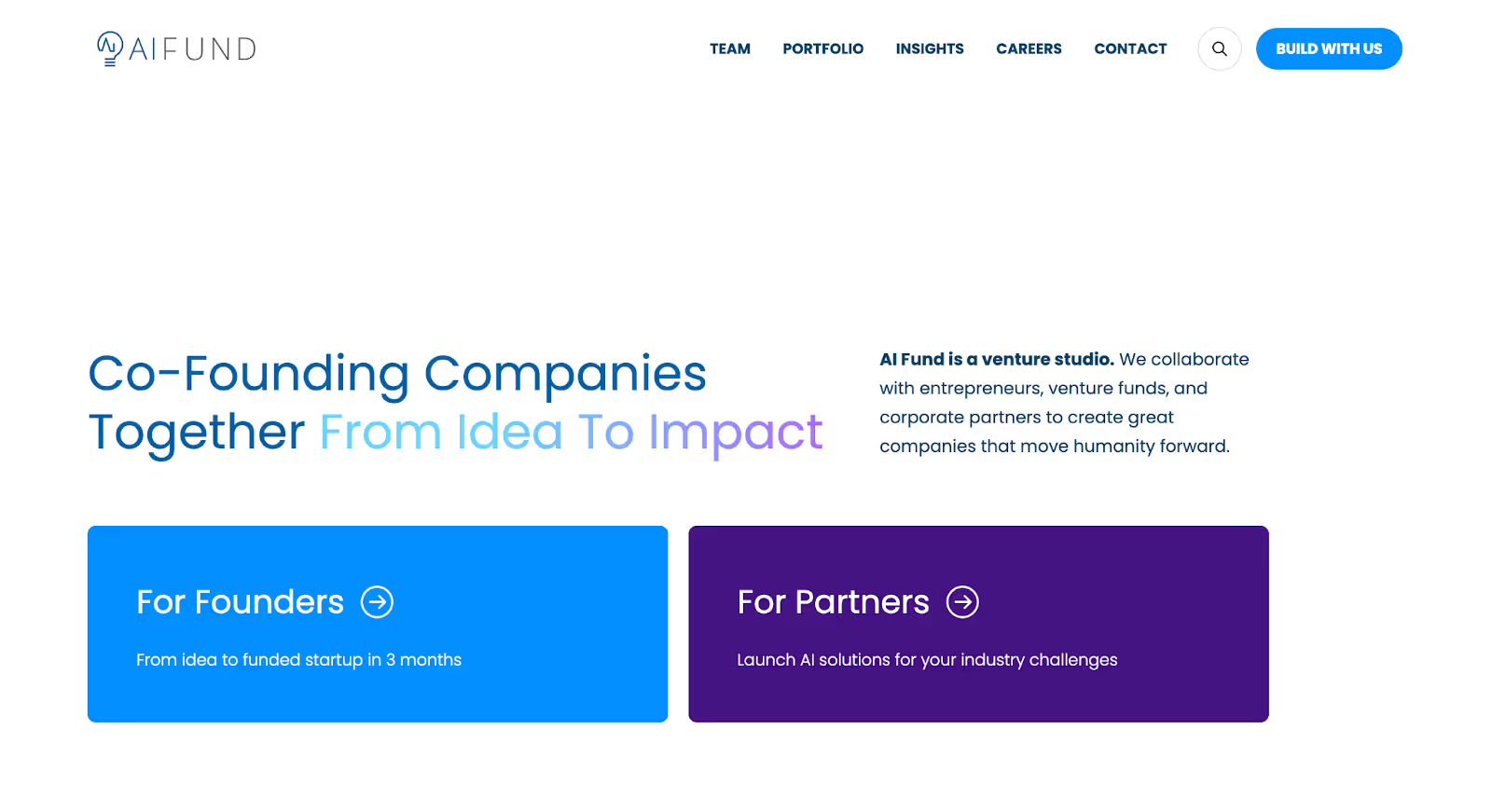
4. AI Fund
AI Fund is a venture studio–style VC firm that positions itself around building and scaling companies, not just backing them using its website to communicate hands-on involvement and operational depth.
Why it works:
Clear articulation of the firm’s operating model The website quickly explains how AI Fund works differently from traditional VCs. Visitors understand that this is a firm that helps create companies from the ground up, not just invest at arm’s length.
Simple messaging that reduces ambiguity The language is straightforward and concrete. There’s little room for misinterpretation about what the firm does, how it engages, or what founders can expect from the partnership.
Focused content over broad storytelling Instead of sprawling sections, the site concentrates on explaining the firm’s approach, team, and portfolio in a tight, structured way, keeping attention on the core value proposition.
Credibility driven by execution, not scale The site doesn’t attempt to look large or complex. Its confidence comes from clarity of role and purpose, which is especially effective for founders evaluating early-stage partners.
Takeaway: AI Fund’s website works because it clearly defines how the firm participates in company building. By removing ambiguity and focusing on its operating role, the site makes it easy for founders to self-select an approach many VC websites fail to achieve.
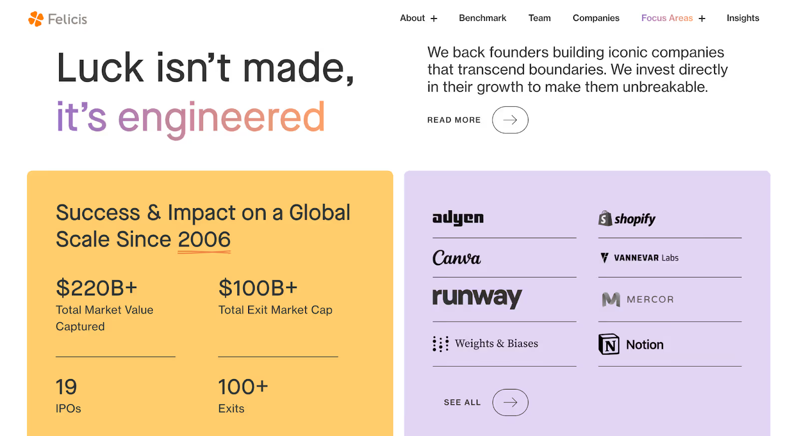
5. Felicis
Felicis is a multi-stage venture capital firm that uses its website to communicate momentum, conviction, and founder alignment without overloading visitors with narrative or jargon.
Why it works:
Immediate sense of direction and momentum The homepage quickly signals what Felicis backs and the scale at which it operates. Portfolio highlights, outcomes, and focus areas are surfaced early, helping visitors understand the firm’s trajectory without digging.
Strong balance between brand and substance The design feels modern and confident, but it doesn’t overshadow the content. Messaging is concise, purposeful, and grounded in what the firm actually does rather than abstract positioning.
Clear emphasis on founder partnership The site consistently reinforces the idea that Felicis is built around long-term founder relationships. This comes through in how portfolio companies, team members, and firm values are presented.
Scannable structure with clear priorities Pages are laid out to support fast scanning, key information is easy to find, and deeper context is available without forcing visitors through long-form explanations.
Takeaway: Felicis’ website works because it communicates confidence through clarity. By focusing on direction, outcomes, and founder alignment, the site helps visitors quickly understand whether the firm is relevant to them without trying to explain everything at once.
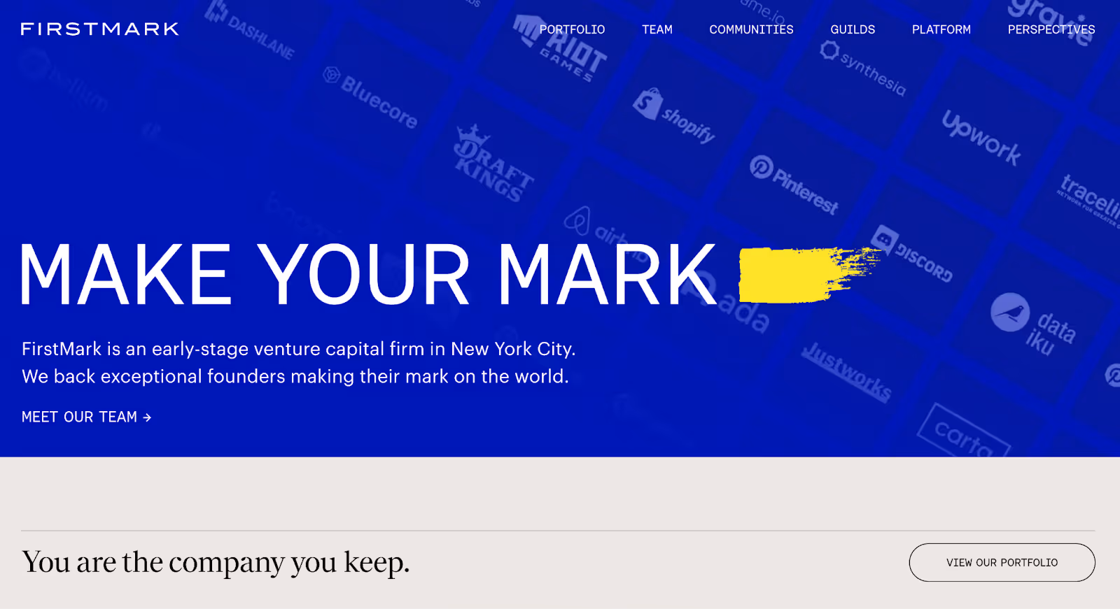
6. FirstMark
FirstMark is an early- and growth-stage venture capital firm that uses its website to emphasise community, platform value, and long-term founder support without relying on heavy storytelling.
Why it works:
Clear positioning around platform and community The website makes it obvious that FirstMark is more than a source of capital. Its platform initiatives, founder network, and operating support surfaced early, helping visitors understand how the firm engages beyond investing.
Structure that mirrors how founders evaluate firms Content is organised around what matters most to founders: how the firm helps, who they’ve backed, and what access they provide. This reduces friction and avoids forcing visitors through generic VC narratives.
Balanced use of content and restraint FirstMark includes enough depth to demonstrate credibility without overwhelming the visitor. Pages feel intentional, with clear priorities and minimal distraction.
Consistent, confident visual language The design is clean and modern, reinforcing trust without calling attention to itself. Typography and layout support scanning while still feeling considered.
Takeaway: FirstMark’s website works because it clearly communicates the firm’s value beyond capital. By structuring the site around community and platform support, it helps founders quickly assess whether the firm is the right long-term partner.
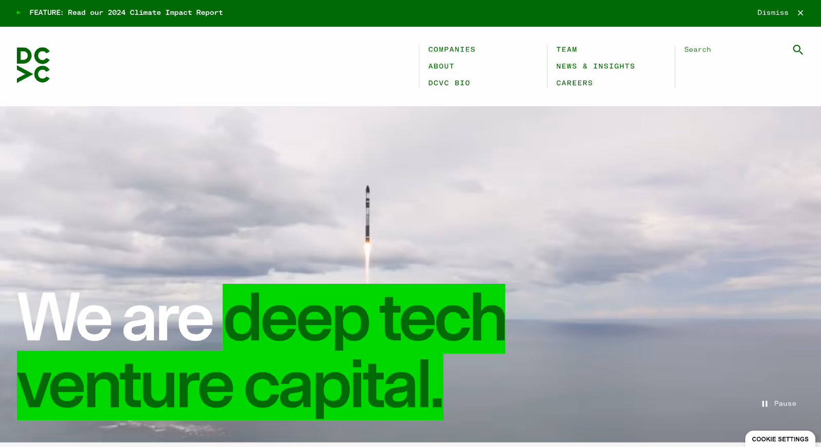
7. DCVC
DCVC is an early-stage venture capital firm that uses its website to communicate depth, rigor, and long-term thinking positioning the firm as a serious partner for technically complex companies.
Why it works:
Clear signal of technical focus The website immediately communicates that DCVC backs companies tackling hard, non-obvious problems. The language, structure, and examples make it clear this is not a generalist firm.
Substance-led storytelling Instead of marketing-heavy claims, the site relies on explanations, portfolio context, and perspective to build credibility. This makes the firm’s expertise feel earned rather than asserted.
Thoughtful pacing and hierarchy Content is structured to support scanning while still allowing deeper exploration. Visitors can quickly understand the firm’s focus, then dig further without feeling lost or overwhelmed.
Aligned tone and design The visual design is restrained and serious, reinforcing trust and intellectual rigor. Nothing feels decorative for the sake of it, everything supports clarity.
Takeaway: DCVC’s website works because it leans into specificity. By clearly signalling its technical depth and long-term orientation, the site helps founders quickly understand whether the firm is the right fit, saving time for both sides.
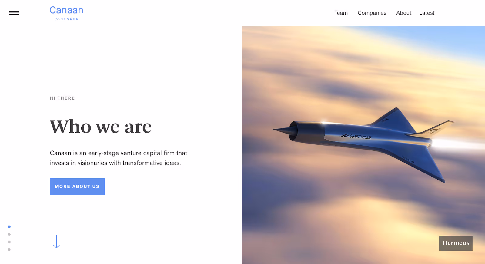
8. Canaan
Canaan is a multi-stage venture capital firm that uses its website to communicate experience, focus, and consistency without relying on flashy design or overextended narratives.
Why it works:
Clear articulation of investment focus The website quickly communicates what Canaan invests in and at what stages. Sector focus, portfolio depth, and approach are presented plainly, helping visitors understand fit without ambiguity.
Experience-led credibility Rather than leaning on buzzwords, the site lets longevity, outcomes, and portfolio quality do the work. This signals stability and conviction, especially important for founders evaluating long-term partners.
Straightforward structure and navigation Pages are easy to scan and logically organised. Visitors can move from firm overview to team to portfolio without friction or unnecessary detours.
Design that stays out of the way The visual system is understated and functional. It supports clarity and trust rather than trying to differentiate through aesthetics alone.
Takeaway: Canaan’s website works because it prioritises clarity and credibility over spectacle. By focusing on what matters: experience, focus, and consistency, it shows how a VC website can be effective without trying to be flashy.
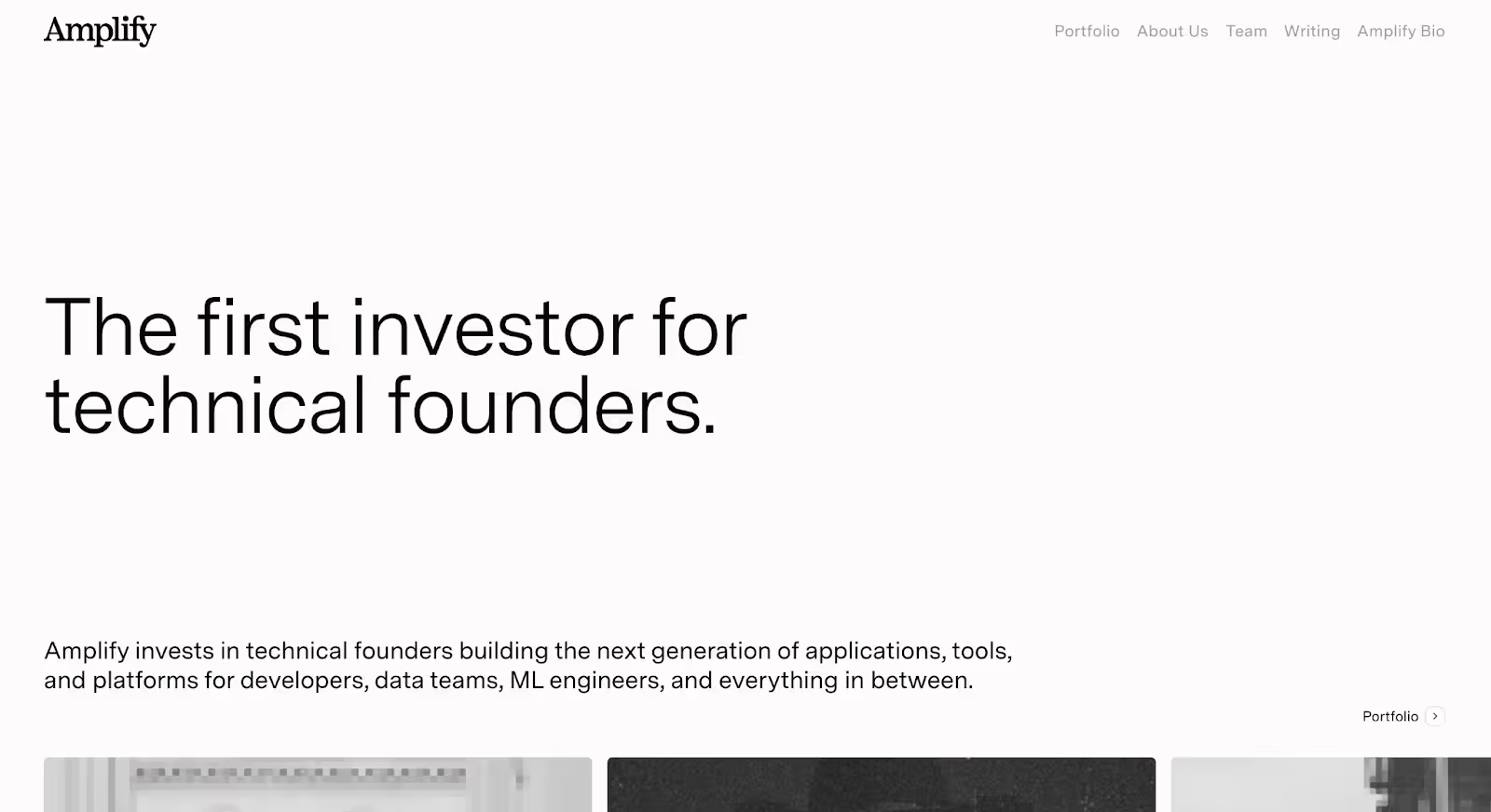
9. Amplify Partners
Amplify Partners is an early-stage venture capital firm that uses its website to signal depth, focus, and technical seriousness without relying on scale or surface-level storytelling.
Why it works:
Immediate clarity on what the firm cares about The website quickly communicates Amplify’s focus on deeply technical founders and infrastructure-level problems. There’s no broad positioning or catch-all language visitors understand the firm’s lane early on.
Messaging that respects a technical audience Copy is precise and restrained. Instead of oversimplifying or over-marketing, the site assumes a knowledgeable reader, which builds trust with founders working on complex problems.
Focused content over volume The site avoids sprawl. Portfolio, team, and perspective are presented clearly without unnecessary sections, reinforcing a sense of discipline and intentionality.
Design that supports seriousness, not spectacle The visual language is calm and confident. Typography, spacing, and layout prioritise readability and clarity over flair, aligning well with the firm’s positioning.
Takeaway: Amplify Partners’ website works because it knows exactly who it’s for. By leaning into focus and technical credibility, the site helps the right founders recognise fit quickly without trying to appeal to everyone.
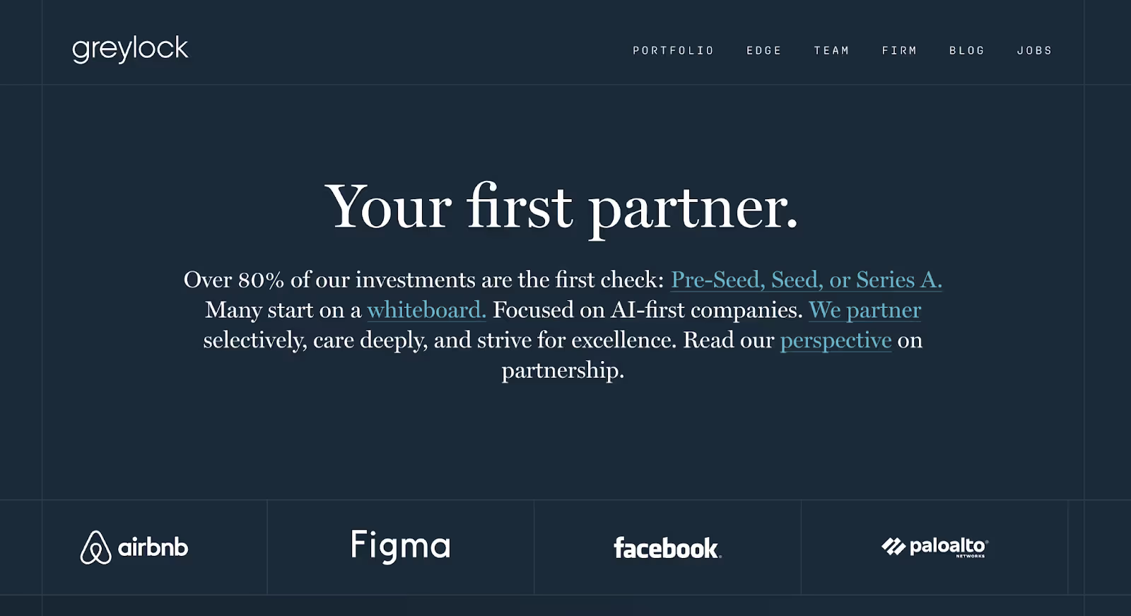
10. Greylock
Greylock is a multi-stage venture capital firm that uses its website to project clarity, confidence, and long-term relevance without relying on excess content or visual noise.
Why it works:
Strong signal of focus and maturity The website quickly communicates that Greylock backs enduring, category-defining companies. The messaging is calm and assured, reflecting a firm that doesn’t need to overstate its role to be taken seriously.
Editorial restraint that builds credibility Rather than flooding the site with commentary, Greylock uses selective content and careful framing. This restraint reinforces trust and positions the firm as thoughtful and deliberate.
Clear structure with minimal friction Navigation is simple and predictable. Visitors can easily move between the firm’s approach, team, and portfolio without distraction, making the experience feel efficient and intentional.
Design that supports authority The visual language is understated but polished. Typography, spacing, and layout work together to communicate stability and confidence without drawing attention away from the substance.
Takeaway: Greylock’s website works because it doesn’t try to convince, it signals. Through clarity, restraint, and consistency, the site reflects the firm’s long-term orientation and helps visitors quickly understand what Greylock stands for.
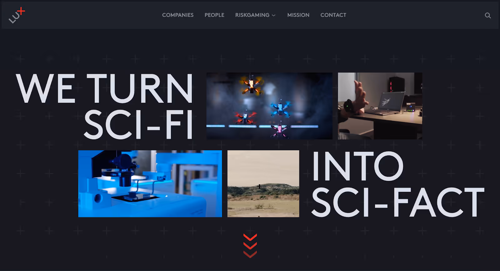
11. Lux Capital
Lux Capital is a multi-stage venture capital firm that uses its website to communicate ambition, depth, and intellectual curiosity positioning the firm around big ideas rather than broad claims.
Why it works:
Clear emphasis on thinking, not just investing The website foregrounds ideas, writing, and perspective. Visitors quickly understand that Lux is driven by curiosity and long-term bets, not trend-chasing or surface-level narratives.
Editorial-led credibility Instead of leaning heavily on marketing copy, the site uses essays, insights, and commentary to show how the firm views the world. This builds authority through substance rather than slogans.
Distinct visual identity The design feels bold and intentional without becoming distracting. Typography, layout, and pacing reinforce the firm’s positioning as thoughtful and future-oriented.
Content that rewards deeper engagement At a glance, the site is approachable. For readers who choose to go deeper, there’s meaningful content that adds context and depth to the firm’s worldview.
Takeaway: Lux Capital’s website works because it leads with ideas. By centering perspective and long-term thinking, the site communicates conviction and differentiation, making it a strong reference for VC firms that want their website to reflect how they think, not just what they back.
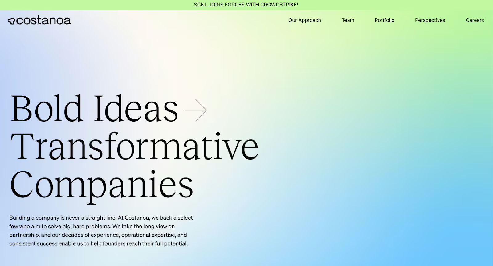
12. Costanoa Ventures
Costanoa Ventures is an early-stage venture capital firm that uses its website to emphasise hands-on support, founder readiness, and disciplined execution without overcomplicating the message.
Why it works:
Clear positioning around early-stage support The website makes it obvious that Costanoa is built for founders navigating the earliest phases of company building. Its messaging consistently reinforces preparation, focus, and practical help.
Strong articulation of how the firm helps Instead of vague promises, the site explains concrete ways the firm supports founders through go-to-market guidance, community, and operational insight. This reduces uncertainty for first-time founders.
Clean structure with purposeful content Pages are organised to answer common founder questions quickly. The site feels efficient and intentional, avoiding unnecessary sections or decorative storytelling.
Approachable but credible tone The language strikes a balance between being supportive and serious. It feels accessible without undermining the firm’s experience or expectations.
Takeaway: Costanoa Ventures’ website works because it clearly communicates who it’s for and how it helps. By focusing on early-stage realities and practical value, the site makes it easy for founders to assess fit before reaching out.
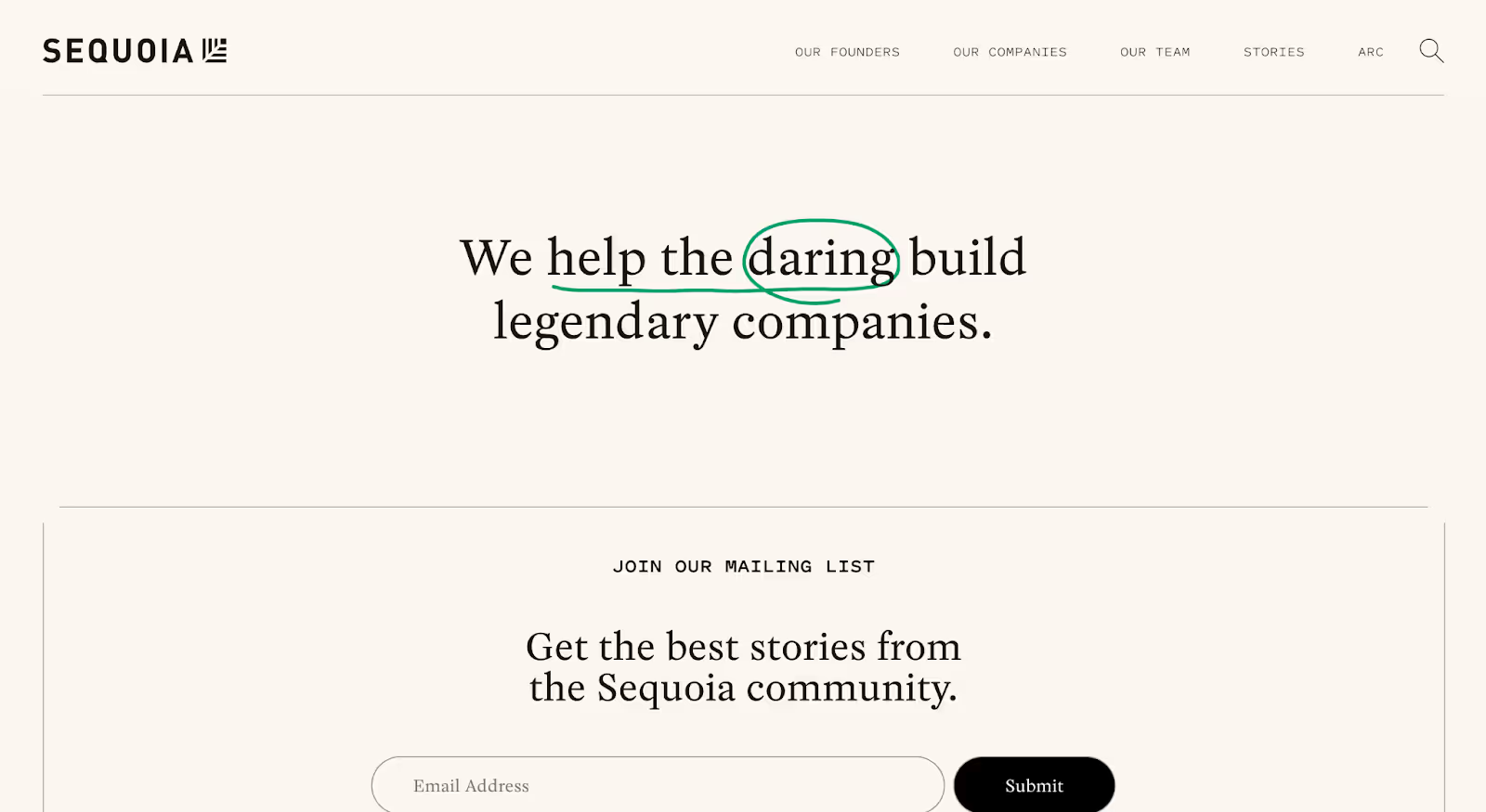
13. Sequoia Capital
Sequoia Capital is a multi-stage venture capital firm that uses its website to communicate enduring relevance, founder partnership, and long-term company building without relying on hype or trend-driven messaging.
Why it works:
Clear emphasis on company building, not deal-making The website consistently frames Sequoia as a long-term partner. Messaging focuses on helping founders build enduring companies, setting expectations beyond capital from the first interaction.
Resources that add real value Playbooks, guides, and structured founder resources are easy to find and clearly presented. This shifts the site from a brand surface into something founders can actively use.
Strong balance of legacy and modern clarity While Sequoia’s history is unmistakable, the website avoids leaning on reputation alone. Design and structure feel current, ensuring the firm’s relevance is communicated, not assumed.
Simple, confident structure Navigation is minimal and purposeful. Visitors can quickly understand the firm’s approach, explore resources, and view the portfolio without friction or distraction.
Takeaway: Sequoia Capital’s website works because it reinforces trust through usefulness and clarity. By focusing on long-term partnership and founder support, the site reflects the firm’s philosophy while remaining practical and accessible.
Best VC Firm Website Design Trends in 2026
The strongest VC websites in 2026 aren’t defined by visual trends alone. They’re shaped by how venture firms need to communicate clarity, credibility, and conviction faster than ever.
Across the best examples, a few clear design and content patterns stand out, not as stylistic choices, but as responses to how founders and operators actually evaluate firms today.
1. Clarity Over Clever Positioning
VC websites are moving away from abstract taglines and broad mission statements.
Instead, the best sites clearly communicate:
What the firm focuses on
Who it’s best suited for
How it works with founders
This clarity shows up in headlines, navigation, and page structure not buried in subpages.
2. Content That Signals How the Firm Thinks
Portfolio logos alone no longer do the job.
Top VC websites use:
Writing, insights, or resources
Platform or operating content
Clear explanations of approach
This content isn’t marketing-heavy. It’s there to show perspective and conviction, helping visitors understand the firm’s worldview.
3. Structured for Scanning, Not Exploration
Founders don’t browse VC websites, they evaluate them.
The best sites are designed for:
Fast scanning
Clear visual hierarchy
Predictable navigation
Long-form content exists, but it’s organised so visitors can understand the firm quickly before deciding to go deeper.
4. Restraint as a Trust Signal
In 2026, restraint is becoming a differentiator.
Many of the strongest VC websites avoid:
Overdesigned interactions
Trend-heavy visuals
Excessive animation
Instead, they use calm layouts, confident typography, and intentional spacing to project seriousness and focus.
5. Websites as Strategic Assets, Not Brochures
The best-performing VC websites are treated as living assets.
They’re updated regularly, support multiple audiences, and evolve with the firm rather than existing as static snapshots. This signals momentum, relevance, and long-term intent.
Taken together, these trends point to a shift: VC websites are no longer just about looking established. They’re about helping the right founders understand fit, quickly and confidently.
Final Thoughts
The difference between a good-looking VC website and a great one is rarely design skill,it’s intent.
The strongest VC websites in 2026 all solve the same underlying problem: they remove ambiguity. Within seconds, visitors understand what the firm stands for, who it’s built for, and whether it’s worth engaging further. There’s no need to dig, decode, or guess.
Across the examples in this list, the pattern is consistent. Clear positioning replaces broad claims. Structure takes priority over volume. Content exists to signal how the firm thinks, not just what it owns. And design is used to support clarity, not compete with it.
This matters because VC websites are no longer passive touchpoints. Founders, operators, and talent make fast judgments, often before any conversation begins. When a site feels generic, overloaded, or unclear, that decision is made just as quickly in the wrong direction.
The best VC websites don’t try to impress everyone. They focus on helping the right people recognise fit. That restraint, more than any visual trend, is what makes them effective.
If you’re evaluating your own VC website, the question isn’t whether it looks modern. It’s whether it communicates conviction, clarity, and credibility fast enough to matter.
Need a VC firm website that actually works?
The best VC websites featured in this list succeed because they make one thing clear very quickly: what the firm stands for and who it’s right for. They don’t rely on vague positioning or polished visuals alone, they communicate focus, conviction, and credibility.
At Amply, we design and build websites for venture capital firms that want their site to do more than look established. Whether you’re launching a new fund, refining your positioning, or fixing a website that feels unclear or outdated, we help translate your investment thesis into a website that’s structured, credible, and easy to understand.


.png)
.png)


.avif)