Best Healthcare Website Examples (2026) and What Makes Them Work
Rajat Kapoor
February 10, 2026
8
min
Key Takeaways
The best healthcare websites reduce uncertainty by answering practical questions early, like cost, access, and next steps.
Clear guidance matters more than visual polish when users are stressed or unsure.
Strong healthcare websites are designed for non-linear behavior, not ideal user journeys.
Differentiation comes from clarity about who a service is for, not generic claims.
Tone plays a critical role in helping users feel confident enough to move forward.
Websites that work do not push users to convert. They help them decide.
Most healthcare websites don’t fail because of bad design.
They fail because they make it unnecessarily hard for people to answer simple, high-stakes questions.
Questions like:
Is this the right place for my problem?
How soon can I get help?
What will this cost?
What do I do next?
When those answers are buried, vague, or scattered, people hesitate. And in healthcare, hesitation usually means delay, not conversion.
This article breaks down the best healthcare website examples in 2026 and explains why they work. Not from a visual or branding lens, but from a clarity and decision-making perspective.
Each example is reviewed based on how well it:
Surfaces critical information
Reduces uncertainty
Guides users toward a clear next step
We design healthcare websites at Amply, and the patterns you’ll see here are the same ones we apply when building for real healthcare and healthtech teams. If you want a deeper look at how this translates into execution, you can explore our approach as ahealthcare web design agency.
Let’s get into the examples.
What Makes a Healthcare Website Great?
A great healthcare website helps users decide what to do next with minimal effort. It surfaces critical information early, differentiates clearly, supports non-linear behavior, and uses calm, direct language that reduces hesitation.
Healthcare websites aren’t judged on how much information they contain. They’re judged on how quickly they help someone feel confident enough to move forward.
Confidence in healthcare comes from clarity, knowing if this is the right place, what to expect, and what to do next. Great websites focus on guidance, not completeness, and reduce hesitation instead of adding to it.
Here’s what great healthcare websites consistently get right.
1. Critical Information Is Easy to Find
Great healthcare websites make essential, practical information easy to find without forcing users to search or guess.
Cost expectations or ranges
Insurance acceptance
Appointment availability
Location relevance
This information isn’t hidden in PDFs or buried three levels deep. It’s visible where users are already looking, because the site anticipates their real questions.
Availability matters more than completeness.
2. Clear Differentiation Without Marketing Language
Great healthcare websites help users understand whether a service is right for them without relying on generic or promotional claims.
Saying “patient-first” or “high-quality care” doesn’t help users decide.
Great healthcare websites explain:
Who the service is actually for
What kinds of cases it’s best suited to
When it may not be the right option
This kind of clarity builds more trust than polished claims ever will.
3. Obvious Next Steps at Every Stage
Great healthcare websites guide users toward a clear next action at every point in their journey.
Users shouldn’t have to guess what to do next.
Strong healthcare websites provide clear, low-pressure guidance:
Book an appointment
Check eligibility
Explore treatment options
Talk to someone
The goal isn’t aggressive conversion. It’s reducing decision paralysis.
4. Designed for Non-Linear, High-Stress Behavior
Great healthcare websites are designed around how people actually behave under stress, not idealized user journeys.
People don’t move neatly through healthcare websites.
They:
Jump between pages
Scan headlines
Backtrack often
Revisit the same question multiple times
Great sites are designed for this behavior. They repeat key information, reinforce context, and help users re-orient quickly instead of assuming calm, linear journeys.
5. Tone That Matches the Emotional Moment
Great healthcare websites use language that acknowledges emotional weight while still providing clarity and direction.
Healthcare decisions rarely happen in a neutral state.
Great healthcare websites avoid being:
Cold and corporate
Overly clinical
Emotionally flat
Instead, they use calm, direct language that reassures without dramatizing, acknowledging uncertainty while still offering direction.
A great healthcare website isn’t defined by how much information it contains. It’s defined by how little effort it takes for someone to decide what to do next.
Best Healthcare Websites in 2026
The healthcare websites that stand out in 2026 aren’t chasing trends. They’re focused on one thing: helping users orient themselves quickly and move forward with less friction.
The examples below aren’t just visually polished. They’re strong because of how they structure information, surface practical details, and guide people through uncertainty, especially when decisions aren’t linear or calm.
Each website is evaluated using the same lens, so you can clearly see what works, who it’s best for, and where it falls short.
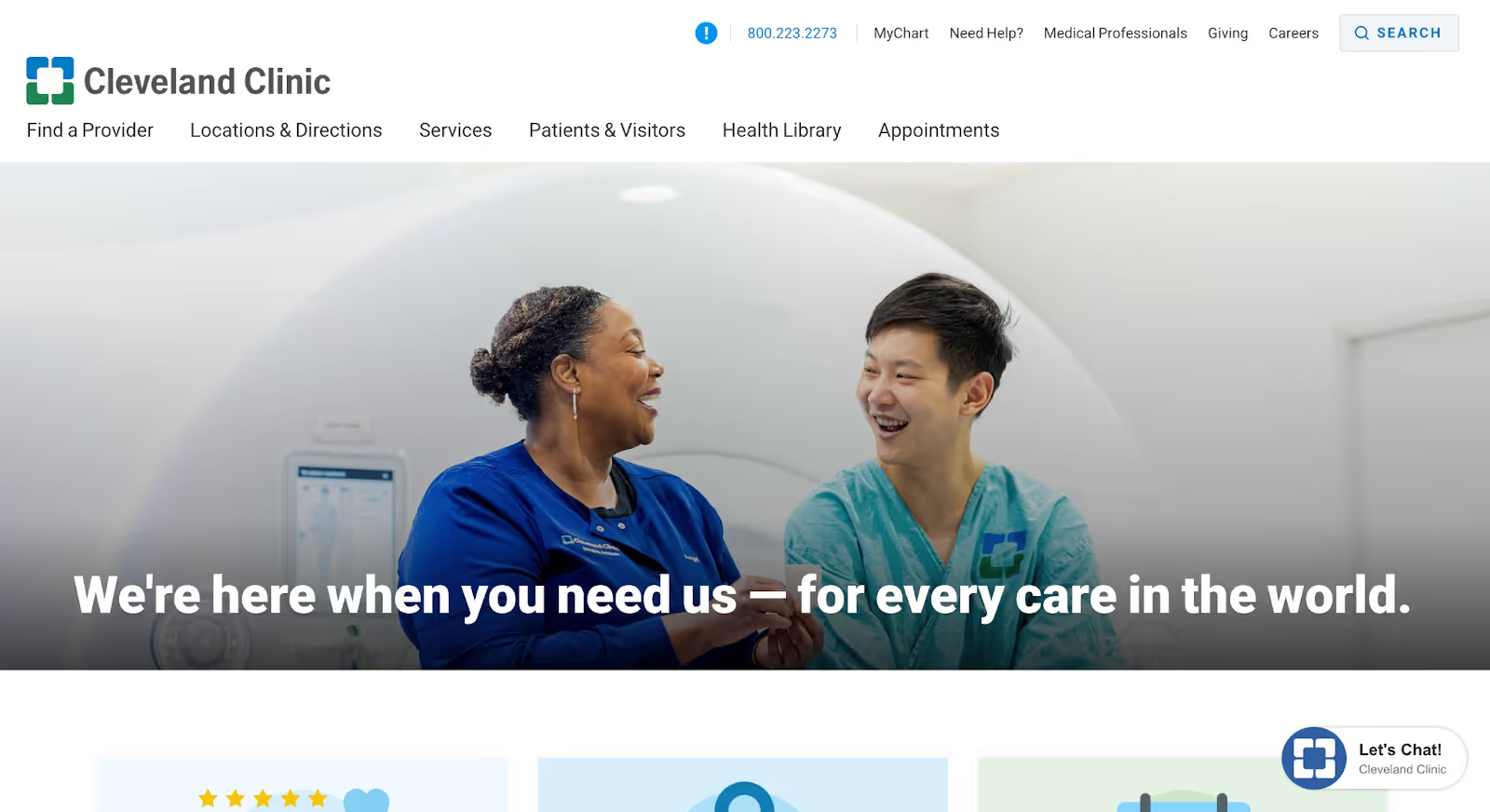
1. Cleveland Clinic
Cleveland Clinic is a nonprofit academic medical center known for complex, specialized care across a wide range of conditions. Its website supports millions of users annually, from patients researching symptoms to caregivers coordinating care and professionals seeking clinical information.
Why it works:
Complex healthcare information is structured around real user intent Instead of overwhelming visitors with departments and specialties upfront, the website allows users to approach care from multiple starting points: conditions, treatments, doctors, or services. This makes it easier for people who don’t yet know what kind of care they need to orient themselves without feeling lost.
Education and action are balanced carefully Cleveland Clinic’s site is highly educational, but it doesn’t stop at explanation. Throughout the experience, learning is paired with clear next steps, finding a doctor, exploring treatment options, or understanding when to seek care. This helps users move from research to decision without abrupt transitions.
Credibility is established through depth, not marketing language Rather than relying on generic claims, the website builds trust by showing expertise directly: detailed condition pages, physician profiles, and clear explanations of procedures. The depth itself becomes the proof, which is especially important in healthcare contexts where reassurance matters more than persuasion.
Takeaway: Cleveland Clinic’s website works because it respects how uncertain healthcare decisions actually are. By structuring vast amounts of information around user intent and pairing education with guidance, the site reduces confusion without oversimplifying care.
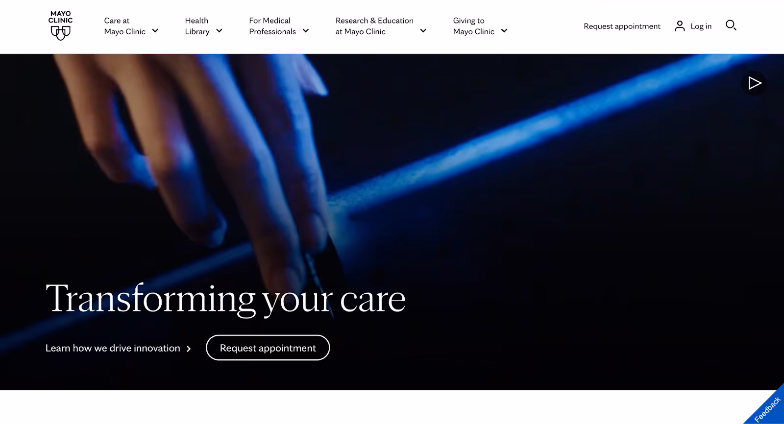
2. Mayo Clinic
Mayo Clinic is a nonprofit medical organization focused on integrated clinical practice, education, and research. Its website serves a wide audience, from patients seeking clear medical answers to caregivers and clinicians looking for trusted reference material.
Why it works:
It meets users at the research stage without overwhelming them Many healthcare websites struggle when users arrive early in their decision-making process. Mayo Clinic’s site excels here by offering condition- and symptom-led content that’s written for non-experts, helping users understand what might be happening before pushing them toward action.
Medical authority is communicated through clarity, not complexity The website doesn’t rely on technical language to signal expertise. Instead, it explains medical topics in plain terms, using structure, diagrams, and layered depth so users can choose how much detail they need. This builds trust without alienating less-informed readers.
Content is designed to be reusable across journeys Condition pages, treatment explanations, and FAQs are structured in a way that supports scanning, revisiting, and jumping between topics. This works well for non-linear behavior, users can move between symptoms, conditions, and care options without losing context.
Takeaway: Mayo Clinic’s website works because it treats education as a service, not a content dump. By making medical knowledge accessible and navigable, it supports users who are still forming decisions, long before they’re ready to take action.
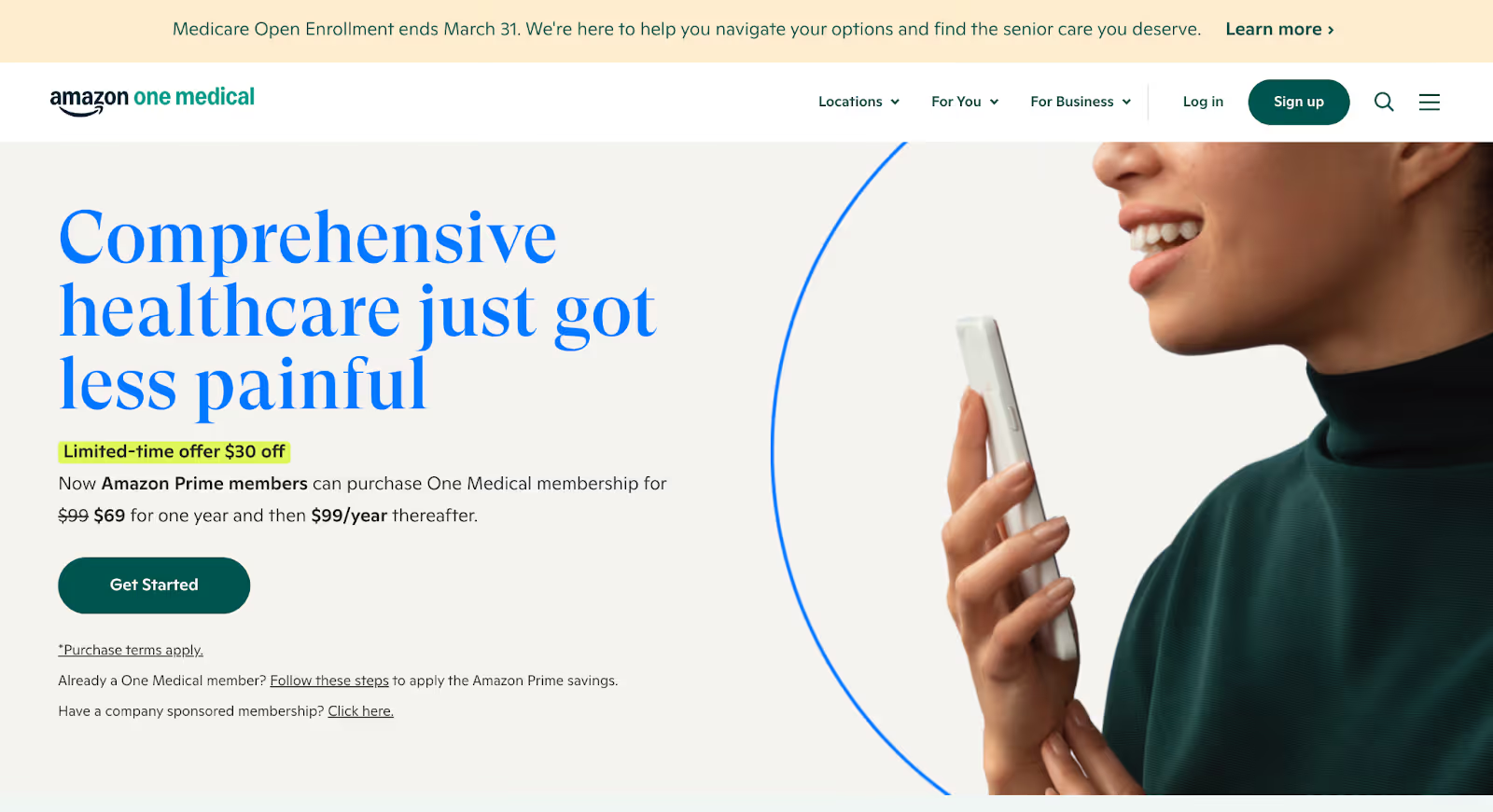
3. One Medical
One Medical is a modern primary care provider offering in-person and virtual care through a membership-based model. Its website is designed to support people who want healthcare to feel simpler, faster, and more predictable.
Why it works:
The value proposition is immediately clear One Medical’s website doesn’t start with medical complexity. It starts with outcomes users care about: easier access, less waiting, and a more straightforward care experience. This clarity helps users quickly understand whether the service fits their expectations of primary care.
Practical questions are addressed early Pricing structure, membership details, appointment access, and locations are surfaced upfront instead of being buried deep in the site. This removes a major source of friction for users who want to understand logistics before committing.
The experience is designed around everyday healthcare, not edge cases Unlike hospital websites built for rare or complex conditions, One Medical’s site is optimized for routine, repeat interactions. Navigation, language, and CTAs all reinforce the idea of ongoing care rather than one-off visits, which aligns well with how users actually engage with primary care.
Takeaway: One Medical’s website works because it reframes healthcare as a service people use regularly, not a system they have to decode. By focusing on clarity, logistics, and everyday usability, it lowers the barrier to taking the first step.
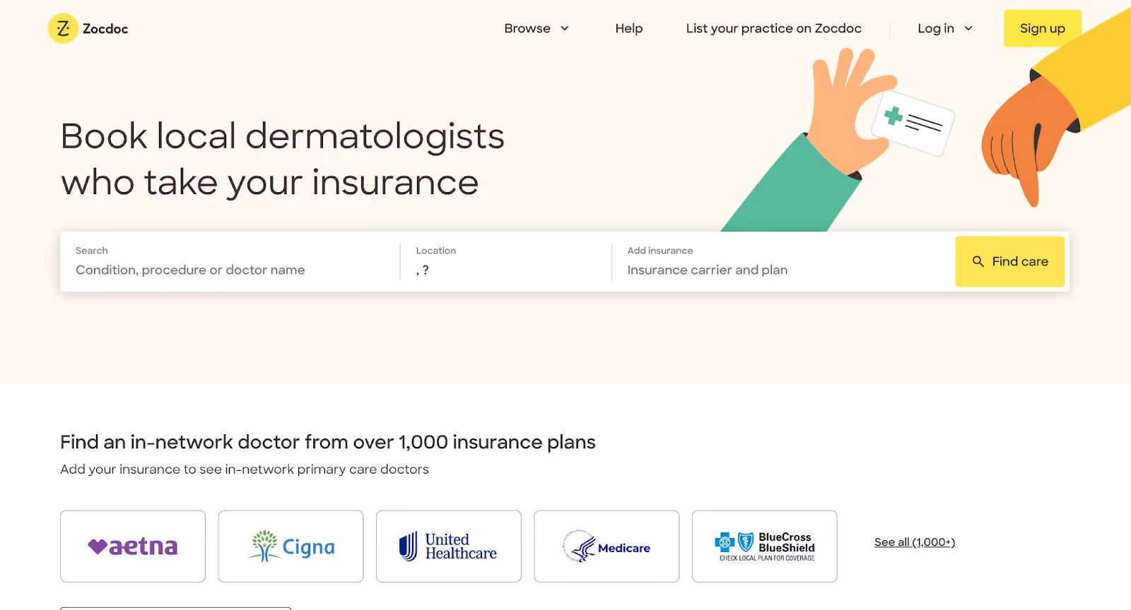
4. Zocdoc
Zocdoc is a healthcare marketplace that helps patients find doctors, check availability, and book appointments online. The website is built around one primary job: removing friction from access to care.
Why it works:
The website is organized around a single, high-intent action Zocdoc doesn’t ask users to understand the healthcare system before acting. From the first interaction, the site is centered on searching by specialty, location, and insurance matching how people actually think when they need a doctor.
Insurance and availability are treated as core decision drivers Instead of burying insurance compatibility or appointment slots, Zocdoc makes them central to the experience. This directly addresses two of the biggest blockers in healthcare decision-making and helps users move forward with fewer unknowns.
Trust is built through transparency, not persuasion Doctor profiles include reviews, availability, and practical details that allow users to compare options confidently. The site avoids heavy marketing language and instead lets visibility and choice do the work.
Takeaway: Zocdoc’s website works because it removes system-level complexity from the user’s decision. By designing around access, insurance, and availability, it turns a frustrating healthcare task into a clear, repeatable action.
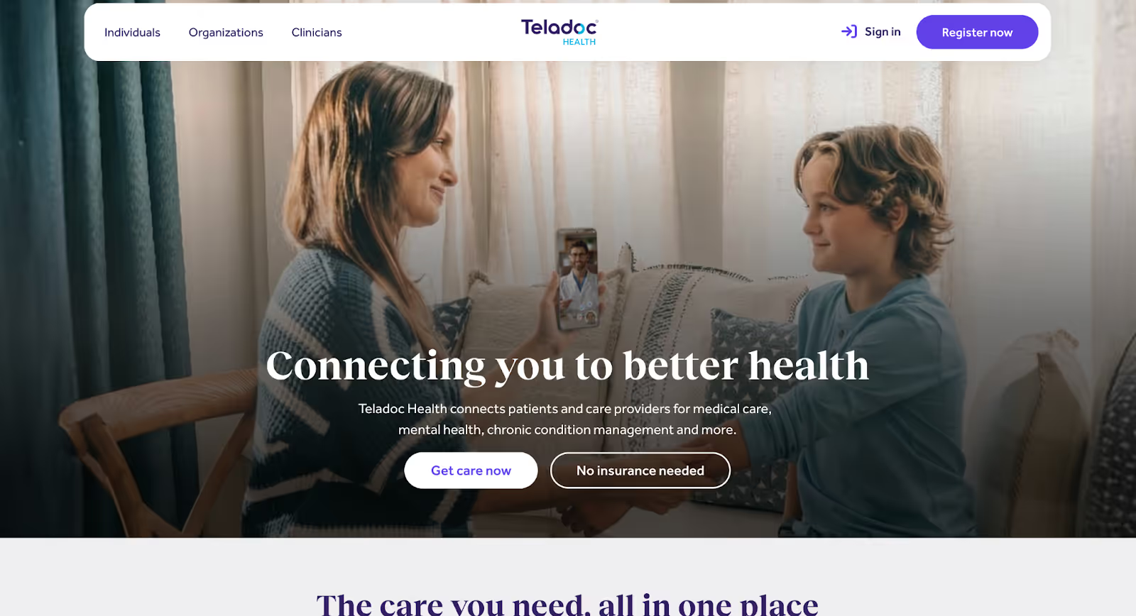
5. Teladoc Health
Teladoc Health is a global virtual healthcare provider offering on-demand care, chronic condition management, and mental health services. Its website serves users who want quick access to care without navigating traditional healthcare infrastructure.
Why it works:
The website clearly sets expectations for virtual care Teladoc’s site does a strong job of explaining when virtual care makes sense and what it can be used for. This helps users self-qualify early, reducing confusion and mismatched expectations.
Multiple services are organized without overwhelming users Despite offering a wide range of services, the website breaks them down into clear categories that map to real needs: urgent issues, ongoing conditions, and mental health. This structure helps users find relevance quickly without reading everything.
Access and immediacy are emphasized throughout Messaging and layout consistently reinforce speed, availability, and convenience. Users are reminded that care can happen now, not later, which aligns well with why most people seek telehealth in the first place.
Takeaway: Teladoc Health’s website works because it makes virtual care feel practical and trustworthy. By setting clear boundaries, organizing services by need, and emphasizing immediacy, it helps users decide quickly whether telehealth is the right next step.
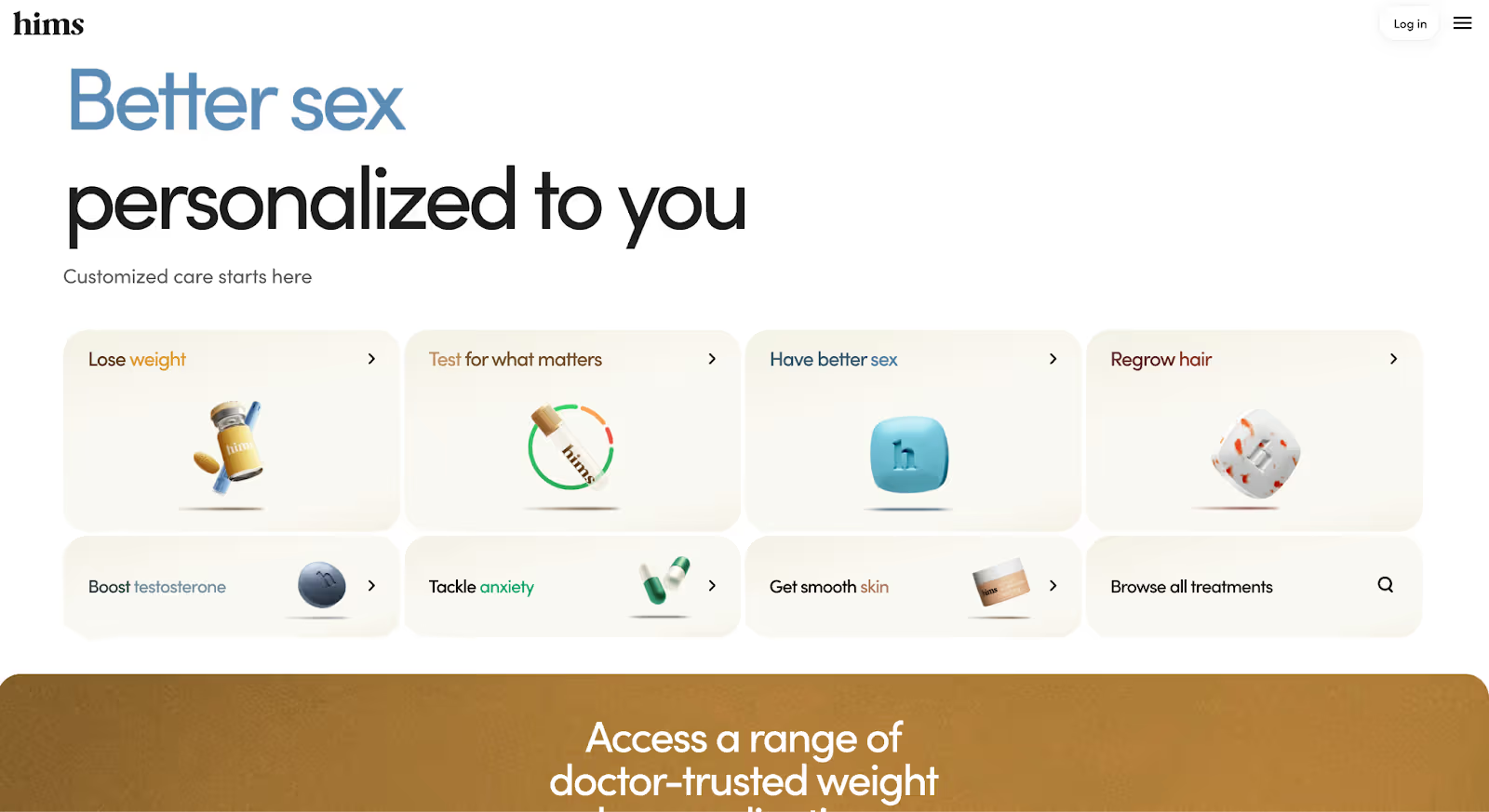
6. Hims & Hers
Hims & Hers is a direct-to-consumer telehealth platform focused on treatments for sensitive and often stigmatized health issues, including mental health, sexual health, dermatology, and hair loss. Its website is designed to make starting care feel private, simple, and low-friction.
Why it works:
Sensitive problems are addressed without embarrassment or ambiguity Hims & Hers avoids clinical heaviness and euphemisms alike. The website names problems directly, explains options clearly, and creates a sense of normalcy around seeking help, lowering the emotional barrier to getting started.
Pricing and process are made explicit early Users can quickly understand how the service works, what it costs, and what happens after they begin. By removing uncertainty around logistics and payment, the site reduces hesitation for first-time users.
The journey is optimized for confidence, not exploration Unlike traditional healthcare sites that encourage browsing, Hims & Hers guides users through a focused, step-by-step flow. This minimizes decision fatigue and helps users move from curiosity to action without unnecessary detours.
Takeaway: Hims & Hers’ website works because it treats emotional friction as seriously as medical accuracy. By pairing clear information with a calm, direct experience, it helps users take action on issues they might otherwise avoid.
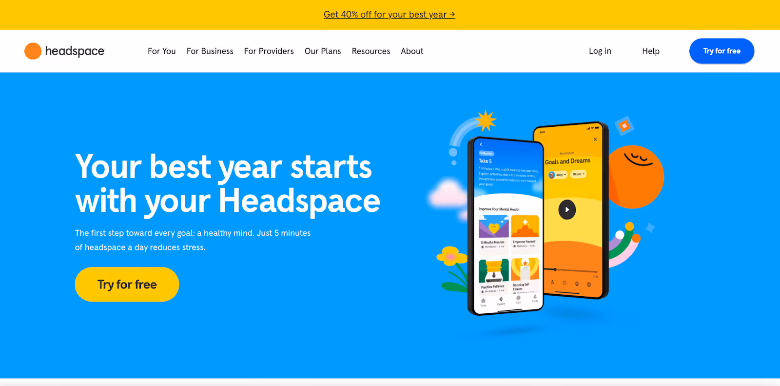
7. Headspace Health
Headspace Health is a mental health platform offering meditation, coaching, and clinical care for individuals and organizations. Its website supports users who may be exploring mental health support for the first time.
Why it works:
The experience lowers the emotional barrier to entry Headspace Health’s website is designed to feel calm and approachable without minimizing the seriousness of mental health. Language, pacing, and visual hierarchy work together to reduce intimidation for users who may already feel hesitant.
Services are clearly framed by need, not diagnosis Instead of leading with clinical labels, the site organizes offerings around common concerns like stress, anxiety, sleep, and burnout. This helps users find relevance without needing to self-diagnose.
Guidance is emphasized over choice overload Rather than presenting too many options at once, the website nudges users toward appropriate paths based on what they’re experiencing. This reduces decision fatigue and keeps the experience supportive rather than overwhelming.
Takeaway: Headspace Health’s website works because it prioritizes emotional safety alongside clarity. By guiding users gently and organizing care around real concerns, it makes mental health support feel accessible and actionable.
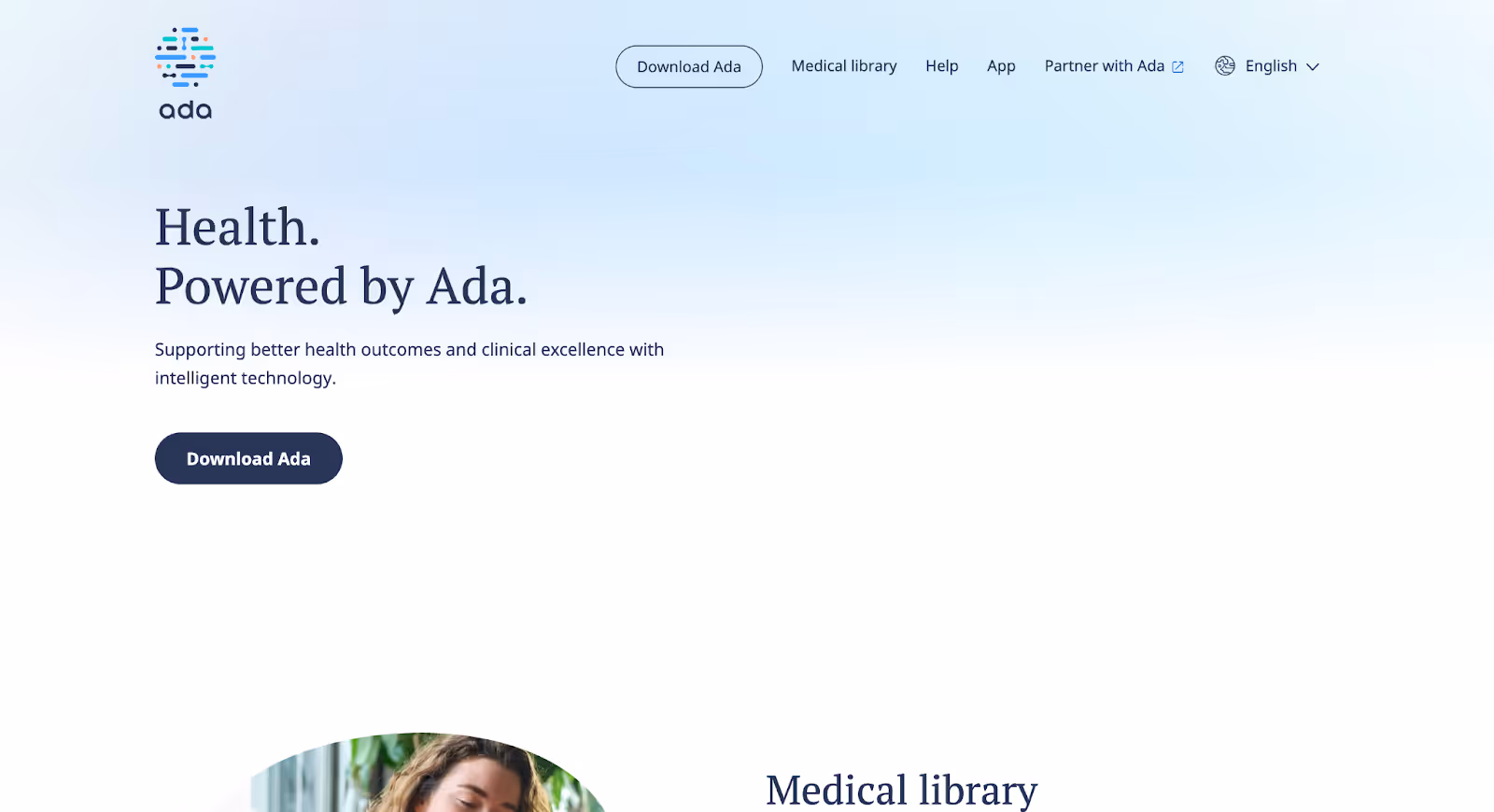
8. Ada Health
Ada Health is a digital health platform that helps users understand symptoms and possible causes through an AI-powered assessment, guiding them toward appropriate next steps in care.
Why it works:
The website addresses uncertainty before diagnosis Ada Health is designed for the moment when users know something feels wrong but don’t yet know what it means. The website clearly positions the product as a starting point for understanding symptoms not a replacement for care which sets accurate expectations and builds trust.
Complex AI is framed as guidance, not authority Rather than presenting AI as definitive or all-knowing, the site explains how assessments work and what users should do with the information. This responsible framing reduces fear and overreliance while still highlighting the value of structured guidance.
Next steps are explicit and responsible After assessment, the website consistently emphasizes what to do next: seek urgent care, talk to a doctor, or monitor symptoms. This helps users move forward without confusion or false reassurance.
Takeaway: Ada Health’s website works because it supports users at an early, uncertain stage of healthcare decision-making. By positioning AI as a guide rather than a verdict, it provides clarity without overstepping trust boundaries.
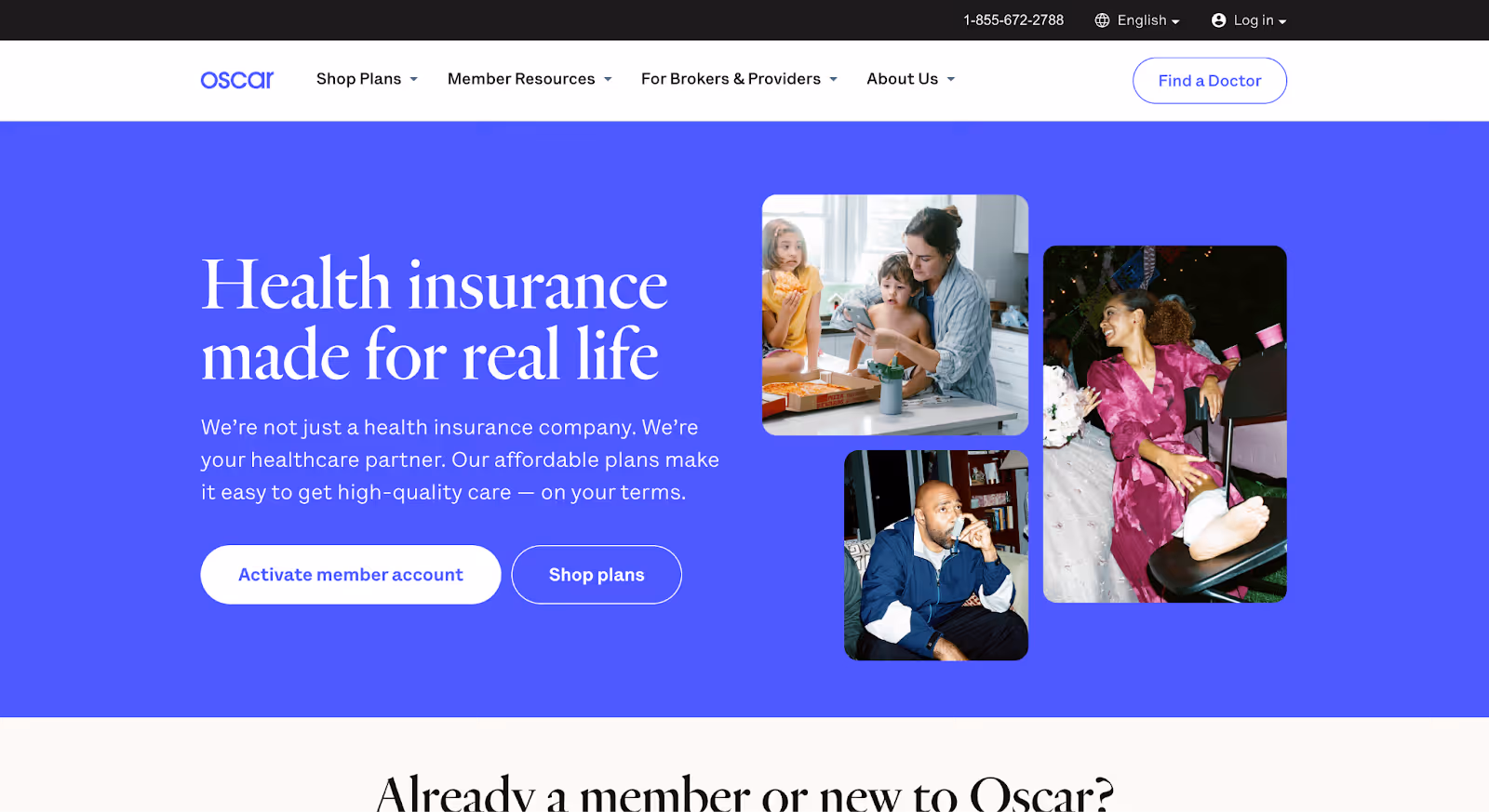
9. Oscar Health
Oscar Health is a health insurance company built around simplifying how people understand, choose, and use coverage. Its website supports users navigating one of the most confusing parts of healthcare: insurance decisions.
Why it works:
Insurance is explained through use, not policy language Oscar’s website avoids leading with dense plan terminology. Instead, it frames coverage around real scenarios: finding care, understanding costs, and getting help, making insurance feel more approachable and less abstract.
Cost visibility is treated as essential, not optional Pricing, copays, and plan comparisons surfaced early, helping users evaluate trade-offs without digging through fine print. This directly addresses one of the biggest sources of frustration in healthcare decision-making.
Support is positioned as part of the product The site consistently reinforces access to help, whether through virtual care, care teams, or guidance tools. This reassures users that they won’t be left alone once they choose a plan.
Takeaway: Oscar Health’s website works because it reframes insurance as a service people actively use, not just a policy they buy. By focusing on clarity, cost visibility, and ongoing support, it reduces confusion in an otherwise opaque part of healthcare.
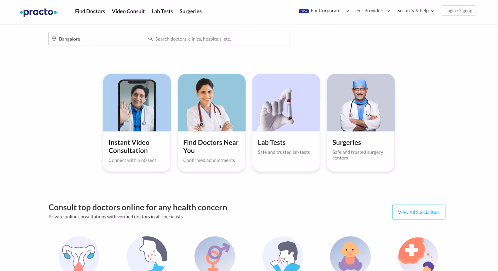
10. Practo
Practo is a healthcare platform that helps users find doctors, book appointments, access digital health records, and consult online. The website serves users navigating fragmented healthcare systems, often with limited time and information.
Why it works:
The website is built for urgency and practicality Practo assumes users want to act quickly: find a doctor, check availability, or book a consultation. Core actions are front and center, reducing the effort required to move from intent to appointment.
Discovery is localized and context-aware Location, specialty, and availability are tightly integrated into the experience. This is especially important in markets where healthcare access varies widely and users need immediate, relevant options rather than abstract information.
Complex choice is simplified through comparison Doctor profiles, reviews, and pricing cues help users evaluate options without having to call clinics individually. This replaces offline friction with clear digital signals.
Takeaway: Practo’s website works because it’s optimized for real-world healthcare constraints. By prioritizing speed, locality, and actionable information, it helps users make decisions in environments where clarity and access matter most.
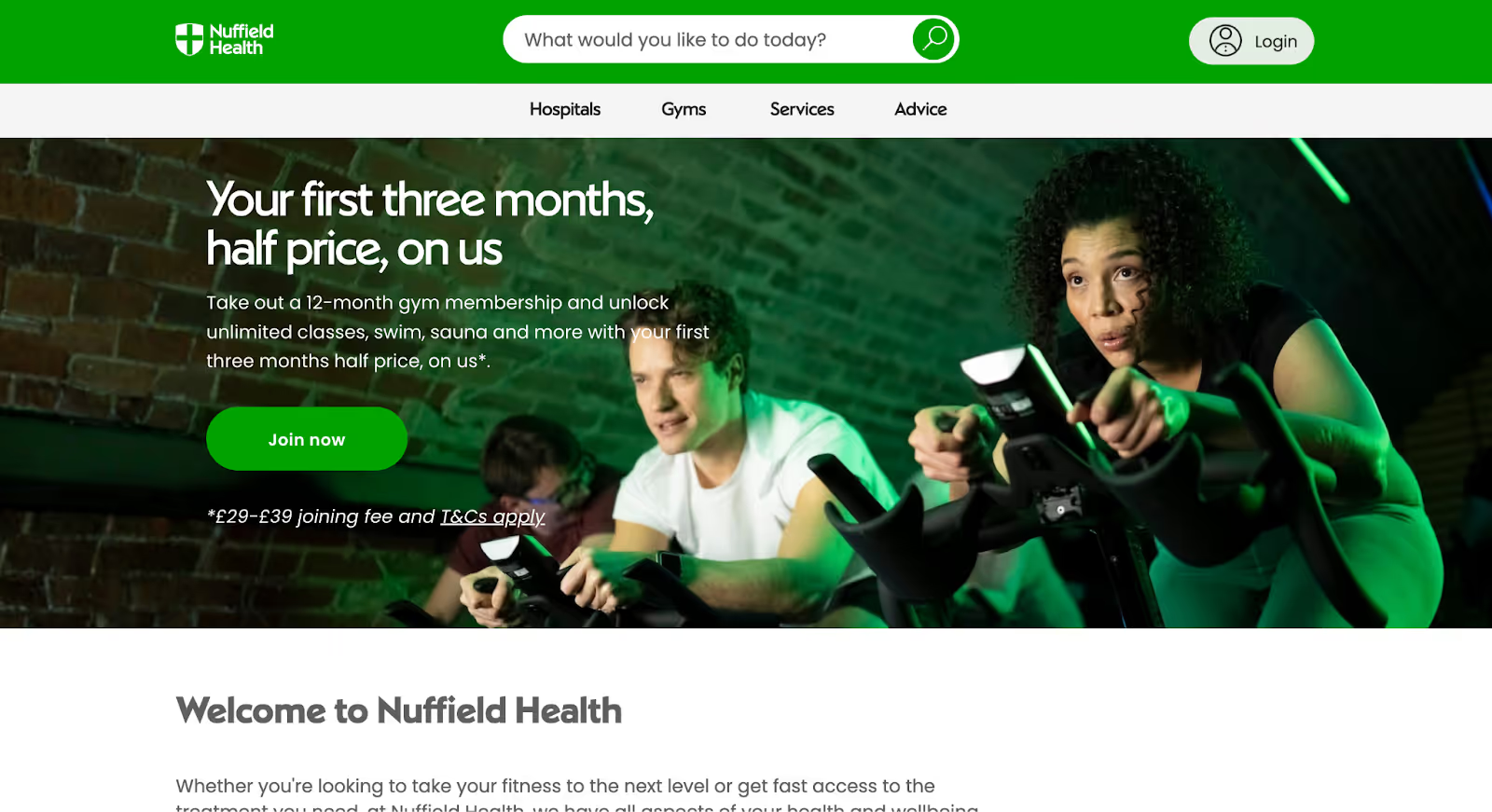
11. Nuffield Health
Nuffield Health is a UK-based healthcare charity offering hospitals, clinics, and wellbeing services. Its website supports users who are weighing private healthcare options alongside preventive and long-term wellbeing.
Why it works:
Healthcare and wellbeing are presented as one continuum Nuffield Health doesn’t separate treatment from prevention. The website clearly connects diagnostics, treatment, recovery, and fitness, helping users see care as an ongoing relationship rather than a one-time event.
Private healthcare is explained without intimidation For users unfamiliar with private care, the site does a strong job of explaining services, pricing approaches, and access pathways in plain language. This reduces uncertainty for people comparing public and private options.
Content supports confidence before commitment The website encourages exploration, understanding conditions, services, and outcomes before pushing users to act. This respects the fact that private healthcare decisions often require reassurance and reflection.
Takeaway: Nuffield Health’s website works because it reframes private healthcare as approachable and continuous. By combining clarity, education, and wellbeing, it helps users make informed decisions without pressure.
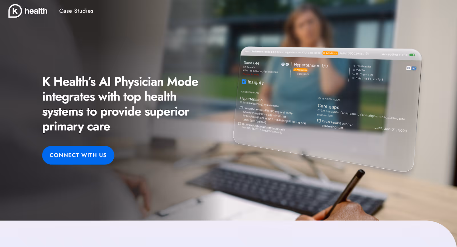
12. K Health
K Health is a digital healthcare platform that combines AI-powered symptom analysis with access to licensed clinicians. Its website is designed for users who want quick guidance before deciding whether professional care is needed.
Why it works:
The website meets users at the earliest point of uncertainty K Health is positioned for the moment when someone feels “something might be wrong” but isn’t ready to book a visit yet. The site clearly communicates that it helps users understand what’s going on before escalating to care.
AI is framed as assistive, not authoritative Rather than presenting AI as a replacement for doctors, the website explains how data-backed insights support better conversations with clinicians. This responsible framing builds trust and avoids overconfidence.
A clear escalation path is built into the experience Users are shown exactly how AI insights connect to talking to a doctor, getting prescriptions, or seeking in-person care. This continuity reduces fear of dead ends and reinforces that help is available when needed.
Takeaway: K Health’s website works because it supports decision-making at the very start of the healthcare journey. By pairing AI guidance with a clear path to human care, it reduces uncertainty without overstepping trust.
Best Healthcare Website Design Trends in 2026
Healthcare website design in 2026 is less about looking modern and more about removing friction at the exact moments users hesitate. The strongest trends reflect a shift away from branding-first thinking toward clarity, guidance, and emotional intelligence.
Designing for uncertainty, not certainty
Healthcare websites are increasingly built for users who don’t know what they need yet. Instead of forcing visitors to choose a department or service upfront, sites are leaning into symptom-led entry points, guided paths, and contextual prompts that help users orient themselves before making a decision. This acknowledges that most healthcare journeys begin with doubt, not clarity.
Practical information is moving up the page
Cost expectations, insurance acceptance, appointment availability, and access details are no longer treated as secondary information. In 2026, leading healthcare websites surface these details early, often alongside service explanations. This shift reflects a growing recognition that transparency reduces anxiety and speeds up decision-making more than polished messaging ever could.
Clear next steps without aggressive CTAs
Healthcare websites are becoming more direct without becoming pushy. Instead of vague “Learn more” links or hidden contact options, sites now guide users with clear, low-pressure actions: book an appointment, check eligibility, explore options, or talk to someone. The focus is on helping users move forward confidently, not forcing conversions.
Non-linear navigation is the default
Designing for linear user journeys is becoming obsolete. Modern healthcare websites assume users will skim, jump between pages, revisit sections, and change direction mid-journey. As a result, key information is repeated thoughtfully, context is reinforced across pages, and navigation supports exploration without disorientation.
Tone and language are becoming emotionally aware
In 2026, healthcare websites are paying closer attention to how language lands emotionally. Overly clinical or corporate tone is giving way to calm, direct, human language that reassures without oversimplifying. This doesn’t mean being casual, it means being considerate of the emotional state users are often in when they arrive.
Technology is explained through outcomes, not features
As AI, virtual care, and digital tools become more common, healthcare websites are shifting how they talk about technology. Instead of leading with tools or technical capability, they frame innovation around outcomes: faster answers, better guidance, continuity of care. This helps users understand value without needing technical context.
Final Thoughts
The healthcare websites that perform best all do one thing well: they make uncertainty feel manageable.
That’s what most users are actually looking for. Not exhaustive explanations, not polished messaging, but reassurance that they’re in the right place, clarity on what matters next, and enough guidance to move forward without second-guessing.
The strongest healthcare websites address the real blockers head-on. They surface practical information instead of burying it. They differentiate clearly instead of sounding like every other provider. They offer obvious next steps without pressure. They’re designed for scanning, backtracking, and non-linear behavior. And their tone acknowledges the emotional weight that often accompanies healthcare decisions.
Across the examples in this list, the pattern is consistent. When healthcare websites reduce friction at moments of hesitation, people don’t just stay longer, they act sooner and with more confidence.
If you’re building or redesigning a healthcare website, the goal isn’t to add more content or follow design trends. It’s to remove uncertainty where it slows decisions down.
That’s what turns a healthcare website from something people visit into something they actually rely on.
Need a healthcare website that actually works?
The healthcare websites featured in this list work because they make a few critical things clear very quickly: who the care is for, what to expect, and what to do next. They don’t rely on surface-level design or vague reassurance. Instead, they use structure, clarity, and thoughtful sequencing to reduce uncertainty and help people move forward with confidence.
At Amply, we design and build healthcare websites for teams that want their site to do more than exist online. Whether you’re launching a new healthcare product, modernizing an outdated site, or fixing a website that feels confusing or overwhelming, we focus on turning complex services into clear, usable experiences.

.avif)


.png)
.png)


.avif)