The best B2B landing page examples focus on one conversion goal, whether that's booking demos, starting free trials, or generating qualified pipeline.
High-performing B2B landing pages speak to multiple stakeholders, including end users, managers, and budget owners, because B2B purchases rarely involve one decision-maker.
Social proof should appear within the first scroll. Customer logos, testimonials, and case studies build trust before visitors reach the form.
The highest-converting pages reduce friction by asking only for essential information, such as a first name and work email address.
Great demo pages qualify serious buyers, while free-trial pages remove barriers and help users experience value as quickly as possible.
ROI calculators work because they give prospects numbers they can share internally, making it easier to build a business case for your solution.
The best B2B landing pages are honest about trade-offs on competitor comparison pages. Clear positioning builds more trust than claiming to win every category.
Building a B2B website landing page in Webflow allows teams to use reusable CMS components, run tests faster, and update content without developer support.
Most B2B landing pages fail for the same reason: they copy what looks good instead of understanding what actually drives conversions. Many articles showcase attractive designs and trendy layouts, but they rarely explain why certain pages turn visitors into qualified pipeline while others don't.
This guide breaks down 12 real B2B landing page examples by the goal they're designed to achieve. You'll see how leading companies structure demo pages, free-trial experiences, ROI calculators, and competitor comparison pages, along with the specific copy, trust signals, and conversion patterns that make them effective.
We've also included practical Webflow implementation notes for every example because execution matters as much as strategy. If you're building a B2B landing page that needs to generate opportunities, not just impress stakeholders, these are the patterns worth learning from and applying to your own site.
Why B2B Landing Pages Are Harder to Convert Than B2C
The best B2B landing pages have to convince multiple decision-makers, build trust over time, and guide buyers through longer sales cycles. Unlike B2C pages, which often target a single customer, a B2B landing page must address different priorities and objections at every stage of the buying process.
You're Selling to Buying Committees, Not Individuals
Most B2B purchases involve several stakeholders, not one person making a quick decision. The person who lands on your page may become an internal champion, but they still need approval from others before moving forward.
A typical buying group can include:
The champion who discovered your solution
The operator who uses the product every day
The manager responsible for implementation
The budget holder who approves spending
Procurement, legal, or security teams
Each person cares about something different. That's why the most effective B2B landing page examples combine clear messaging, trust signals, and proof points that answer multiple concerns within a single experience.
Trust Matters More Than Urgency
Trust drives B2B conversions more than scarcity or limited-time offers. Buyers want confidence that your solution will deliver results and fit into their existing processes.
Before taking action, they often look for:
Customer testimonials and case studies
Security certifications and compliance standards
ROI evidence and business outcomes
Implementation support and onboarding processes
Executive or industry validation
The best B2B landing pages focus on reducing risk rather than creating pressure. Strong social proof and transparent messaging help buyers feel comfortable moving to the next step.
Every Scroll Has to Work Harder
A B2B website landing page has one primary goal: move buyers closer to a business decision. Every section should support that goal and remove unnecessary distractions.
High-converting pages typically include:
Clear and specific messaging
Trust signals early on the page
Minimal form friction
One obvious call to action
The examples in this guide use these principles in different ways, but they all make it easy for buyers to understand the value, build confidence, and take the next step.
How We Evaluate Every B2B Landing Page (Our 5-Point Framework)
The best B2B landing page examples follow a few consistent principles, regardless of industry or offer. Before we look at individual pages, here's the framework we use to evaluate what makes a B2B landing page convert and where most companies go wrong.
1. Hero Clarity
A strong hero section communicates the main problem or outcome in fewer than eight words. Visitors should understand the value of your offer within seconds, without reading multiple paragraphs or scrolling further down the page.
The most effective headlines focus on customer pain and desired results rather than product features. Instead of talking about what your platform does, explain what buyers achieve by using it.
2. Trust Architecture
Trust signals should appear above the fold, not halfway down the page. Buyers want proof that credible companies already trust your solution before they commit to a demo or free trial.
Strong trust elements include:
Customer logos
Testimonials from real users
Industry certifications
Security and compliance badges
Awards or analyst recognition
The best B2B landing pages make credibility visible from the very first screen.
3. Form Friction
High-converting pages ask only for information that is essential to the next step. Every extra field adds effort and gives visitors another reason to leave.
For most B2B offers, the ideal form includes:
First name
Work email address
Additional questions should only be added when they help qualify serious buyers or improve the sales process.
4. Proof Placement
Social proof works best when visitors see it within their first scroll. Waiting until the bottom of the page means many users never reach the content that builds trust.
Strong B2B landing page examples place testimonials, customer logos, or success metrics close to the hero section. This helps buyers feel confident before taking action.
5. Conversion Path
Every B2B website landing page should guide visitors toward one clear action. Whether the goal is booking a demo, starting a trial, or using an ROI calculator, the next step should always be obvious.
Pages with multiple calls to action often create confusion and reduce conversions. A single goal keeps buyers focused and makes it easier to measure performance.
Demo Request Landing Page Examples
The best B2B landing page examples for demos focus on quality over quantity. Their goal is not to generate as many leads as possible, but to attract the right buyers, build trust quickly, and make a demo feel valuable enough to justify a prospect's time.
What Great Demo Pages Must Do
High-converting demo pages typically do four things well:
Filter qualified buyers instead of every visitor
Increase the perceived value of the demo experience
Reduce reasons for visitors to abandon the page
Build trust before asking for contact information
The following examples show how some of the best B2B landing pages accomplish these goals.
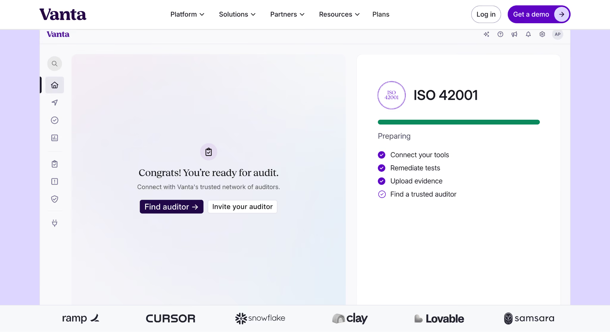
Example 1: Vanta
Vanta's demo page works because it builds credibility before asking users to fill out a form. Security and compliance buyers want proof that established companies already trust the platform.
What They Do
Vanta uses several trust-building elements above the fold:
An outcome-focused headline that promises a clear result
Enterprise customer logos near the hero section
Messaging that emphasizes security and compliance expertise
Why It Works
Compliance software buyers face high levels of risk and internal scrutiny. Recognizable brands help reduce uncertainty and give decision-makers confidence that they are evaluating a proven solution.
The page answers an important question immediately: "Who else trusts this company?"
What to Steal
Place customer logos directly below your hero section instead of hiding them further down the page. Early trust signals help visitors feel comfortable before they reach the form.
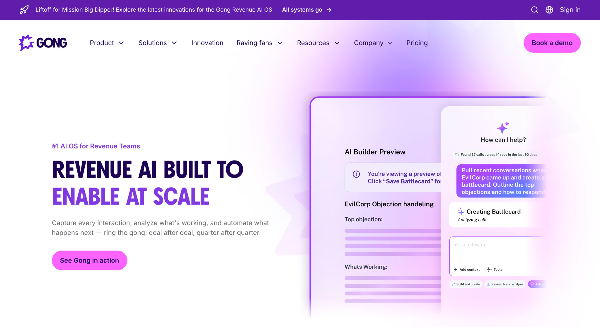
Example 2: Gong
Gong takes a different approach by putting customer voices directly into the hero section. The page uses real people to communicate value instead of relying only on company logos.
What They Do
The page includes:
Customer testimonials in the hero area
Photos, names, and job titles
Messaging focused on revenue outcomes and business impact
Why It Works
People trust other people more than brands. Seeing a real customer with a recognizable role makes the proof feel authentic and relatable.
This approach also helps prospects picture themselves achieving similar results.
What to Steal
Bring testimonials closer to the top of the page. Instead of treating customer quotes as a separate section, integrate them into your hero to build trust immediately.
Free Trial and Self-Serve Landing Page Examples
The best free-trial pages remove as much friction as possible. Unlike demo pages, which focus on qualification, self-serve experiences aim to help users experience value quickly and sign up with minimal effort.
What Great Trial Pages Must Do
The strongest B2B SaaS landing pages make getting started feel simple and low risk. Visitors should understand the product, trust the brand, and begin using the platform within minutes.
High-converting trial pages usually:
Avoid asking for credit card details upfront
Keep forms short and easy to complete
Show the product experience before users sign up
Remove unnecessary steps in the onboarding process
Many of the best B2B landing pages for self-serve products follow these principles.
Example 3: Linear
Linear's landing page succeeds because it shows the product before asking users to commit. Visitors can immediately understand how the platform looks and works without reading long explanations.
What They Do
Linear keeps its hero section simple and focused:
Real product UI as the hero image
Short, outcome-driven headlines
A single email field for signup
Why It Works
Users know exactly what they are getting before they create an account. The page removes uncertainty and makes the experience feel approachable.
There is no leap of faith because the product itself becomes the proof.
What to Steal
Replace generic illustrations or stock visuals with actual screenshots of your platform. Real product experiences create more trust and help buyers visualize success.
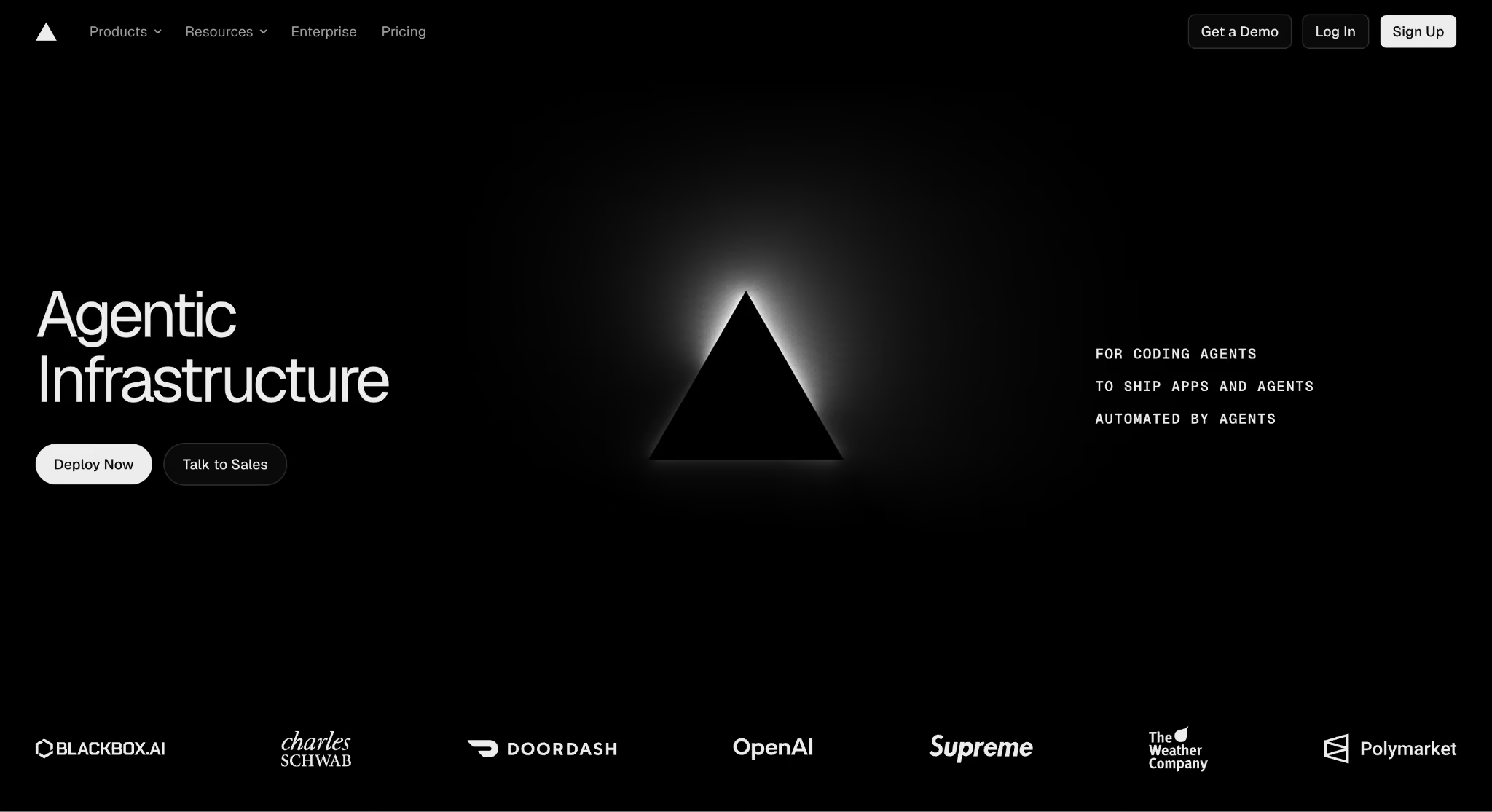
Example 4: Vercel
Vercel reduces signup friction by aligning the experience with its audience. The page feels familiar to developers because it uses tools and workflows they already trust.
What They Do
The page includes:
GitHub authentication for quick access
Open-source credibility signals
Messaging designed specifically for developers
Why It Works
Developers are more comfortable using GitHub than filling out traditional registration forms. The signup process feels natural because it matches their existing habits and preferences.
Meeting users where they already are creates a smoother conversion experience.
What to Steal
Choose authentication methods that fit your audience. Buyers are more likely to complete a process that feels familiar and requires less effort.
ROI Calculator Landing Page Examples
ROI calculators work because they help buyers justify a purchase before speaking with sales. Instead of asking prospects to trust broad promises, these pages give them numbers they can use to build an internal business case.
What Great ROI Pages Must Do
High-converting ROI pages help buyers understand the value of a solution in terms that matter to their business. They should provide immediate insights and make the next step feel logical rather than forced.
Strong ROI pages typically:
Help buyers build internal business cases
Quantify potential business impact
Allow prospects to self-qualify before sales conversations
Deliver useful results without unnecessary friction
Many B2B landing page examples use calculators because they attract high-intent buyers who are already evaluating solutions.
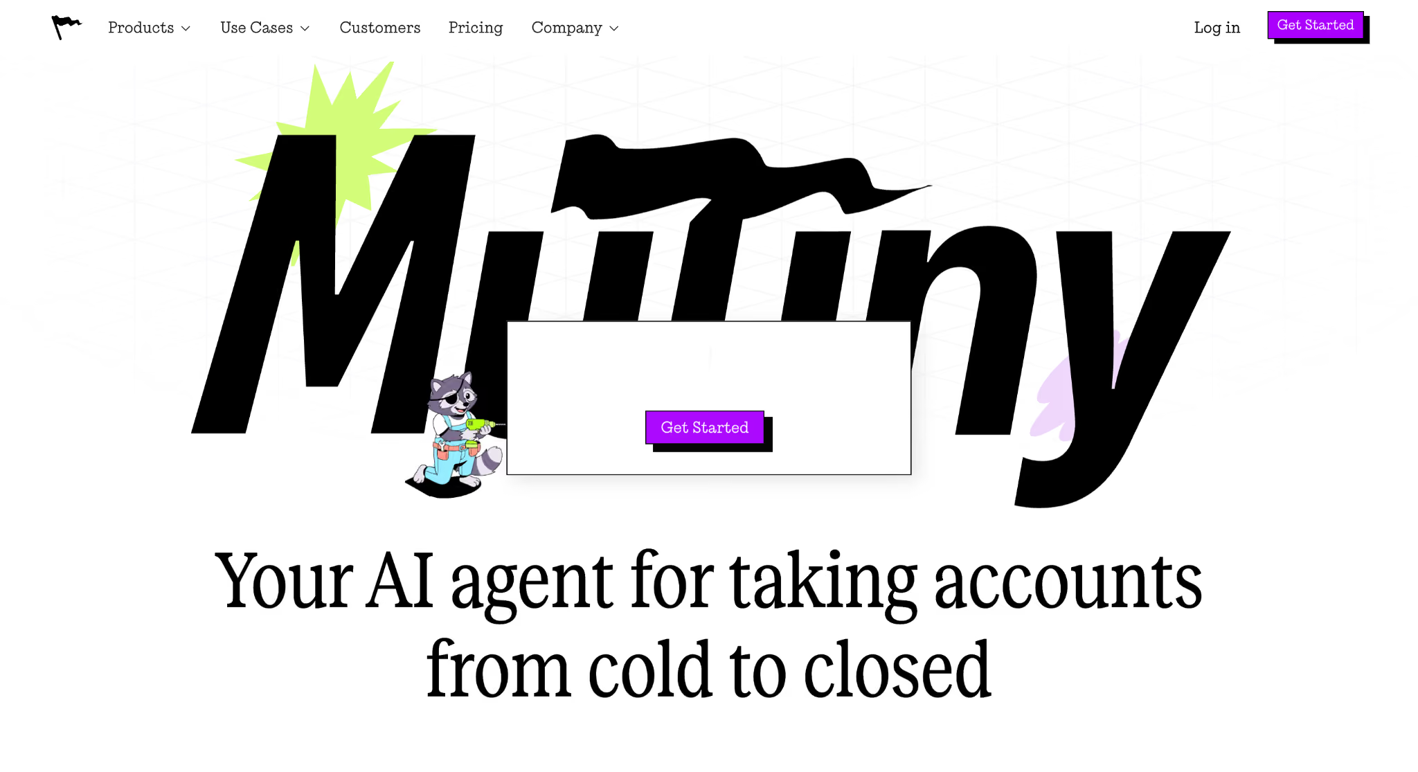
Example 5: Mutiny
Mutiny's calculator focuses on outcomes that buyers can immediately connect to revenue growth. The experience feels practical because users enter their own numbers rather than relying on generic assumptions.
What They Do
The calculator asks visitors to input:
Website traffic volumes
Existing conversion rates
Business metrics related to revenue growth
The tool then estimates the potential financial impact of personalization efforts.
Why It Works
The buyer owns the results because the numbers come directly from their business. That makes the output more credible and easier to share with managers, finance teams, or executives.
The calculator becomes a tool for internal selling, not just lead generation.
What to Steal
Create outputs that buyers can use beyond your website. Reports, estimates, and downloadable summaries make it easier for champions to justify a purchase internally.
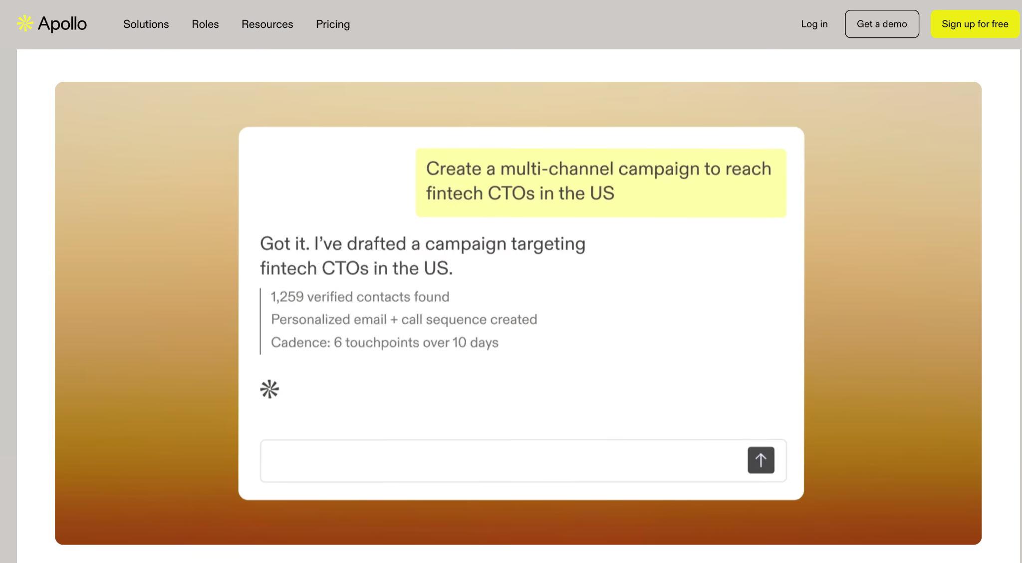
Example 6: Apollo.io
Apollo frames value around business growth instead of cost reduction. This positioning aligns more closely with how sales teams measure success.
What They Do
The page focuses on outcomes such as:
More booked meetings
Increased pipeline opportunities
Better sales productivity
Rather than emphasizing savings, the messaging highlights revenue generation.
Why It Works
Sales leaders are often rewarded for growth, not cost cutting. A calculator that speaks their language feels more relevant and easier to champion within the organization.
The best B2B landing pages align value propositions with the metrics buyers already care about.
What to Steal
Build calculators around customer goals rather than your product features. If buyers care about pipeline, retention, or efficiency, make those metrics the centerpiece of the experience.
Competitor Comparison Landing Page Examples
Competitor comparison pages attract some of the highest-intent visitors in B2B. People who land on these pages are already evaluating alternatives and are often close to making a purchase decision.
What Great Comparison Pages Must Do
The strongest comparison pages help buyers make informed decisions instead of pushing aggressive sales messages. They build trust by being transparent about strengths, trade-offs, and ideal customer fit.
High-performing comparison pages typically:
Target buyers who are actively comparing solutions
Build credibility through honest positioning
Explain who each product is best suited for
Help prospects self-qualify before speaking with sales
Many of the best B2B landing pages use this approach because trust matters more than winning every argument.
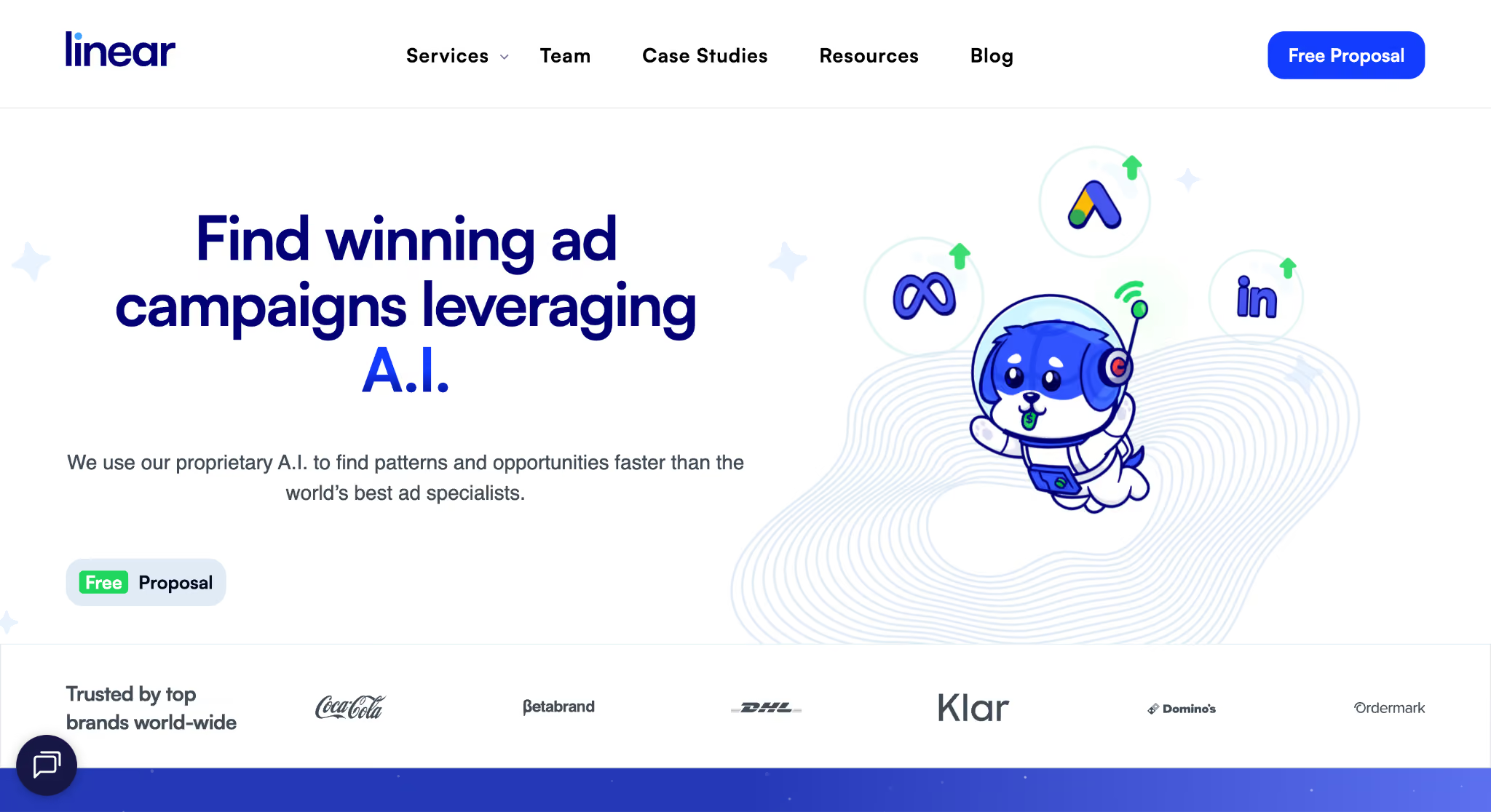
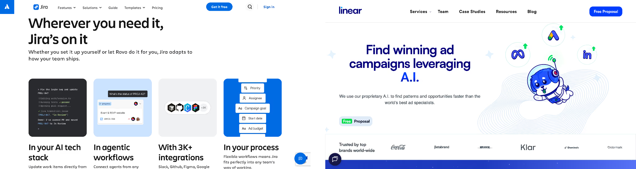
Example 7: Linear vs Jira
Linear's comparison page succeeds because it treats buyers like informed decision-makers. Instead of attacking Jira, it explains where each platform works best.
What They Do
Linear openly acknowledges the strengths of Jira and explains the situations where teams may prefer it. The page focuses on fit rather than declaring a universal winner.
Why It Works
Honesty increases credibility. Buyers are more likely to trust a company that recognizes trade-offs than one that claims to be better in every category.
Balanced comparisons also make your ideal customer profile clearer. When you explain who should choose a competitor, you reinforce who should choose you.
What to Steal
Be explicit about customer fit. Clearly defining when another solution makes sense helps your positioning feel more authentic and trustworthy.
A well-built comparison page should stay accurate as products, features, and pricing evolve. Dynamic content systems make that possible without requiring constant redesigns.
What They Do
An effective Webflow implementation includes:
CMS-driven comparison tables
Reusable content components
Dynamic pricing and feature updates
Why It Works
Static comparison pages become outdated quickly. A CMS-driven approach allows marketing teams to update information without relying on developers, which keeps the experience accurate and relevant.
This flexibility is particularly important for fast-moving SaaS markets where products change frequently.
What to Steal
Avoid hardcoded comparison content whenever possible. Build systems that support regular updates and make maintenance easier as your competitors evolve.
Webflow Build Note
Use Webflow CMS collections for feature matrices, pricing information, integrations, and competitive differentiators. This creates a scalable framework that can support multiple B2B landing page examples across different comparison pages.
6 Patterns Found in Every High-Converting B2B Landing Page
The most effective landing pages follow a similar structure, regardless of industry or offer. When you study enough B2B landing page examples, the same conversion principles appear repeatedly because they align with how business buyers evaluate solutions.
Headlines Focus on Customer Pain
Strong headlines talk about problems and outcomes instead of product features. Buyers care more about what they can achieve than what your software or service does behind the scenes.
The best B2B landing pages make their value clear within seconds of a visitor arriving. Instead of describing product features, they focus on the customer's problem and the outcome they want to achieve. If you're building your messaging from scratch, our guide to SaaS homepage templates explains how product storytelling and conversion-focused copy work together to create stronger buying journeys.
A good headline should:
Address a specific challenge
Promise a clear outcome
Use simple, direct language
Avoid internal product terminology
The best B2B landing pages make their value clear within seconds of a visitor arriving.
Social Proof Appears Immediately
Trust signals should appear within the first scroll. Buyers want evidence that other companies have already achieved success before they commit to a demo, trial, or conversation.
Effective trust elements include:
Customer logos
Testimonials from real users
Case study highlights
Awards and certifications
Industry recognition
Placing these elements near the hero section helps reduce uncertainty and encourages visitors to keep moving through the page.
There Is Only One CTA
High-converting landing pages focus on one action at a time. Whether the goal is booking a demo or starting a free trial, visitors should never wonder what to do next.
Multiple calls to action can create confusion because users must choose between competing options. A single conversion path keeps the experience simple and easier to measure.
Navigation Is Removed
Landing pages perform better when unnecessary navigation is removed. Every extra link gives visitors another opportunity to leave before completing the intended action.
This does not mean removing helpful information. It means prioritizing the primary conversion goal and reducing distractions that do not support it.
Forms Stay Minimal
The most effective forms only ask for information that is necessary to move the conversation forward. Shorter forms generally create less friction and encourage more completions.
For many businesses, that means collecting:
First name
Work email address
Additional fields should have a clear purpose and provide value to both the buyer and the sales team.
Mobile Experiences Come First
A modern B2B website landing page must perform well on mobile devices. Buyers often discover solutions on their phones before continuing research on a desktop computer.
Mobile-first design priorities include:
Fast page load speeds
Easy-to-read typography
Large tap targets for buttons
Simple, responsive layouts
The strongest B2B landing page examples deliver a consistent experience across every device, making it easy for buyers to take action wherever they are.
How to Build These Landing Page Patterns in Webflow
Building a high-converting landing page is easier when you create systems instead of one-off designs. The best B2B landing page examples use repeatable components, fast testing cycles, and accurate tracking to improve performance over time.
Use CMS Components Instead of Hardcoded Pages
CMS-driven components make landing pages easier to scale and maintain. Instead of rebuilding sections for every campaign, marketing teams can update content from a central system without developer support.
Reusable CMS structures work well for:
Customer logos and social proof
Testimonials and case studies
Comparison tables
Pricing information
Feature lists and FAQs
This approach also makes testing simpler because content changes do not require design changes.
Use Motion Carefully
Motion should support conversions, not distract from them. Subtle interactions can improve engagement, but heavy animations often hurt usability and page speed.
Helpful uses of motion include:
Hero section animations that reinforce the value proposition
Social proof reveals as users scroll
Interactive calculators and pricing tools
Avoid:
Delayed calls to action
Full-screen loading animations
Effects that increase page load times
The best B2B landing pages use motion to guide attention rather than compete for it.
Run A/B Tests Without Developers
Testing should be part of every landing page strategy. Small changes can have a meaningful impact on conversion rates, especially when buyers have multiple options to choose from.
Webflow Optimize allows marketing teams to test elements such as:
Headlines and value propositions
Hero section layouts
CTA button copy
Social proof placement
A B2B website landing page should evolve based on user behavior and performance data, not assumptions about what works.
Configure Conversion Tracking Properly
Accurate tracking is essential because you cannot improve what you do not measure. Before publishing any landing page, make sure every conversion event is connected and working correctly.
A complete tracking setup typically includes:
Webflow Forms
HubSpot integrations
GA4 conversion events
CRM attribution systems
Always test your implementation before launch. Confirm that forms submit correctly, events fire in GA4, and leads appear in your CRM with the right attribution data. Reliable tracking turns B2B landing page examples into repeatable conversion systems rather than isolated campaigns.
B2B Landing Page Launch Checklist
The best B2B landing page examples succeed because they get the fundamentals right before launch. A final review helps catch small issues that can hurt conversions, tracking, or the overall user experience.
Use this checklist before publishing your next campaign page.
Content and Messaging
Headline is under eight words and focuses on a customer problem or outcome
Social proof appears above the fold
The meta title aligns with the page headline and primary message
There is only one primary call to action on the page
Forms and Conversion Paths
Forms ask only for essential information:
First name
Work email address
Every button leads to the same conversion destination
Navigation menus and unnecessary links have been removed
Mobile and Performance
The page has been tested at a 375px mobile width
PageSpeed Insights scores are above 80 on mobile
Images, animations, and scripts have been optimized for fast loading
Tracking and Integrations
HubSpot forms and automations are working correctly
GA4 conversion events have been configured and tested
CRM attribution data is passing through accurately
The best B2B landing pages treat launch as the beginning of an optimization process, not the final step. Reviewing these items helps ensure your B2B website landing page is ready to generate reliable data, better user experiences, and more qualified opportunities from day one.
Final Thoughts
The most effective B2B landing page examples succeed because they follow proven conversion principles, not because they look the most impressive. Strong pages focus on one goal, remove unnecessary friction, build trust early, and make the next step easy for buyers to take.
The patterns we covered in this guide appear across many of the best B2B landing pages, regardless of industry or offer type. Whether the objective is booking demos, driving free trials, or helping buyers calculate ROI, the fundamentals remain the same:
Focus on a single conversion goal
Put social proof near the top of the page
Keep forms short and simple
Remove distractions that compete with the CTA
Design for mobile users first
That's what separates a high-performing B2B landing page from one that simply looks good in a design portfolio. Great landing pages guide buyers toward action and give them the confidence to move forward.
Amply builds B2B landing pages in Webflow that are designed to generate pipeline, not just win design awards. Book a call with Amply to learn how they approach strategy, design, and implementation.
Get your Webflow SEO Google sheet checklist
Short description on the benefits or value you’ll get from using this checklist
Organizes SEO tasks for efficiency
Simplifies keyword tracking and management
Ensures consistent on-page optimization efforts
Thank you! Your submission has been received!
Oops! Something went wrong while submitting the form.
Frequently Asked questions
What makes a good B2B landing page?
What are some of the best B2B landing pages to learn from?
How many form fields should a B2B landing page have?
Should B2B landing pages have navigation menus?
What should appear above the fold on a B2B landing page?
How do you build a high-converting landing page in Webflow?
Why are competitor comparison pages effective for B2B companies?
What is the biggest mistake companies make with landing pages?
About the Author
Rajat Kapoor
Copywriter, marketer, and Webflow developer. Rajat focuses on crafting clear, SEO-focused copy for scaling B2B brands.
CRO is the practice of increasing the share of visitors who take a key action. Here is how conversion rate optimization works for B2B websites in Webflow.
See what Webflow agencies cost in 2026, with real pricing from 12 firms, typical B2B project ranges, what each tier includes, and how to compare proposals.
See what Webflow MCP and Claude can actually do for marketing teams, from CMS updates and SEO audits to content workflows, approvals, and practical automation.
Rajat Kapoor
10
min
Our Portfolio
Explore Our Resource Collections
Amply Academy
Learn Web design, webflow, and web design best practices, all tailored to help you grow your B2B business



.avif)


.avif)