

.avif)
SaaS Homepage Template: The Guide To Product Storytelling And Conversion
The B2B landing page or "homepage"... the one page on your website that is supposed to entice, introduce your brand, convert, and more importantly educate your target audience (without going into too much detail of course) that your product is the product that they've been dreaming of. Hopefully, that doesn't sound too daunting, because it shouldn't be. Here in this comprehensive guide, we'll go over...
- The overall goals of the homepage as a whole,
- How to structure the flow of the homepage
- The goals of each section
- Prompts for sections and specific content
- Real-world examples
The goal for B2B landing pages
Ok, I think we've all been there. We land on a homepage and after scrolling and clicking around, we realize "Wow, I have very little idea of what this product actually does." It happens a lot to me at least. This happens because there is a lack of alignment as to what the homepage is actually supposed to do. It's simple, your homepage should answer the following primary and secondary questions for visitors landing on your site:
Primary
- What problem do you solve?
- What is your product?
- Who is your product for?
Secondary
- How does it work?
- Is this legit?
- Is it robust enough for my needs?
- Is it easy to use?
- How much does it cost?
- How do I get started?
Homepage template (download above)

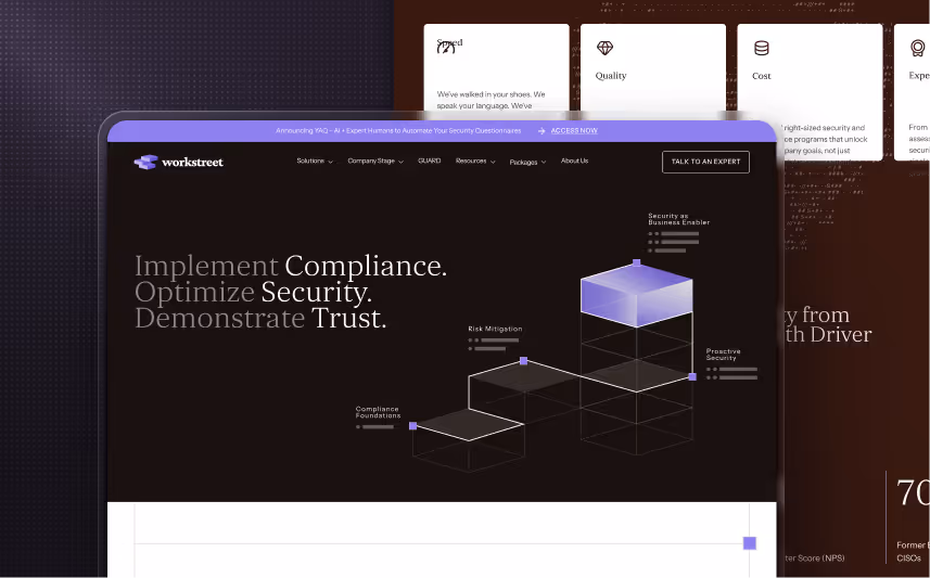
Hero section
The hero section is what we call the first touchpoint with the homepage. It includes your main value proposition, CTAs, and a powerful visual. It should convey what your company is in a concise and compelling way.
The hero section should leave the visitor with the answers to these three questions:
- What does your product do?
- Who is it for?
- How does it solve their problems?
When you describe what your product does, try to fit it into one sentence without naming specific features. Focus on what super powers it gives your customers.
Next, you should consider your target customer. Your product can cater to a wide group of people but narrow it down as much as possible by considering who will benefit most from it.
After you decide who is your perfect customer, consider their biggest pain point and describe how your product will solve it. While highlighting the benefits is crucial for a SaaS website, the real-life problems will resonate with your customers on a deeper level.
The answers to these three questions should be clear and come without too much thought. Many SaaS websites leave the visitors confused with the amount of information, while others leave visitors feeling they don’t know what the product is.
Keep in mind that people coming to your website don’t know your product, and they don’t need it. It’s your job to convince them and explain why.
With these important aspects in mind, you can start crafting the most important part of your homepage – the main value proposition.

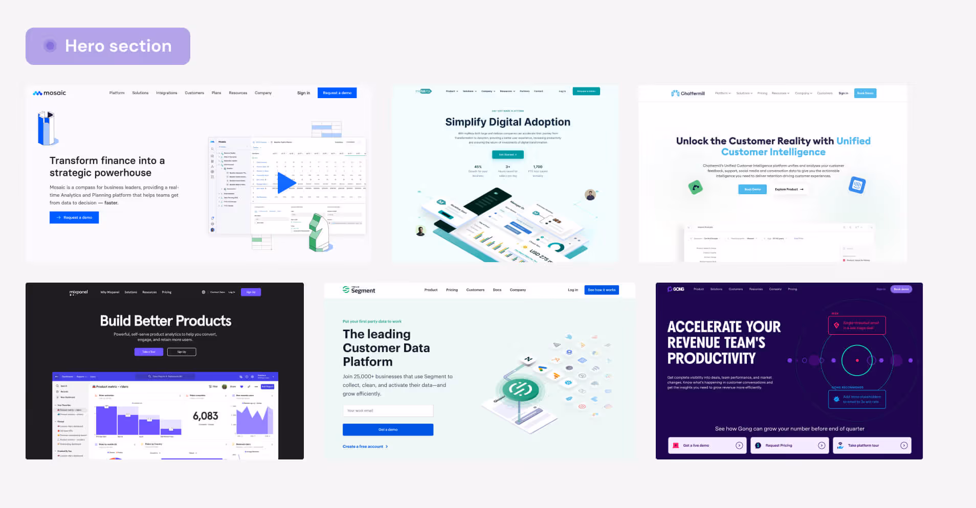
Value proposition
The main value proposition is the heading the visitor sees first. It should explain the value of your product in one short sentence. Clearly communicate what your SaaS product does and how it solves a specific problem for your target audience.
The goal of the main value proposition is to convince users that your product addresses their pain points. Ultimately, it should encourage them to explore and learn more about your product.
We love to use a prompt to create a great value proposition that helps put the main benefit into perspective.
{{company name}} so you can {{main value of your product}}
Let’s use Calendly as an example to illustrate how it works.
{{Calendly}} so you can {{book meetings without the back and forth}}
The part “book meetings without the back and forth” is the main benefit of using the product that would be a great H1 in the hero section.
Follow your headline with a sub-headline that provides more details about your product’s key features, benefits, or target audience. The subtext part should refer to who the product is for and how it solves the problem. What does your product do that makes customers’ lives easier? In the case of Calendly, their product automates scheduling meetings.
Crafting a great value proposition is key in creating a SaaS homepage that leaves the visitor with the feeling that they want to explore the product further.
CTAs
Under the subheading, you should include the CTAs. The primary CTA is the most important thing you want website visitors to do. It should be short and to the point, for example, “Try for free!” or “Book a demo!” The perfect CTA should stand out and compel visitors to click on it.
You can also include a secondary CTA that caters to the unsure visitors that want to learn more about your company. This CTA is for people at the top of the funnel that might not be ready to convert yet. It’s a perfect opportunity to tell them the story of your company or educate them about the topic.
An example of the secondary CTA can include phrases like “Read success stories” or “See how it works.” It can link to educational resources that can interest people and get them ready to convert. It engages them and gets them to take action on the website.
The hero section also needs a very powerful visual that can help visitors instantly picture your product. Remember, it should resonate with your main value proposition and engage the visitors in taking action.
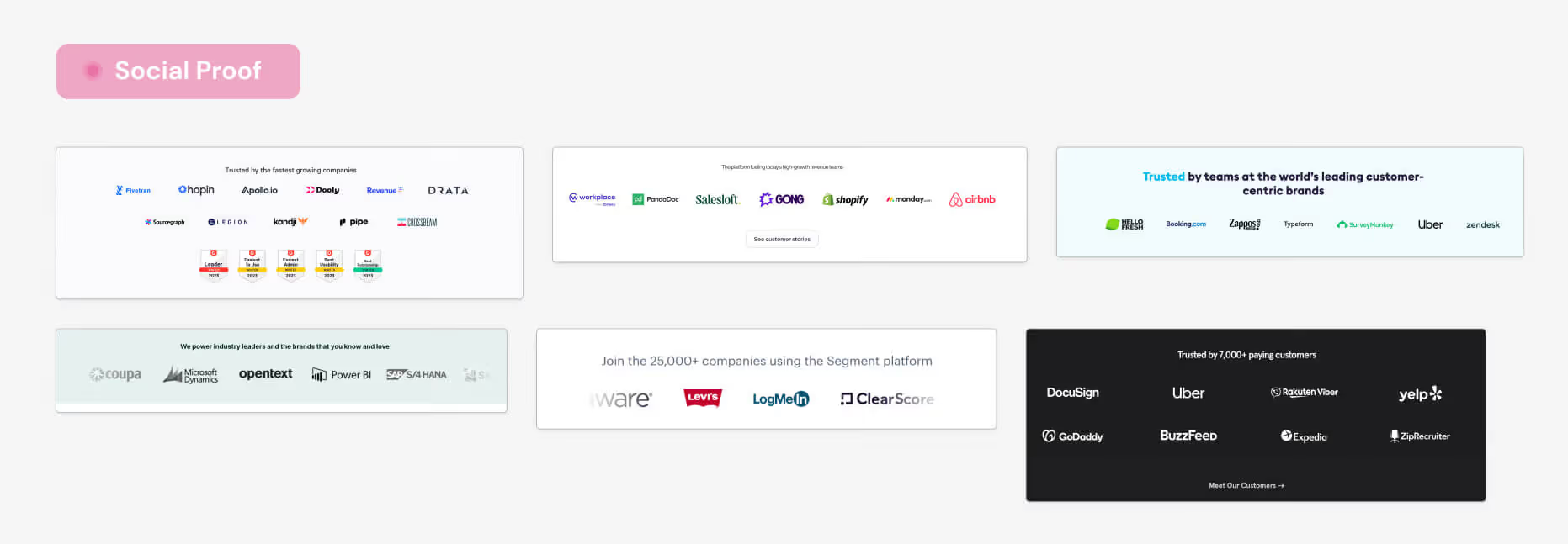
Social Proof
Social proof is another important part of a great SaaS homepage. In this section, you want to showcase people and companies that use your product. The goal of social proof is to highlight the trustworthiness and authenticity of your brand.
In this section of your SaaS website, you should include existing customers, especially popular brands. It can significantly boost the credibility of your brand and help it stand out from the competition.
Apart from presenting active SaaS clients, you can also use numbers or statistics that the prospect may find relatable. For example, “used by 10 000+ marketers” or “4 000 000 generated invoices”.
Remember that the social proof should be relatable to the visitor and be relevant to your brand’s message.
What is your product
The next section of a SaaS website template is “What is your product.” After introducing the user to your brand, you can present how the product works at a more in-depth level.
It’s especially important to SaaS companies that have more technically complex products to help prospective customers understand what the product actually does. You can go into more detail about certain features or processes; for example, if you use a specific tool or technology, this is the place to show off.
However, it’s crucial to remember that the SaaS homepage should be extremely concise and show the value your product can bring. So, if you decide your product is too complicated, it’s better to present an enticing preview of what it can do for the user.
In fact, this section should be mostly visual and not contain too much content. “Show, don’t tell” would be a great tactic in this case. If you want to incorporate some content, avoid technical jargon and complex language that may confuse the visitors. Instead, use clear and simple language that anyone can understand. Focus on the benefits and outcomes your product offers.
To illustrate your product vividly, incorporate visual elements, such as screenshots, product demos, a powerful graphic, statistics, or before and after. The visual you choose should demonstrate your product’s interface and functionality. This helps visitors visualize how your product works and what they can expect.


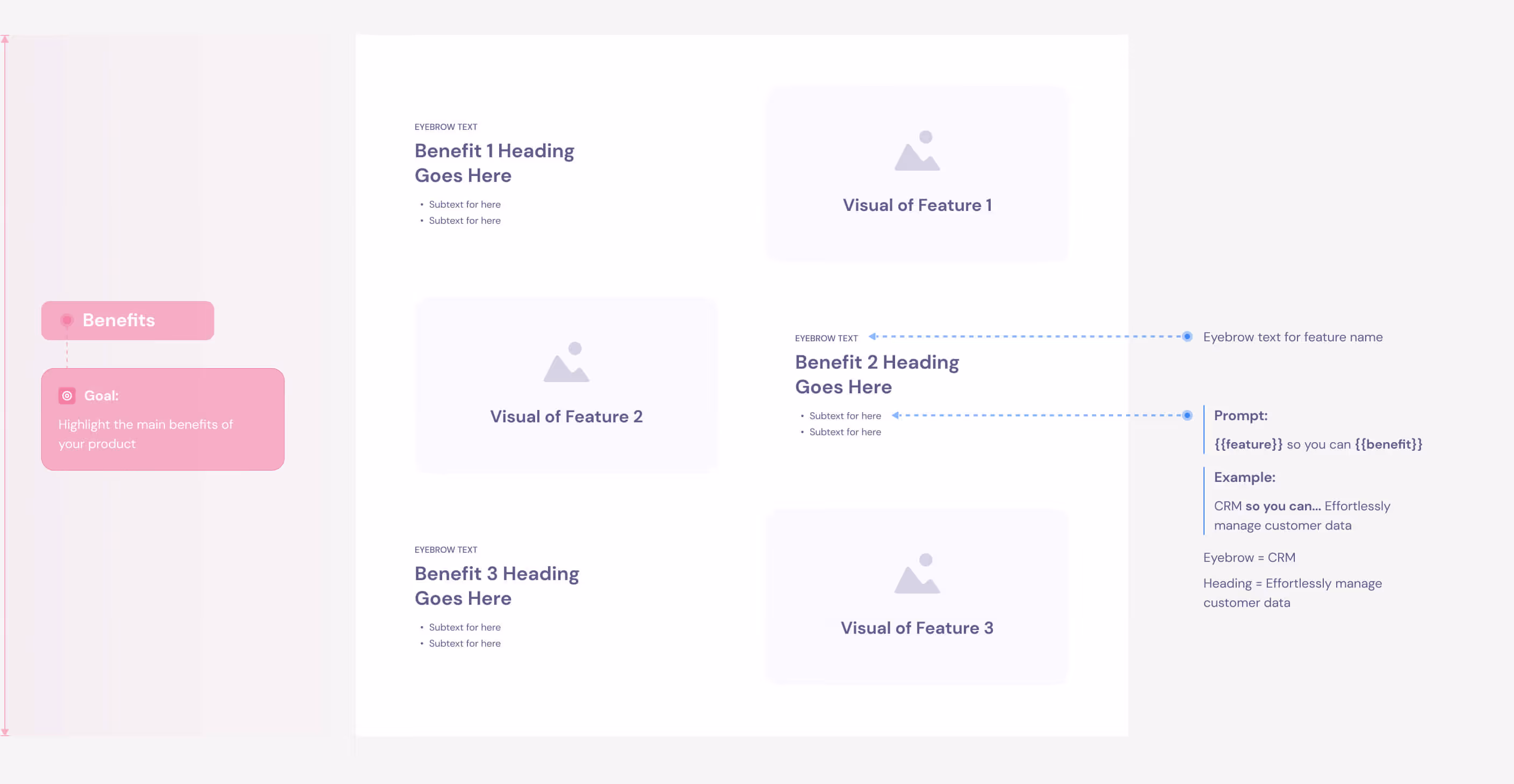
Benefits
While in the main value proposition, we focused on one most prominent benefit your product is based on, this is the moment to go deeper into specific advantages of using your solution.
Choose around three main benefits you want to showcase and break them down. First, talk about the feature in the context of your benefit. You can include the feature in the eyebrow text so it’s visible, but it doesn’t shift the focus from the value it provides.
Next is the heading where you place the benefit that comes from using the feature. Lastly, in the subtext, write one sentence about how the feature works so it results in the value for the user.
A great way to frame the benefits is to use the “pro without the con” approach that hits the pain point your customer can have. For example, “get paid faster, without chasing clients every week” if you develop invoicing software. This shows the user that the benefit of using your product is not only added value but also takes care of their problem.

How it works
The “How it works” section explains to the user how to get from signing up to getting the first results. Create a short step-by-step guide to show your user how to start using your product quickly.
Describe three initial steps that the user needs to take to get familiar with the software. For example, these steps could include importing CRM data, customizing fields, and dashboards, and getting instant recommendations for your customers.
This short guide aims to highlight how easy it is to start using your product and see results. Use suggestive visuals that show exactly how the user can get from point A to point B.


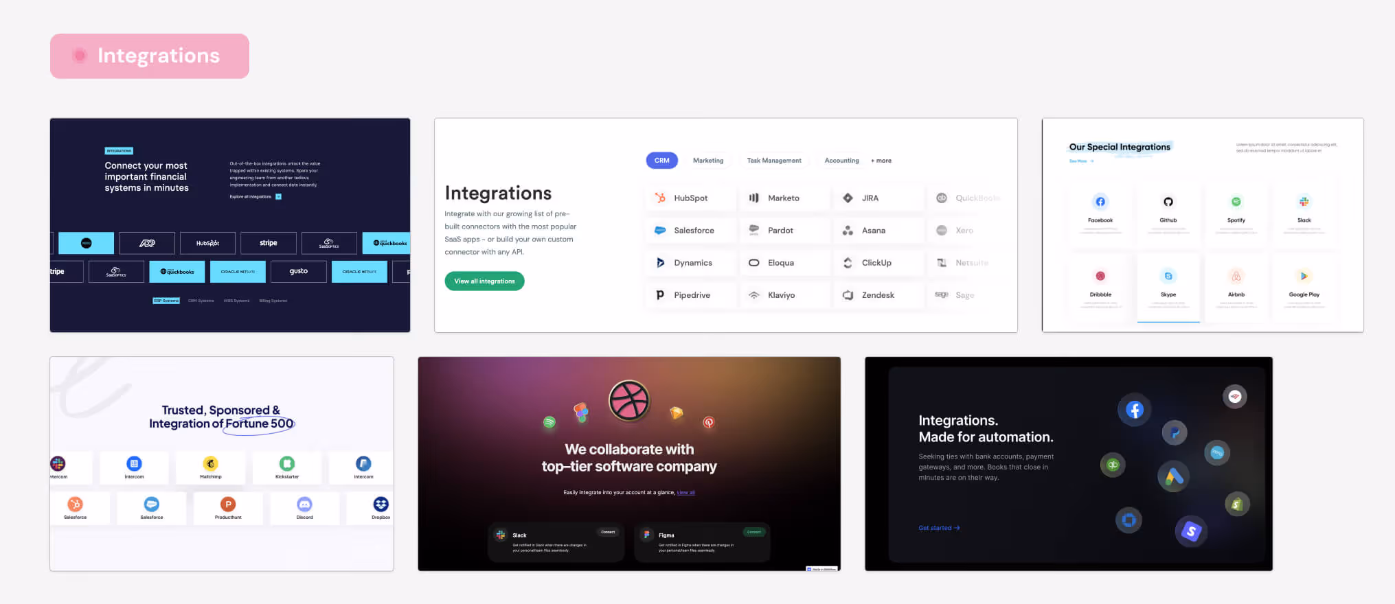
Integrations
Showing off your integrations is essential for your B2B SaaS design. If your product can integrate with other popular platforms, showcase them in this section. This helps customers see that your product is versatile and fits perfectly into their existing workflow.
It’s a big advantage you want to emphasize because people always prefer a product that can easily integrate with what they already use rather than one that works separately and causes extra hassle.
You don’t need to write much content in this section; you can simply use icons of the companies your product can integrate with. These icons will quickly show customers that your product can connect with the platforms they already know and trust, making their lives easier and more efficient.

Testimonials
An important part of any B2B landing page is testimonials. They are another way to increase the credibility of your product and show the results your product can deliver.
Remember to find testimonials that resonate with your perfect customer. Best testimonials are based on authenticity and relatable experience. Don’t hesitate to include many details, as more elaborate stories seem more authentic.
Here are the crucial elements that a great testimonial should have:
- name and picture of a customer
- position and name of the company
- a short testimonial that shows how your product helped solve a specific problem
- numbers that back up the claim, i.e., “20% increase in revenue.”
You can include video testimonials if you find willing customers. Users that speak from the heart will seem more authentic. Videos are also a powerful and effective way to build credibility and trust.
Most B2B SaaS companies struggle with the lack of testimonials at the beginning. In such a case, consider creating one yourself and seek out a current customer who aligns with it. You can also ask them to modify it to resonate with their experience.
You can also ask your current customers directly if they would be willing to write a testimonial. Don’t forget to proactively look for the customers that talk about your product online and discover a quote that captures your company’s narrative. This way, you can find the most authentic and honest opinions to place on your website.


Use Cases
The final part of a great SaaS homepage design is Use Cases. This section might not be necessary for your B2B SaaS product, but they are effective in showing how versatile your tool can be.
It’s especially useful if your product applies to different settings, such as roles or industries. Similarly to testimonials, you should use real-life stories presenting a particular problem and your product as the solution.
You can expand more on the benefits or present success stories from your existing customers. The Use Cases section aims to help visitors discover the specific areas your product can be used in.
At the bottom of the homepage, repeat the main CTA to give the visitor a final push to try your product. Remember, the CTA should be consistent throughout the entire website to ensure that the user takes desirable action.
%2520(1).avif)
Your turn to create a good landing page
Designing and creating a compelling SaaS homepage requires careful consideration of various elements, from engaging content to intuitive navigation and visual appeal. Throughout this article, we have explored the key aspects of crafting a captivating SaaS homepage that effectively communicates your value proposition, engages visitors, and drives conversions.
By implementing SaaS website best practices such as clear and concise value messaging, defining your perfect customer, and framing your benefits correctly, you can create a homepage that captures attention, builds trust, and guides users to take desired actions.
Follow our SaaS homepage template that walks you through every vital section of a SaaS website to quickly assemble your perfect homepage.
If you're looking for a SaaS Website Design Agency, reach out to Amply.


.svg)


.svg)


.avif)


.avif)


.svg)


.avif)
%20and%20What%20Makes%20Them%20Work.avif)

.avif)


