8 Best fintech Website Examples (2026) and What Makes Them Work
Rajat Kapoor
February 23, 2026
8
min
Key Takeaways
The best fintech websites reduce hesitation by clarifying positioning, credibility, and value within seconds.
Clear structure matters more than visual trends when users are evaluating financial risk.
Trust signals should be embedded throughout the experience, not isolated in a single proof section.
Complex financial products perform better when explained through layered, progressive architecture.
Differentiation comes from specificity about audience and outcomes, not generic innovation claims.
Conversion improves when CTAs align with user readiness instead of forcing commitment too early.
Fintech websites that work don’t try to impress visitors they help them decide with confidence.
“Smarter banking.” “Financial tools for the future.” “Modern finance made simple.”
If your fintech website sounds like this, you don’t have a design problem, you have a positioning problem.
In fintech, similarity is expensive. When every brand claims to be innovative, secure, and seamless, users default to the option that feels most credible. And credibility isn’t built through buzzwords. It’s built through clarity.
In 2026, users expect immediate answers:
Who is this for?
What specific problem does it solve?
Why should I trust this company with my money?
How is this different from the ten other tools I just opened in separate tabs?
The strongest fintech websites resolve these questions within seconds. They use structured messaging, clear hierarchy, proof signals, and friction-aware UX to move visitors from skepticism to confidence without overwhelming them.
This curated list breaks down the best fintech website examples in 2026 and explains exactly what makes them work. Not just visually, but strategically, from positioning and trust mechanics to navigation, conversion flow, and differentiation.
If you’re redesigning your fintech website or planning one from scratch, this is the benchmark to study. And if you’re looking for a team that understands the nuance of designing for financial products, our fintech website design agency page breaks down how we approach positioning, trust, and conversion for fintech brands specifically.
Because in financial technology, clarity isn’t a branding choice. It’s a growth lever.
What Makes a Fintech Website Great?
A fintech website doesn’t need to be flashy. It needs to be clear.
Because in finance, users aren’t impressed by design trends, they’re assessing risk. Every headline, layout decision, and proof element either reduces uncertainty or increases it.
The best fintech websites don’t just look modern. They solve five core problems immediately:
1. Instant Positioning Clarity
Within seconds, you should know:
Who the product is for
What specific financial problem it solves
Why it exists
If visitors have to scroll to understand the basics, you’ve already lost momentum.
2. Structured Trust Signals
Fintech operates in a high-skepticism category. Strong websites surface credibility early through:
The goal isn’t just to look credible, it’s to move users forward.
Strong fintech websites:
Align CTAs with user intent
Offer clear next steps (demo, sign up, talk to sales)
Reduce uncertainty before asking for commitment
Guide both retail and enterprise buyers appropriately
In a high-trust category, pushing too early creates drop-off. Guiding intelligently increases activation.
These are the standards we used to evaluate the fintech websites in this list.
Each example below demonstrates these principles in action with different positioning, audiences, and product complexity levels.
Because in fintech, great design isn’t about aesthetics.
It’s about reducing doubt at every scroll.
8 Best Fintech Websites in 2026
When someone lands on your fintech website, they’re not browsing.
They’re comparing you against competitors, incumbents, and the risk of switching.
That decision starts within seconds.
The websites below stand out because they win that comparison early. They clarify who they’re for, what they solve, and why they’re credible before hesitation sets in.
Each example shows how structure, positioning, and trust signals reduce friction, not just how good design looks.
Let’s start with one of the strongest benchmarks in fintech website strategy.
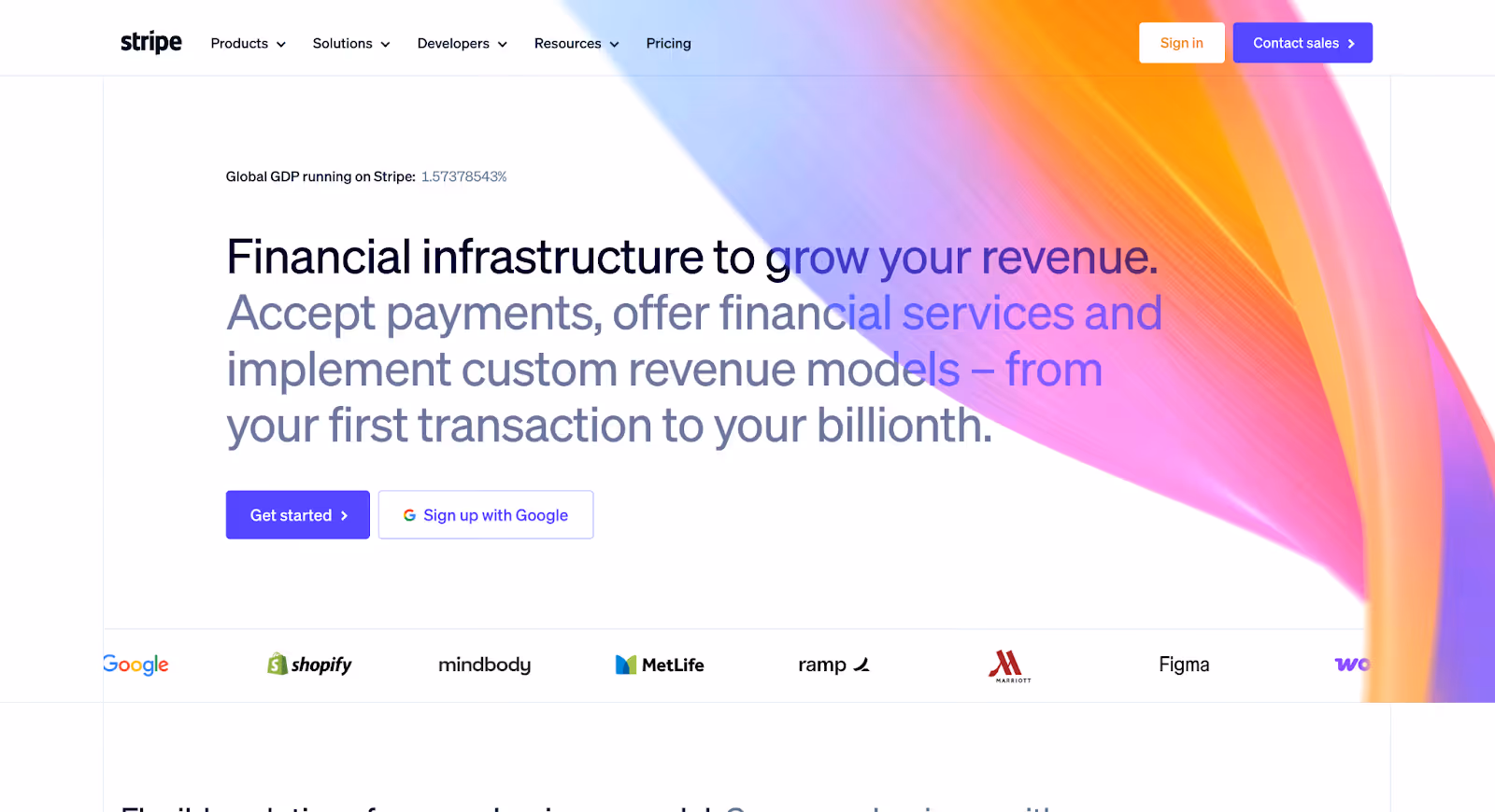
1. Stripe
Stripe is a global financial infrastructure platform that enables businesses to accept payments, manage revenue, prevent fraud, and build programmable financial workflows. Its website serves startups, enterprises, developers, and finance teams, all with very different needs and technical depth.
Why it works:
Positioning is instantly clear, even with product depth Stripe operates across payments, billing, tax, fraud prevention, and embedded finance, yet the homepage doesn’t feel overwhelming. The messaging communicates what Stripe fundamentally is (financial infrastructure for the internet) before branching into use cases. The structure scales without confusing first-time visitors.
Complex infrastructure is explained through layered architecture Stripe avoids long paragraphs and instead uses progressive disclosure. High-level benefits are introduced first, followed by expandable technical detail, documentation links, and product-specific pathways. This allows developers to go deep without intimidating business users who just need strategic clarity.
Trust is embedded into the interface, not isolated in a proof section Instead of relying on loud credibility claims, Stripe integrates trust signals throughout the site: recognizable customer logos, data-driven performance metrics, global scale references, and ecosystem integrations. The design feels engineered which reinforces the perception of reliability.
Navigation reflects how different buyers think Startups, enterprises, developers, and platforms can each enter through distinct pathways. The website doesn’t assume one audience. It structures the experience around intent, which reduces friction and shortens the evaluation process.
Takeaway:
Stripe’s website works because it makes highly technical financial infrastructure feel structured and controlled. By layering information intelligently and aligning navigation with user intent, it builds confidence without oversimplifying the product.
It’s a strong benchmark for fintech brands balancing technical depth with strategic clarity.
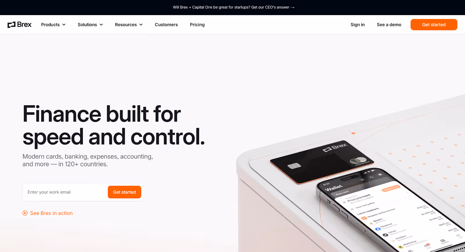
2. Brex
Brex is a financial platform built for startups, mid-market companies, and enterprises. It combines corporate cards, expense management, travel, and financial controls into one integrated system. Its website speaks primarily to founders, finance leaders, and operations teams managing rapid growth.
Why it works:
Audience segmentation is immediate and intentional Brex doesn’t try to speak to everyone at once. Early in the experience, users are guided toward pathways based on company stage or role. Whether you’re a startup founder or a CFO at a larger company, the navigation adapts to your context. This reduces friction and keeps messaging relevant.
Benefits are framed around control, not just features Instead of leading with product mechanics, Brex emphasizes outcomes: visibility, automation, and smarter spending. The language reflects how finance teams think: risk reduction, efficiency, scalability which strengthens credibility with decision-makers.
Product depth is structured, not stacked Brex offers multiple financial tools, but the website avoids clutter. Each product component (cards, expenses, travel, bill pay) is clearly defined within a larger ecosystem narrative. This prevents confusion and reinforces the idea of a unified financial platform.
Trust is reinforced through specificity Customer examples, operational use cases, and measurable claims appear throughout the site. Rather than relying on generic statements about innovation, Brex shows how its system supports real-world financial workflows.
Takeaway:
Brex’s website works because it understands its buyer. By structuring the experience around company stage and financial responsibility, it reduces complexity and positions itself as a scalable financial operating system, not just another corporate card provider.
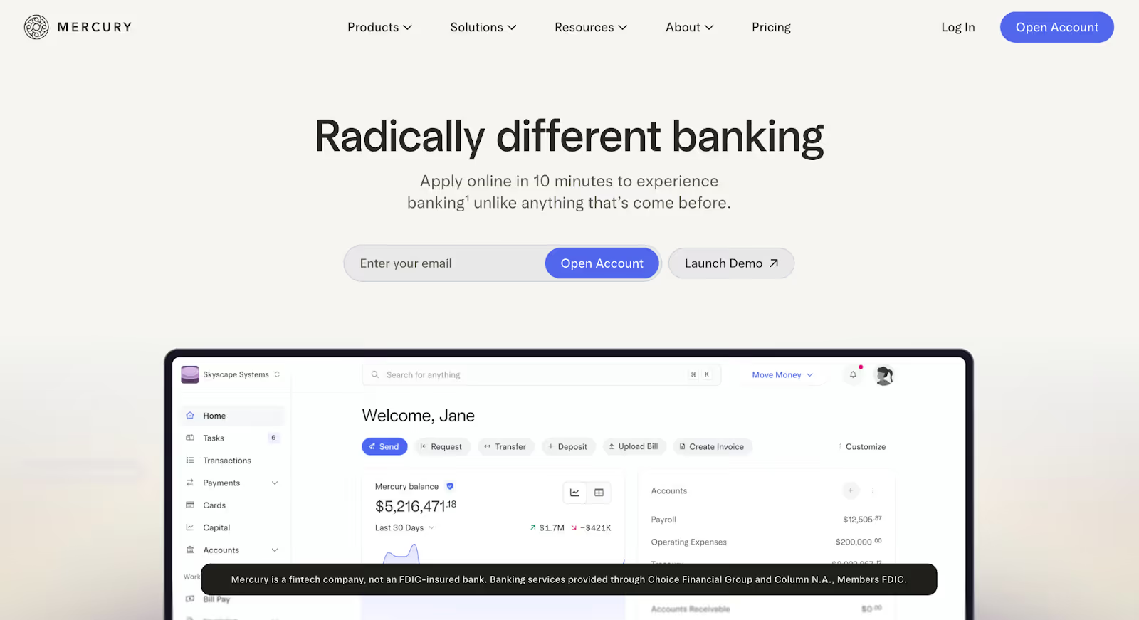
3. Mercury
Mercury is a digital banking platform built for startups and technology companies. It offers business checking and savings accounts, payment tools, cards, and financial workflows without positioning itself as a traditional bank. Its website speaks directly to founders and operators who want speed, simplicity, and control.
Why it works:
Positioning is niche and unapologetic Mercury doesn’t try to serve every business. The messaging is clearly built for startups particularly tech-forward companies. That specificity strengthens differentiation and immediately filters the right audience in.
Simplicity is structural, not just visual The site feels clean, but the clarity goes deeper than aesthetics. Product explanations are concise, workflows are easy to understand, and benefits are framed in operational terms. There’s no unnecessary financial jargon, which lowers cognitive friction.
Trust is communicated through transparency Banking requires reassurance. Mercury addresses this through clear explanations of how funds are held, security standards, and partner banking relationships. Instead of hiding regulatory context, it integrates it naturally into the experience.
Conversion paths align with founder behavior The primary CTA encourages account creation without overwhelming users with aggressive sales prompts. For startups that value autonomy, this self-serve model feels aligned and friction-aware.
Takeaway:
Mercury’s website works because it commits to a specific audience and designs around their mindset. By combining niche positioning with structured clarity, it feels modern without sacrificing credibility, a balance many fintech brands struggle to achieve.
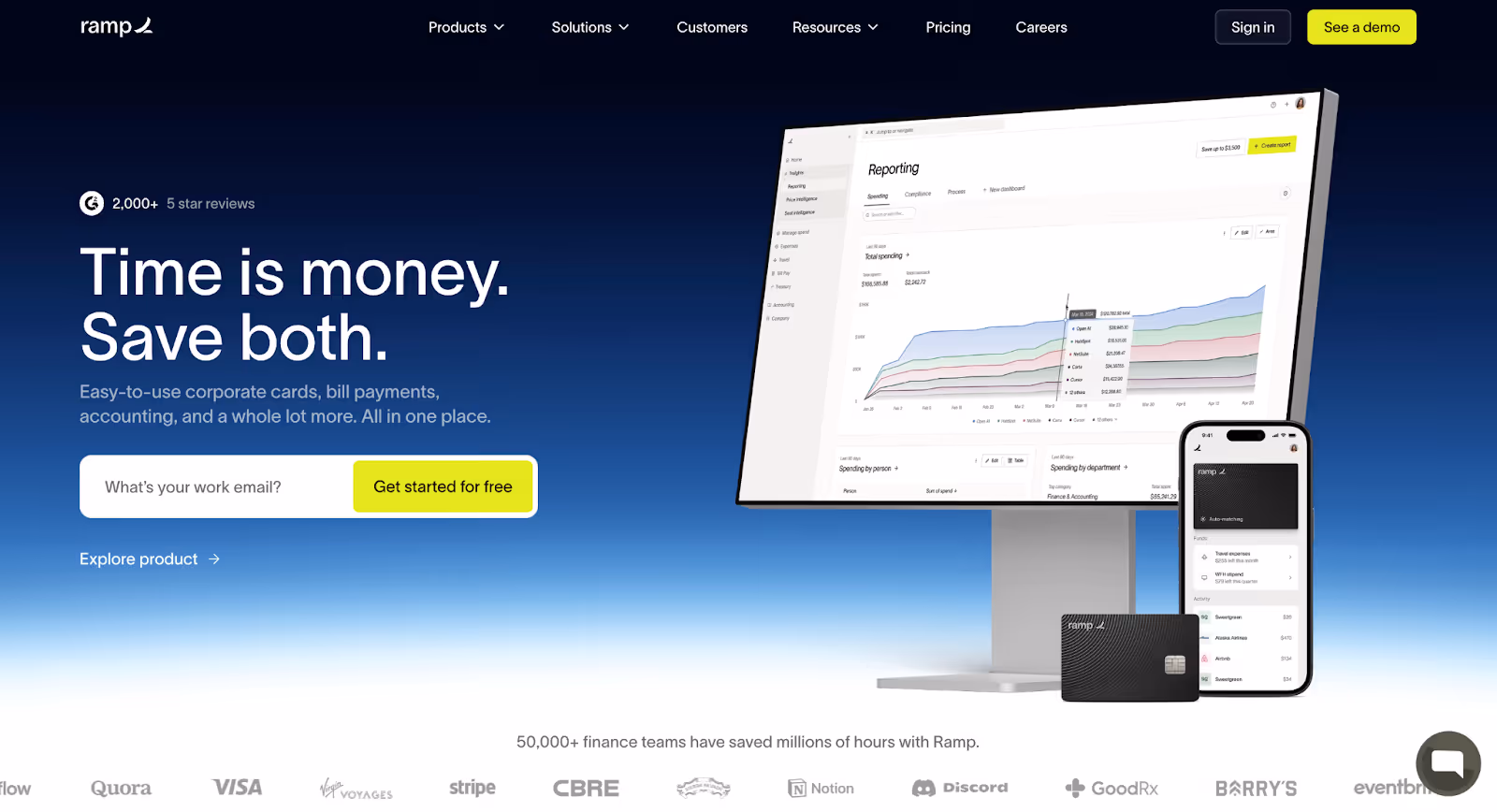
4. Ramp
Ramp is a finance automation platform that combines corporate cards, expense management, bill pay, and accounting integrations into a unified system. It positions itself around one core promise: helping companies spend less and operate more efficiently.
Why it works:
The value proposition is outcome-led Ramp doesn’t lead with features, it leads with results. The messaging consistently reinforces cost savings, financial visibility, and operational efficiency. This outcome-driven framing resonates strongly with CFOs and finance teams who are measured on performance, not tools.
Complex financial workflows are made digestible Expense management and financial controls can be dense topics, but Ramp breaks them into structured, scannable sections. Visual explanations, product flows, and integrations are layered logically, allowing visitors to understand the ecosystem without feeling overwhelmed.
Proof is built into the narrative Ramp frequently reinforces its claims with data, customer references, and quantified results. Rather than generic “trusted by thousands” language, the site anchors credibility in measurable impact which strengthens persuasion in a numbers-driven category.
The site mirrors the product’s personality The tone is confident and direct, reflecting the product’s positioning as a smarter alternative to legacy financial systems. The design supports this, structured, bold, and focused on clarity over decoration.
Takeaway:
Ramp’s website works because it aligns tightly with the priorities of its buyer. By emphasizing financial outcomes, reinforcing claims with data, and structuring complexity clearly, it positions itself as a performance tool, not just another fintech product.
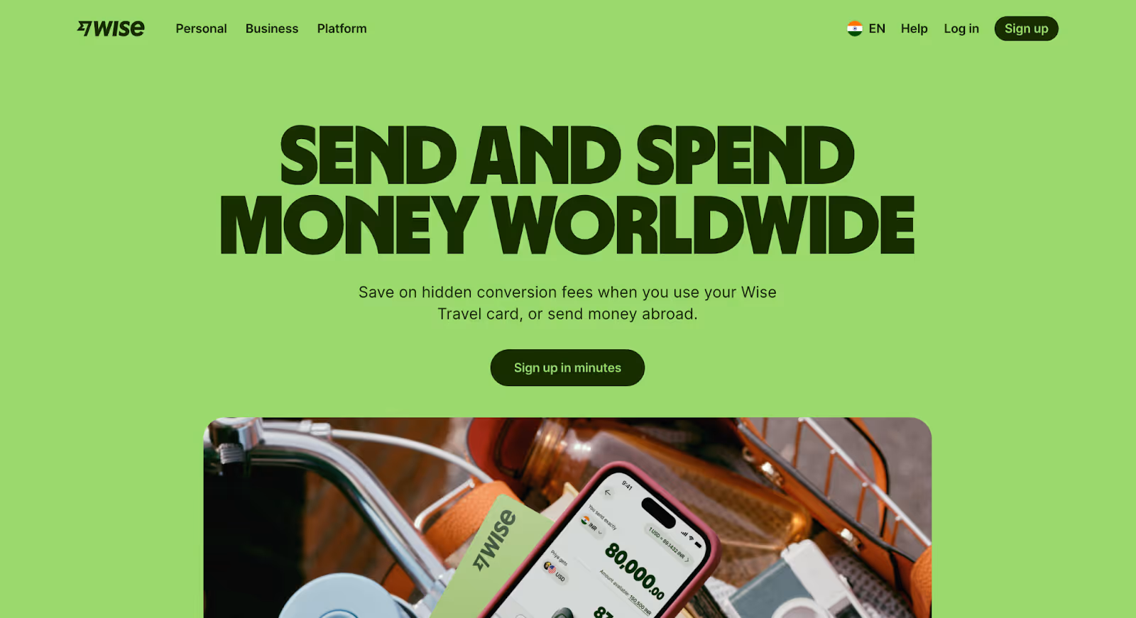
5. Wise
Wise is a global money transfer platform focused on transparent, low-cost international payments for individuals and businesses. Unlike many fintech brands that emphasize innovation, Wise leads with clarity and price transparency.
Why it works:
The core value proposition is instantly measurable Wise doesn’t rely on abstract claims. It shows exchange rates, fees, and comparisons upfront. Visitors can calculate costs immediately, which reduces skepticism and builds trust through transparency.
Trust is reinforced through simplicity, not complexity International payments can feel opaque and intimidating. Wise counters this with plain language, clear fee breakdowns, and straightforward explanations of how money moves. The interface feels approachable, which lowers psychological barriers.
Social proof and scale are visible but not overpowering Wise integrates usage statistics, customer numbers, and global presence throughout the site. These signals reassure users without distracting from the main task: understanding costs and sending money.
The conversion path matches user urgency Visitors often arrive with a specific goal, sending money or comparing rates. The website supports that intent immediately with calculators and clear CTAs, rather than forcing them through brand-heavy messaging first.
Takeaway:
Wise’s website works because it removes ambiguity from a category known for hidden fees and confusion. By making pricing transparent and simplifying global finance, it builds credibility through openness, a powerful differentiator in fintech.
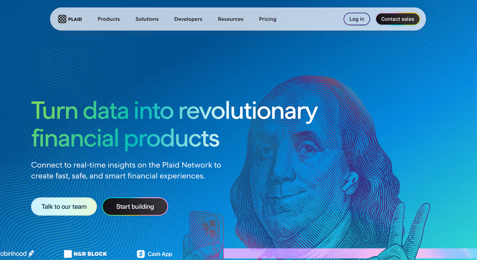
6. Plaid
Plaid is a financial data network that connects apps to users’ bank accounts, enabling secure data sharing for payments, lending, budgeting, and investment platforms. Unlike consumer-facing fintech brands, Plaid primarily serves developers, product teams, and financial institutions.
Why it works:
The positioning is infrastructure-first Plaid doesn’t present itself as a banking app, it positions itself as the connective layer powering fintech. This clarity immediately distinguishes it from end-user products and anchors it in the infrastructure category.
Technical depth is structured for multiple audiences Developers, enterprises, and fintech startups all use Plaid differently. The website accommodates this by offering clear entry points: high-level explanations for business leaders and detailed documentation for technical users. The layering prevents overwhelm while preserving depth.
Security and compliance are surfaced early Because Plaid handles sensitive financial data, trust signals are non-negotiable. The website integrates security explanations, compliance standards, and ecosystem partnerships prominently, reinforcing reliability without sounding defensive.
Use cases make the abstraction tangible “Financial data connectivity” can feel abstract. Plaid solves this by showing real-world applications lending, personal finance apps, payments which helps visitors quickly understand where it fits within their product stack.
Takeaway:
Plaid’s website works because it clearly defines its role in the fintech ecosystem. By balancing technical credibility with structured explanation, it builds trust among both business and developer audiences, a difficult balance to execute well.
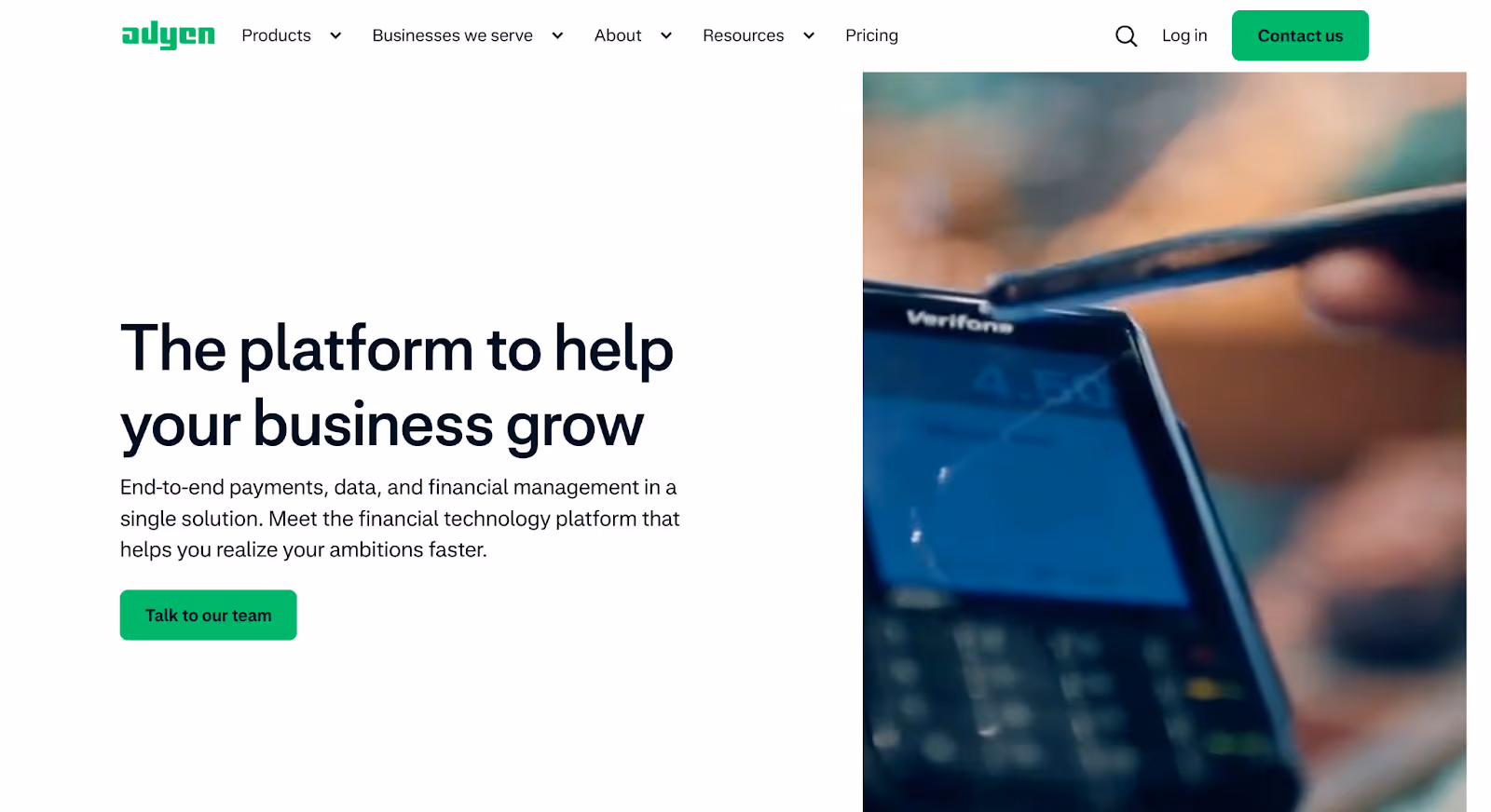
7. Adyen
Adyen is an enterprise payments platform that enables businesses to accept payments across online, in-store, and mobile channels globally. It serves large-scale retailers, digital platforms, and multinational brands that require unified commerce infrastructure.
Why it works:
Enterprise positioning is unmistakable Adyen doesn’t dilute its message to appeal to small businesses. The language, case studies, and scale references clearly signal that it serves global enterprises. That clarity filters the right audience in and reinforces authority.
Unified commerce is explained structurally Payments across channels can become conceptually messy. Adyen organizes its offerings around a single-platform narrative: online, in-store, mobile, data showing how everything connects. The structure mirrors the product architecture, which builds logical trust.
Credibility is demonstrated through scale and clients Rather than generic claims, Adyen highlights recognizable global brands, transaction volumes, and geographic reach. The proof is embedded within the experience, reinforcing reliability without aggressive marketing language.
Navigation reflects buyer complexity Large organizations have multiple stakeholders: payments teams, developers, operations, executives. The site allows entry from different intent points, balancing strategic overviews with technical documentation.
Takeaway:
Adyen’s website works because it confidently owns its enterprise positioning. By aligning its structure with the complexity of global commerce and reinforcing trust through scale, it feels robust without becoming overwhelming.
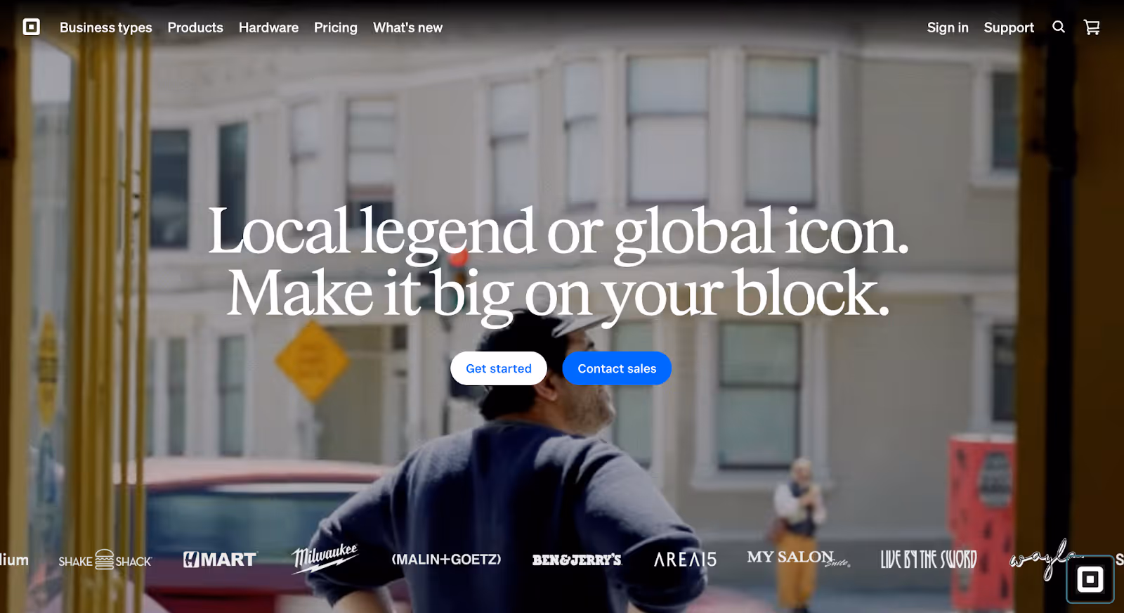
8. Square
Square is a financial services platform that provides payment processing, point-of-sale systems, business banking, payroll, and software tools for small and mid-sized businesses. Unlike enterprise-heavy fintech brands, Square focuses on accessibility and operational simplicity.
Why it works:
The ecosystem is simplified for small business owners Square offers a wide range of tools, but the website organizes them around real business needs getting paid, managing staff, tracking sales. Instead of presenting a product catalog, it presents operational solutions.
Visual clarity reinforces usability The interface uses clean layouts, product imagery, and contextual demonstrations to show how tools work in real-world settings (retail counters, restaurants, service businesses). This grounds the technology in practical application.
Trust is built through familiarity and scale Square integrates recognizable hardware, storefront imagery, and established brand presence to create reassurance. For small business owners, familiarity reduces perceived risk.
Conversion aligns with user readiness Whether someone is exploring hardware, comparing payment tools, or ready to sign up, the CTAs reflect intent. The site balances self-serve onboarding with deeper product education without pushing too aggressively.
Takeaway:
Square’s website works because it translates financial infrastructure into everyday business language. By structuring its ecosystem around how small businesses actually operate, it feels approachable without sacrificing credibility.
Best Fintech Website Design Trends in 2026
Fintech design in 2026 isn’t about aesthetics. It’s about reducing friction faster.
The strongest fintech websites aren’t chasing flashy visuals, they’re refining structure, proof, and positioning to accelerate trust. At their core, they apply the same fundamentals seen in successful B2B websites: clear hierarchy, focused messaging, and navigation built around user intent rather than trends.
Below are the design patterns emerging across high-performing fintech brands.
1. Outcome-First Messaging Above the Fold
Instead of leading with product descriptions, fintech websites are leading with measurable outcomes:
“Increase authorization rates”
“Reduce spend by 30%”
“Transfer globally with zero hidden fees”
This shift moves messaging from abstract capability to concrete impact which resonates more strongly with finance and operations teams.
Trust is no longer confined to a “Trusted by” strip.
Top fintech websites integrate:
Compliance references
Security certifications
Data statistics
Recognizable client logos
Throughout the page, not just in one section. Credibility is structural, not decorative.
4. Audience-Based Navigation
Instead of generic product-first menus, many fintech brands now segment navigation by:
Company size (startup vs enterprise)
Role (CFO, developer, founder)
Use case
This reduces cognitive load and shortens the evaluation process.
5. Interactive Calculators and Live Data Elements
Particularly in payments and personal finance, websites are integrating:
Fee calculators
Rate comparisons
Savings estimators
ROI previews
These interactive elements build transparency and increase engagement while reinforcing value claims.
6. Minimalist Design with Functional Density
The visual style is clean but the content density is increasing.
2026 fintech sites are:
Minimal in decoration
High in informational clarity
Structured around modular sections
Whitespace supports comprehension rather than acting as an aesthetic choice alone.
7. Subtle Motion for Explanation, Not Entertainment
Animation is used to:
Demonstrate workflows
Show product transitions
Explain infrastructure
It’s functional, not ornamental. Motion supports understanding rather than distraction.
What This Means for Fintech Brands?
The trend isn’t louder branding.
It's a smarter structure.
In 2026, the best fintech websites feel calm, precise, and controlled because financial decisions require reassurance, not stimulation.
If you’re planning a redesign, the goal isn’t to look futuristic. It’s to reduce doubt faster than your competitors.
Final Thoughts
In fintech, hesitation is expensive. If visitors cannot quickly understand what you do, who it is for, and why they should trust you, they will not stay long enough to figure it out. They will move to the next tab and compare you against alternatives in seconds.
That is where most fintech websites fail. They look modern but sound identical. They talk about innovation, simplicity, and the future of finance without clearly defining differentiation, credibility, or risk mitigation. In a category built on trust, vague messaging is not neutral. It quietly erodes confidence.
The strongest fintech websites in 2026 take a more deliberate approach. They remove doubt early. They clarify positioning within seconds, structure complex products logically, surface proof before users go looking for it, and guide visitors through friction-aware conversion paths. Their design does not try to impress. It helps people decide.
If your fintech website is underperforming, the issue is rarely aesthetics alone. It is structural clarity. Sharper positioning. Stronger trust architecture. Specific outcomes instead of abstract claims. Messaging aligned with how real buyers evaluate financial risk.
Because in financial technology, design is not decoration. It is infrastructure for trust.
Build a fintech website that earns confidence
The companies featured in this list succeed because they communicate one thing quickly and convincingly: what the product does, who it is for, and why it can be trusted. Everything else supports that clarity.
If your fintech brand feels interchangeable, unclear, or overly reliant on surface-level polish, it is time to rethink the structure behind it. Amply designs and builds fintech websites that align positioning, credibility, and conversion from the ground up.

%20and%20What%20Makes%20Them%20Work.avif)


.png)
.png)


.avif)