

Building scalable design systems in Webflow with Components and Style variants
Ever opened a Webflow project and found six slightly different buttons, three versions of the same card, and a navigation bar that somehow looks different on every page? That’s what happens when you scale without a design system.
Components and Style variants fix this. Build a button once, give it a few variants, and you’ve solved dozens of inconsistent edge cases across your site. Multiply that across cards, CTAs, navbars, and you’ve built a foundation that scales with your product.
In this article, we’ll break down how to set up a scalable design system in Webflow using Components and Style variants. You’ll learn:
- The basics of Components, Style variants, and slots (and why they matter)
- How to structure your system with tokens, utilities, base components, and variants
- Practical naming rules that keep things consistent across projects
- Step-by-step examples, like building a button component with three variants
- Advanced patterns for cards, layouts, and nested components
- When to use a variant vs. when to create a new component
By the end, you’ll have a clear playbook you can adapt to any Webflow project.
Ready? Let’s begin
What are Components, Style variants, and slots?
Let’s start with the basics and understand what these terms mean.
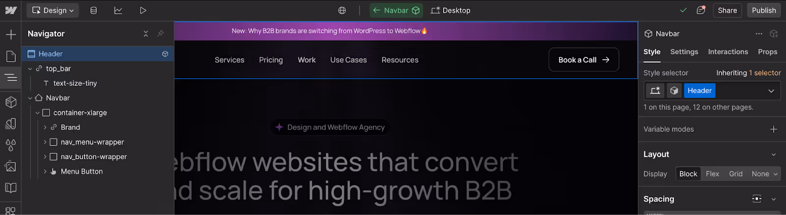
A Component in Webflow is a reusable block you build once and use everywhere. Think of it as a master version of a navbar, card, or button. Instead of duplicating the same element across pages, you edit the Component once and every instance updates automatically.
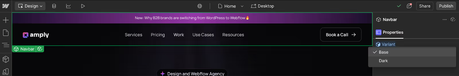
Style variants are alternate looks of the same component. They keep the structure identical but change how it appears. For example, a button might have Primary, Secondary, and Ghost variants. You can swap these per instance without duplicating the component.
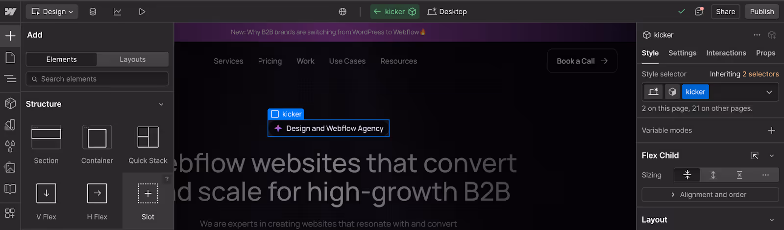
Slots make components flexible. They act as placeholders inside the component where editors can drop in content like swapping an icon or headline without breaking the system or adding new classes.
Together, these three features give you the backbone of a scalable design system: Components provide reusability, variants offer flexibility, and slots keep content editable without risk.
Now that you understand what components, variants, and slots are, let’s see how we can build design systems using these tools effectively.
System architecture: How to go from tokens to pages
A design system works best when it’s built in layers. In Webflow, you can think of it like this:
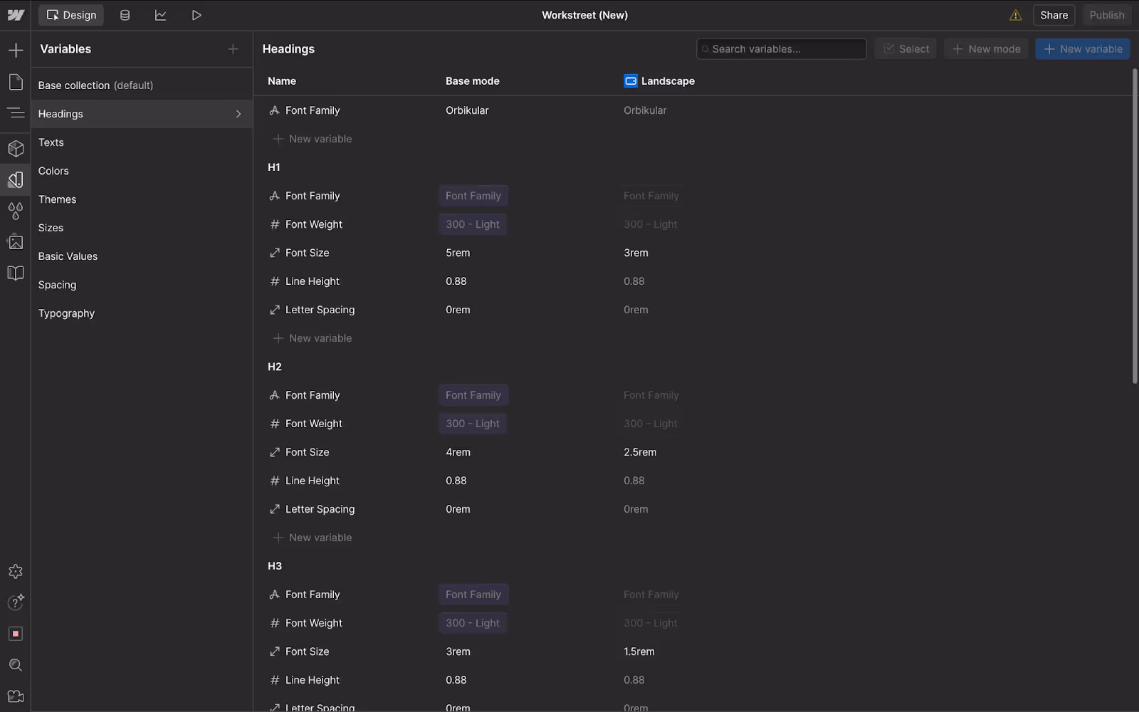
- Tokens are your brand basics like colors, text sizes, spacing, and corner radius. These act as the single source of truth. Change a token once, and every connected element across the site updates.
- Utility classes are quick helper classes you reuse for things like spacing or alignment. They save you from creating random one-off styles.
- Base components are the building blocks you’ll use everywhere: buttons, cards, forms, navbars. Each of these connects back to your tokens, so they stay consistent.
- Style variants are the different looks for those components. A button might come in primary, secondary or ghost variant. A card might have vertical and horizontal versions.
- Pages and templates are where everything comes together. You combine components and variants to build full layouts for both unique pages, and re-usable templates.
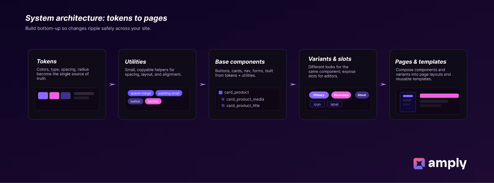
When you build in this order, your system becomes easy to scale. Update a color token, and every button and card changes instantly. Editors can swap variants or slot in new content without breaking layouts. And your site stays consistent as it grows.
Naming rules and token strategy
Good naming and tidy tokens stop confusion before it starts. Names help teammates find styles fast, and tokens make global updates safe. We lean on the Client-First naming approach because it’s built for Webflow projects: it favors clear, descriptive names, avoids abbreviations, and gives people context about a class just by reading it.
Basic principles to keep in mind
- Be descriptive, not clever. If a class styles a product card heading, name it something like
card-product_titleinstead ofcPt. - No shorthand or mystery prefixes. Client-First is explicit about readable class names so non-technical editors can manage the site.
- Keep tokens semantic. Name colors and sizes by purpose, not color name. For example use
bg-accentortext-primaryinstead ofblue-500.This makes theming and rebrands much easier.
Token strategy: What to Name and How
Treat tokens as the site’s nervous system. Name them by role, then by detail. Finsweet’s token guidance suggests a pattern like [element] - [style] - [identifier] for semantic tokens, which keeps token purpose obvious. Examples: background-color-brand, text-color-primary, border-color-accent.
Webflow’s variables and theming docs reinforce this: keep variable names meaningful and grouped by category, for example color.*, spacing.*, type.*. That makes it easy to swap themes or update the brand later.
Note: When you use native Webflow style variants, prefer naming the variant values in the variant UI (Primary, Secondary) so the Designer UI is clear. Start with 2–3 purposeful variants and grow from there; that keeps the system manageable.
Component anatomy - what to include under a component
Think of each component as a small product page for one UI piece. It should be self-contained, documented, and safe to reuse. For every component, answer these five questions:
- What is this for? (purpose)
- What parts can editors change? (slots)
- What visual options exist? (variants)
- Which tokens does it use? (colors, type, spacing)
- Any accessibility or responsive notes?
Here’s a breakdown of how you can create common components on your website:
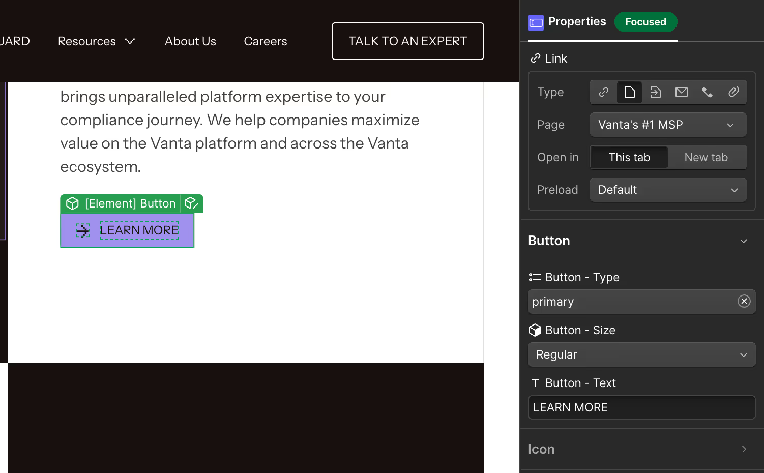
Button Component
Buttons are most commonly used and most messed up element we usually see on websites. Here’s how you can create 1 scalable button component, that would fit all use cases inside a website.
Component Structure:
button(base custom class)button_label(element)button_icon(element - slot)
Variants you can create:
- Button Type: Primary, Secondary, Ghost/text
- Button Size: Small, Regular, Large
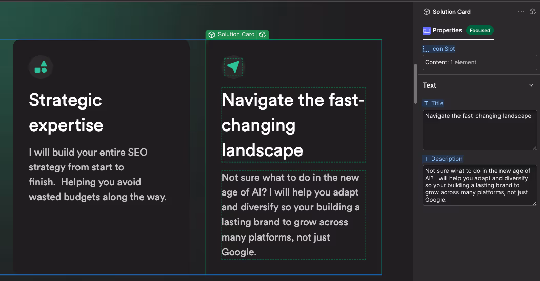
Card Component
Cards can be a more versatile component than you may think. From blog cards, and features to team bios and more, you can create a lot of website sections using different variants of a single card component. Here’s how you can structure your card component -
Component Structure
card_product(base custom class)card_product_media(slot - icon, image or video)card_product_titlecard_product_bodycard_product_cta(slot)
Variants you can create:
- Vertical
- Horizontal
- Feature (no media, badge included)
- Inverted (If your site design calls for it)
Nav Component
Navbar component once created can be pretty much used as is for most pages, unless you have pages with dark or light themes.
Component Structure
nav_topbar(base custom class)nav_topbar_brand(slot)nav_topbar_links(container or CMS-driven list)nav_topbar_cta(slot)
Variants you can create
- Desktop (full links)
- Mobile (hamburger)
- Sticky / non-sticky
Common mistakes new devs make when using components (and how to avoid them)
Components are powerful, but small habits often create big maintenance problems later. Here are a few common mistakes we see new devs often make, and how you can avoid them:
- Editing instances instead of the master component: Editing an instance fixes a single page but creates divergence across the site, which leads to inconsistent UI and extra work later. When a change should apply everywhere, open and edit the master component; use instances only for content edits like changing text or swapping an image.
- Deep-stacking many classes on one element: Long stacks of classes make styles hard to reason about and brittle at different breakpoints. Keep stacks short with a base utility plus one custom class, and if you need repeated combinations, create a utility class or a new, focused component instead.
- Using raw values instead of tokens or utilities: Hard-coded colors, sizes, and spacing mean every brand tweak becomes a manual hunt. Use tokens and utilities for colors, type, spacing, and radii so a single token update flows through every component that references it.
- Creating too many variants: A huge set of variants turns choice into confusion and makes maintenance costly. Limit variants to the few that designers actually reuse, and if a variant needs big structural or data changes, build a separate component instead.
- Not exposing slots or props for editors: If editors must edit inner elements to change content, they will create ad-hoc classes and break patterns. Expose editable slots or props for labels, images, and simple toggles so editors can update content safely without touching styles or structure.
- Building giant, multi-purpose components: A component that tries to do everything becomes fragile and hard to update. Prefer small, single-purpose components that you can compose; if a piece is reused widely, make it a nested component so a single change updates every instance.
- Hard-coding headings and ignoring semantics: Hard-coded H1s or headings inside components break document structure and hurt accessibility and SEO. Accept headline text as a slot and let pages decide heading levels so the visual looks are preserved while semantics remain correct.
- Copy-pasting styled blocks instead of using instances: Copying styled blocks creates duplicates that diverge over time and defeat the purpose of reuse. Audit for copies, replace them with component instances, and train the team to drag from the components panel rather than duplicating finished layouts.
- Not testing variants and nested components across breakpoints: Styles that look fine on desktop often fall apart on tablet or mobile. Test each variant and nested component on tablet and mobile, apply breakpoint-specific overrides sparingly, and consider making a separate component if a variant needs many adjustments.
Advanced patterns: layout variants and nested components
Now that we’ve covered basics and built a few components, let’s look at patterns that save the most time as projects grow: layout variants and nested components. These let you reuse one master component in different layouts, or build small components and compose them into larger ones. Both approaches reduce duplication and make updates predictable.
Layout variants: when to use them
Use layout variants when the component structure stays the same but the arrangement changes. For example:
- A card that switches between vertical (image on top) and horizontal (image left, text right).
- A hero that can be split (text left, media right) or stacked (text above media).
- A nav that can be full links on desktop and condensed on mobile.
Why use variants:
- Keep one master component with multiple visual options.
- Editors can swap the layout at the instance level without changing structure.
- Fewer duplicate classes and less chance of divergence.
Practical approach
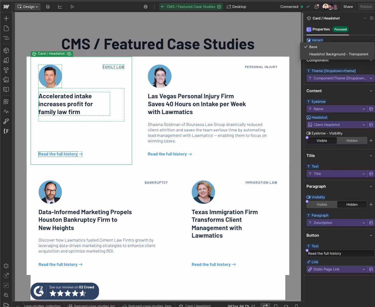
- Create one master component, for example card_product.
- Add variants that your project requires (For example, we created with and without a transparent background on the headshot image on the card)
- Update layout-specific styles per variant using tokens and utilities.
- Test both variants across breakpoints and adjust variant-level breakpoint overrides as needed.
Nested components: composition that scales
Nested components are small components used inside larger components. Think of them as single-responsibility parts that you can reuse in multiple parents.
Examples:
- A
headingcomponent used insidecard-headshot. - A
buttoncomponent nested insidehero_marketing. - An
imagecomponent insidetestimonial_item.
Why nest:
- Change the nested component once and every parent that uses it updates.
- Small components are easier to test for accessibility and performance.
- Teams can own smaller pieces without touching large components.
How to nest safely
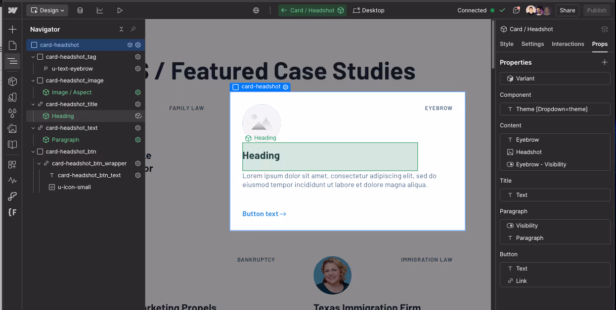
- Build the small component first and name it clearly, for example
heading. - Insert an instance of
headinginside the mastercard-headshotwhile editing the parent. - Expose slots or props on the nested component if the parent needs to alter content (for example, text inside heading).
- Keep nested components visually simple. If a nested piece needs many variants, consider whether it should be its own library component instead of an inline element.
Layout variants vs nested components: quick decision rules
Use this table to choose which solution fits best for your needs:
Short decision matrix
- If you can switch the display by toggling a property and no structural changes are needed, go for the variant.
- If the parent needs to change internal structure or replace whole sections, create a new component.
- If the block appears across multiple different parents, use a nested component.
Conclusion
Design systems in Webflow give you a simple payoff: fewer mistakes, faster pages, and safer edits. When you build token-first, name things with a proper naming convention, and use Components + Style variants with clear slots, small changes become sitewide updates instead of a scavenger hunt.
The easiest way for you to start is by auditing repeated patterns and defining a small set of tokens. From there, build a handful of token-backed components, add 2–3 practical variants for each, and document every component with a one-line usage note and an owner so your team knows who to ask.
Need an expert team to build this for you? Amply’s Webflow team builds scalable sites with token-driven design systems, reusable Components, and tidy style guides your team can actually use. Check out our Webflow development services to learn more.


.avif)