What makes a great VC portfolio website (with examples)
Rajat Kapoor
April 1, 2026
8
min
Key Takeaways (TL;DR)
VC portfolio pages are not just showcases, they are decision-making tools for founders
Founders scan portfolios to answer one question: “Is this firm right for me?”
Logos alone don’t build trust, context, pattern, and clarity do
The best portfolio pages make stage, sector, and thesis instantly visible
Strong portfolios focus on recognition over volume
Filtering and structure are critical for large or multi-stage funds
Adding context to each company helps founders understand relevance faster
Great VC websites are designed for non-linear exploration, not perfect user journeys
A clear next step (thesis, contact, apply) is essential after portfolio exploration
The most effective portfolios reduce friction and help founders decide quickly and confidently
A VC portfolio page isn’t just a showcase, it’s one of the most important decision-making surfaces for founders. When someone lands on it, they’re not casually exploring, they’re quickly evaluating whether your firm understands their space, stage, and ambition. In a matter of seconds, they’re looking for signals: Have you backed companies like mine? Do you have a point of view in my category? Can you actually help me grow? If those answers aren’t obvious, the opportunity is lost before a conversation even begins.
The problem is, most portfolio pages are built like static directories. They rely heavily on logos, filters, and minimal descriptions assuming the brand names will do the talking. But logos without context don’t communicate conviction. They don’t show why you invested, what patterns you see, or how your portfolio connects into a larger thesis. As a result, even strong firms can come across as generic, making it harder for the right founders to recognize themselves in your portfolio.
In this blog, we’ll break down what actually makes a great VC portfolio website, using real examples to highlight what works and what doesn’t. We’ll also show how teams approach portfolio storytelling differently, turning passive lists into structured, high-signal narratives that build trust, communicate expertise, and attract the right kind of inbound.
What Makes a VC Portfolio Website Great?
A great VC portfolio website helps founders quickly decide one thing: “Is this the right firm for me?”
It surfaces the right signals early, creates clarity around what the firm actually believes in, and makes it easy for founders to see where they fit. Instead of overwhelming with logos, it organizes information in a way that builds confidence and reduces ambiguity.
VC portfolio pages aren’t judged by how many companies they showcase. They’re judged by how clearly they communicate pattern, conviction, and relevance.
Confidence for founders doesn’t come from volume, it comes from recognition. Seeing companies like theirs. Understanding why those companies were backed. Knowing what kind of founder or idea this firm believes in.
Here’s what great VC portfolio websites consistently get right:
1. Portfolio Signals Are Clear, Not Just Visible
Great VC portfolio pages don’t just display companies, they help founders understand what those companies represent.
Stage clarity (Seed, Series A, Growth)
Sector or thesis alignment
Geographic focus
Outcome signals (exits, growth milestones)
This information isn’t left for founders to infer. It’s structured and easy to scan, so they can quickly answer: “Do I belong here?”
Recognition matters more than volume.
2. Clear Point of View Behind the Portfolio
Great VC portfolio websites don’t feel like collections, they feel like decisions.
Instead of just showing what they’ve invested in, they communicate:
Why these companies were chosen
What patterns the firm sees in the market
How the portfolio connects to a broader thesis
Saying “we invest in category leaders” or “back bold founders” doesn’t help founders decide.
Great portfolio pages make the firm’s thinking visible. That clarity builds more trust than generic positioning ever can.
3. Each Company Adds Context, Not Just Presence
Great VC portfolio pages don’t stop at logos. They add just enough context to make each company meaningful.
What the company does (clearly, not buzzwords)
Why it matters or what makes it interesting
Relevant tags (sector, stage, theme)
This turns a portfolio from a visual grid into a narrative system where founders can scan and understand patterns, not just names.
Context matters more than completeness.
4. Designed for Non-Linear Exploration
Founders don’t browse VC portfolio pages in a straight line.
They:
Jump between companies
Filter by relevance
Open multiple tabs
Scan quickly, then go deeper
Great portfolio websites are designed for this behavior. They make it easy to:
Filter and sort meaningfully
Re-orient quickly
Move between overview and detail without friction
The goal isn’t to control the journey, it’s to support how founders actually explore.
5. Clear Path From Portfolio to Action
A great portfolio page doesn’t just showcase, it guides.
After scanning the portfolio, founders should know exactly what to do next:
Explore the firm’s thesis
Read about how the team supports companies
Reach out or apply
There’s no ambiguity about the next step.
The goal isn’t aggressive conversion, it’s removing friction from a high-intent moment.
6. Tone That Signals Conviction, Not Hype
Great VC portfolio websites use language that reflects clarity and confidence without overstatement.
They avoid being:
Overly promotional
Vague and buzzword-heavy
Generic across companies
Instead, they use direct, grounded language that helps founders understand how the firm thinks.
Because in venture, conviction isn’t claimed, it’s demonstrated.
A great VC portfolio website isn’t defined by how many companies it lists. It’s defined by how quickly a founder can recognize themselves in it and decide to take the next step.
Best VC Portfolio Websites
Most founders don’t read your entire website, they scan your portfolio and decide what to do next.
In a few seconds, they’re trying to answer critical questions: “Have you backed companies like mine? Do you understand my space? Is this a firm I should spend time reaching out to?” When the portfolio page doesn’t make those answers obvious, even strong firms lose high-intent founders without realizing it.
That’s why the best VC portfolio websites aren’t just collections of logos, they’re structured to communicate pattern, conviction, and relevance instantly. In this section, we’ll break down some of the best VC portfolio websites and what they get right, so you can see what actually drives clarity and where most firms fall short.
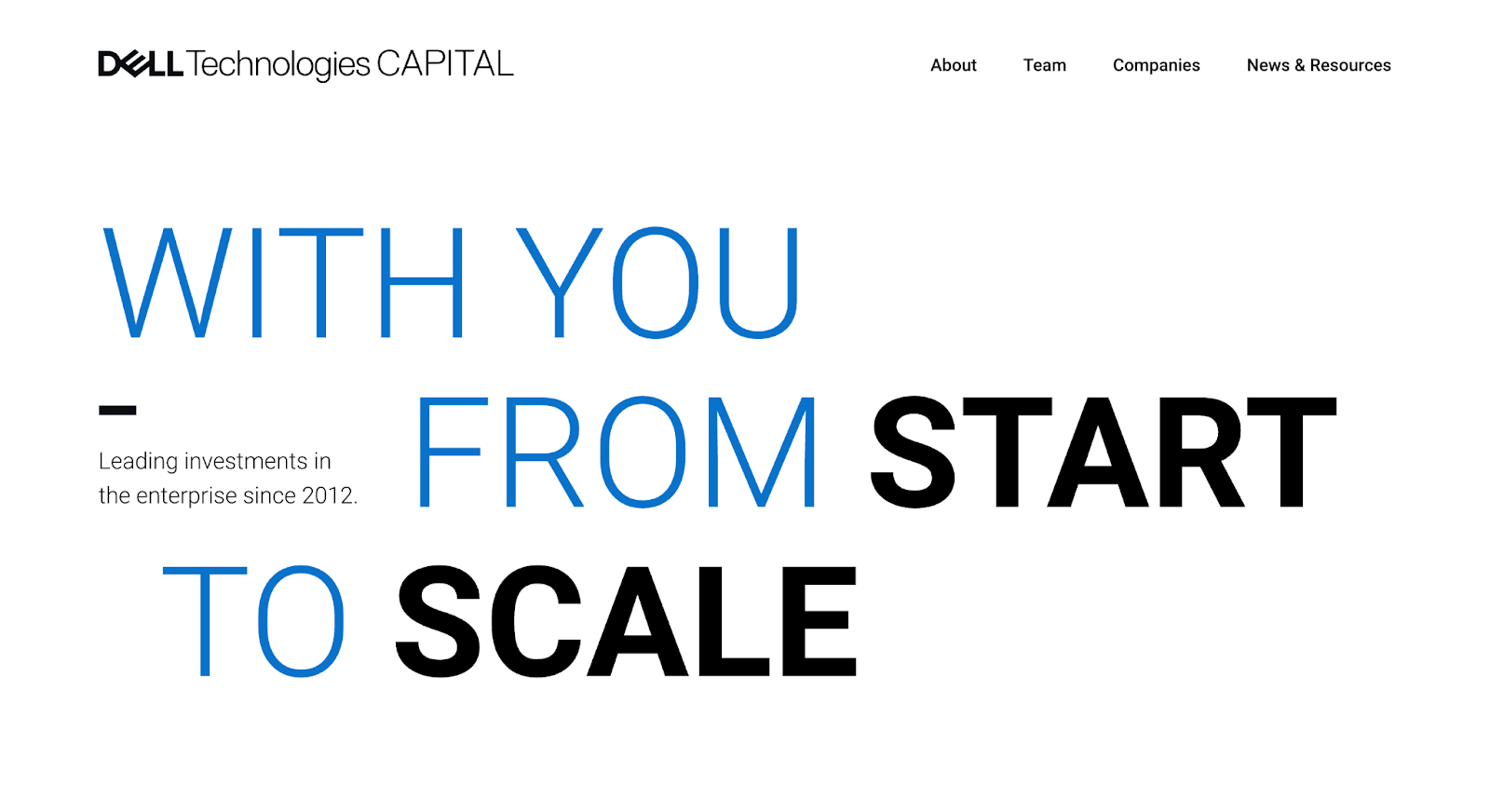
1. Dell Technologies Capital
Dell Technologies Capital is the venture arm of Dell Technologies, focused on investing in early to growth-stage enterprise and deep tech companies across areas like infrastructure, AI, cybersecurity, and cloud. Its portfolio reflects a strong alignment with enterprise innovation and technical depth.
Why it works:
Portfolio reflects a clear enterprise and deep-tech focus Dell Technologies Capital’s portfolio immediately signals where it plays: enterprise infrastructure, data, and emerging technologies. The companies aren’t broad or scattered; they reinforce a focused investment strategy tied closely to real-world technology shifts.
Strong alignment between brand and portfolio Unlike many VC firms where the portfolio and brand feel disconnected, here they work together. The portfolio naturally reflects Dell’s ecosystem and expertise, helping founders understand not just what they invest in, but where they can add strategic value.
Structured simplicity with high signal clarity The portfolio experience is clean and easy to navigate, without unnecessary layers. Companies are presented in a way that makes scanning intuitive, while still allowing founders to understand relevance quickly.
This kind of balance between simplicity and clarity is often the result of intentional portfolio design. In this case, it reflects the kind of structured, founder-first approach teams like Amply bring when designing VC websites, where the goal isn’t just to showcase companies, but to make the portfolio easier to understand and act on. If you want to see how this approach is applied across different VC websites, you can explore Amply’s work in this space.
Takeaway:
Dell Technologies Capital’s portfolio works because it’s tightly aligned with its strengths. By combining clear enterprise focus with a structured, easy-to-navigate experience, it helps founders quickly understand both fit and value without needing to decode the portfolio.
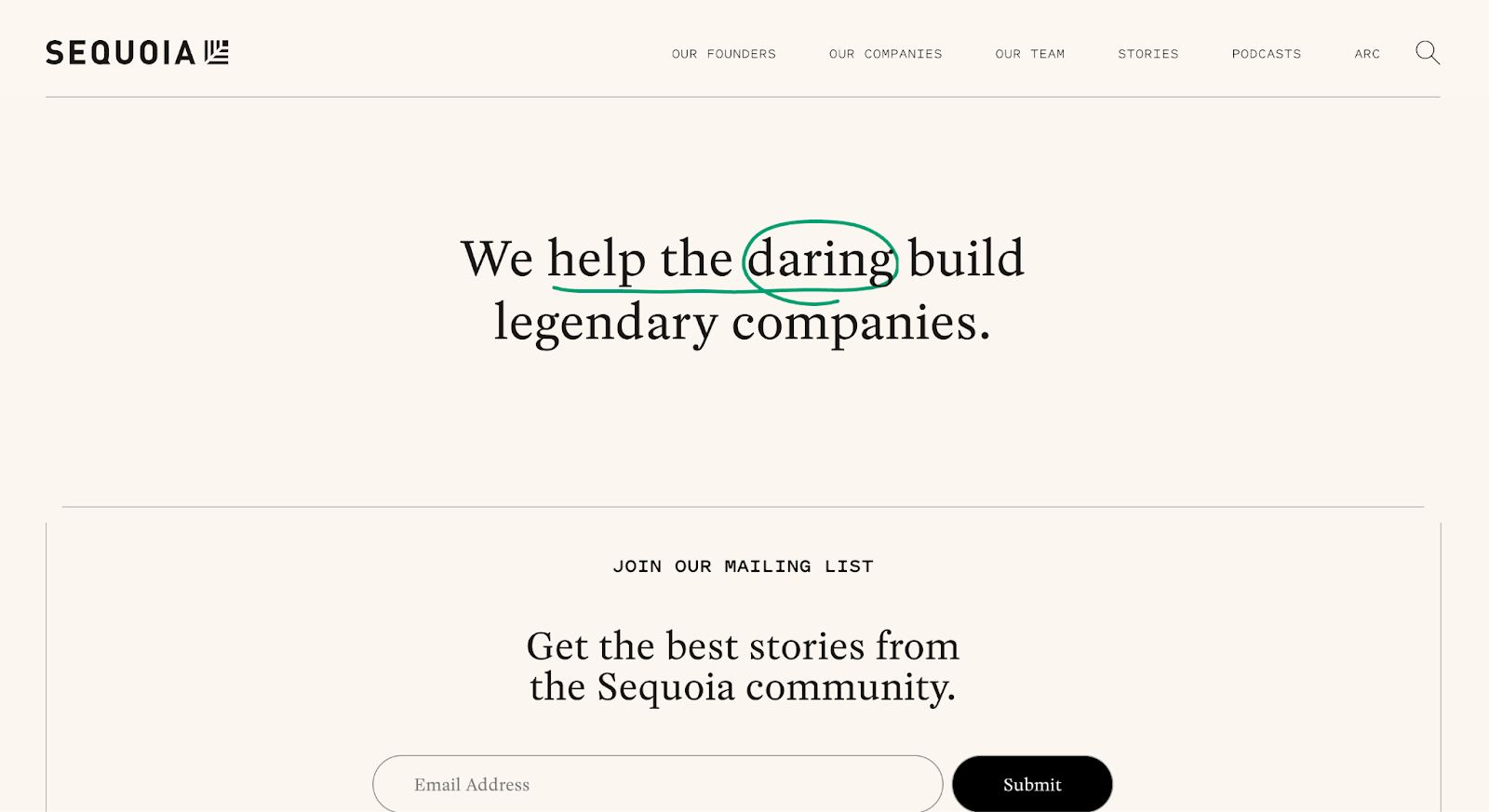
2. Sequoia Capital
Sequoia Capital is one of the most influential venture capital firms globally, known for backing category-defining companies like Apple, Airbnb, Stripe, and WhatsApp. Its portfolio page reflects decades of high-conviction investing while maintaining a simple, modern experience for founders exploring the firm.
Why it works:
Simplicity that highlights signal over noise Sequoia’s portfolio page is intentionally minimal. Instead of layering in excessive filters, descriptions, or categories, it lets the companies speak for themselves. The strength of the portfolio becomes immediately visible, helping founders quickly recognize patterns without being overwhelmed by interface complexity.
Strong pattern recognition through brand and outcomes Even without heavy explanation, the portfolio communicates a clear message: Sequoia backs category leaders. The presence of globally recognized companies creates instant credibility and allows founders to quickly assess whether they fit within that pattern.
Consistency across a large, global portfolio Despite the scale and diversity of its investments, the portfolio maintains a clean, uniform structure. This consistency makes it easy to scan, navigate, and explore without friction especially important for founders quickly evaluating multiple firms.
Takeaway:
Sequoia Capital’s portfolio works because it doesn’t try to explain everything, it lets recognition do the work. By prioritizing simplicity and clarity, the page helps founders quickly understand the level and type of companies Sequoia backs, making it easy to decide whether they belong in that cohort.
3. Andreessen Horowitz (a16z)
Andreessen Horowitz (a16z) is a venture capital firm known for backing companies like Facebook, Coinbase, and Instacart, with a strong focus on emerging technologies including crypto, AI, fintech, and consumer platforms. Its portfolio reflects not just investments, but a broader ecosystem built around content, insights, and operator expertise.
Why it works:
Portfolio is connected to a broader ecosystem a16z’s portfolio doesn’t exist in isolation, it’s tightly linked to its content, research, and operator network. This creates a richer experience where founders don’t just see who they’ve backed, but also how the firm thinks and supports companies.
Clear categorization across emerging sectors The portfolio is structured around sectors like crypto, bio, fintech, and enterprise, making it easy for founders to navigate based on relevance. This clarity helps users quickly identify whether a16z has depth in their specific space.
Depth beyond logos through context and content While many VC portfolios stop at listing companies, a16z adds layers of context through its broader platform: articles, podcasts, and insights tied to sectors. This reinforces their positioning as not just investors, but active participants in shaping industries.
Takeaway:
Andreessen Horowitz’s portfolio works because it extends beyond a static list into a living ecosystem. By combining investments with content and sector depth, it helps founders understand both what the firm backs and how it actively contributes: building trust through visibility, not just reputation.
4. Index Ventures
Index Ventures is a global venture capital firm known for backing companies like Slack, Figma, and Roblox. With a strong presence across the US and Europe, its portfolio reflects a mix of early-stage conviction and growth-stage scale, spanning categories like SaaS, fintech, and consumer tech.
Why it works:
Strong filtering that aligns with founder intent Index Ventures makes it easy to explore the portfolio based on what founders actually care about: stage, sector, and geography. This structured filtering helps users quickly narrow down relevance instead of scanning an undifferentiated list of companies.
Clear sense of global reach and category depth The portfolio highlights both the breadth and depth of Index’s investments. Founders can see not just isolated companies, but a pattern across regions and sectors, reinforcing the firm’s ability to operate at scale while maintaining focus.
Balanced simplicity with meaningful context While the interface remains clean and easy to navigate, there’s enough structure to provide clarity. The portfolio doesn’t overwhelm with information, but it gives founders just enough to understand where they fit within the firm’s investment landscape.
Takeaway:
Index Ventures’ portfolio works because it balances structure with simplicity. By making it easy to filter and recognize patterns, it helps founders quickly assess relevance: turning a large, global portfolio into something that feels clear and navigable.
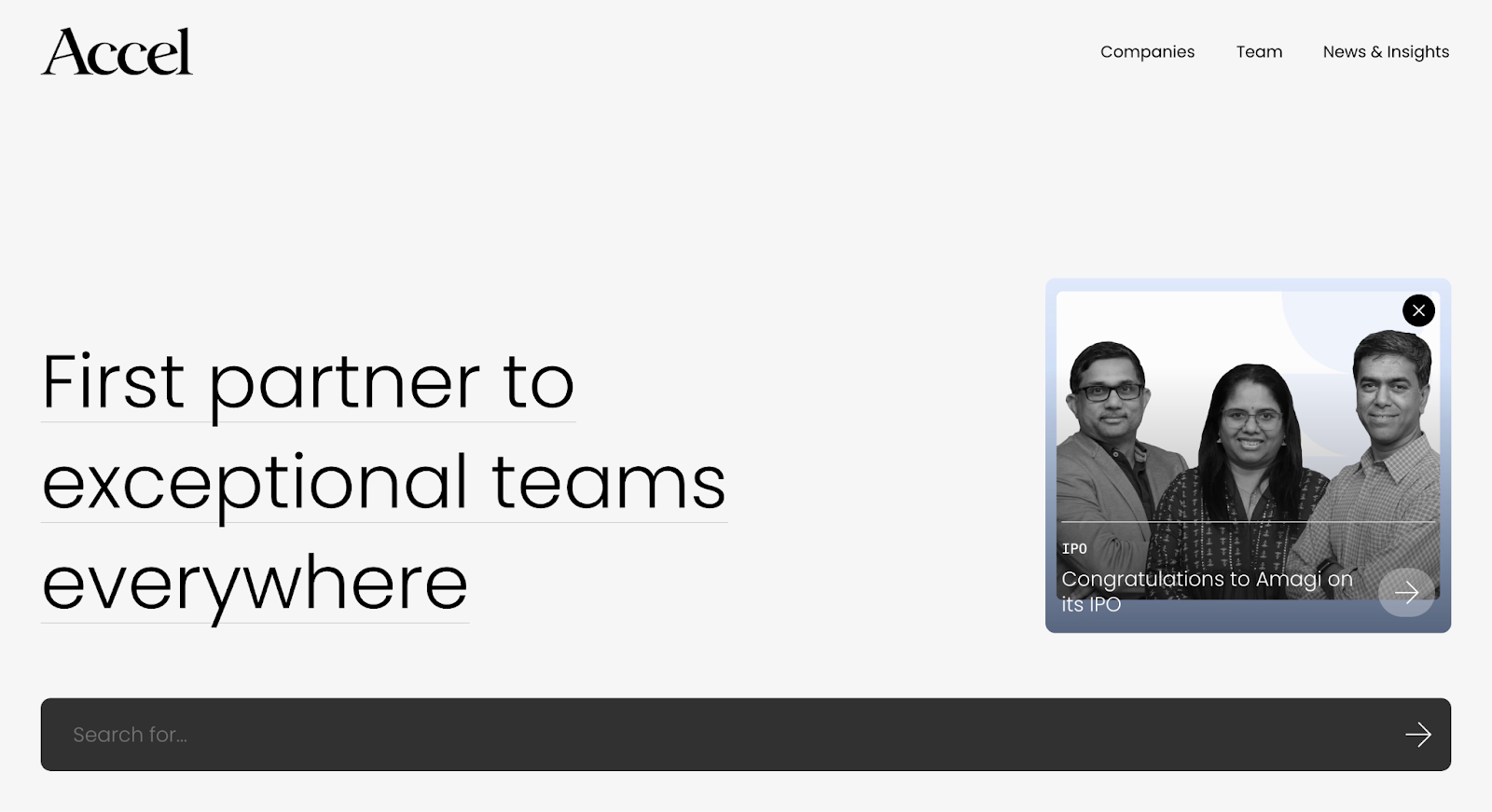
5. Accel
Accel is a global venture capital firm known for backing companies like Facebook, Slack, and Atlassian. With a strong presence across the US, Europe, and India, its portfolio reflects a wide range of early and growth-stage investments across SaaS, consumer, fintech, and infrastructure.
Why it works:
Clean structure that scales across a large portfolio Accel’s portfolio page handles a high volume of companies without feeling cluttered. The layout is simple and consistent, making it easy for founders to scan quickly without getting lost in complexity.
Clear global presence through portfolio organization The portfolio subtly communicates Accel’s global footprint. Founders can see investments across different regions, which helps reinforce the firm’s ability to support companies beyond a single market.
Familiar, low-friction browsing experience There’s no learning curve to navigating the portfolio. The experience is intuitive, allowing founders to move through companies effortlessly, important for quick evaluation during high-intent moments.
Takeaway:
Accel’s portfolio works because it prioritizes clarity at scale. By keeping the experience simple and consistent, it allows founders to explore a large, global portfolio without friction making it easier to recognize fit and move forward.
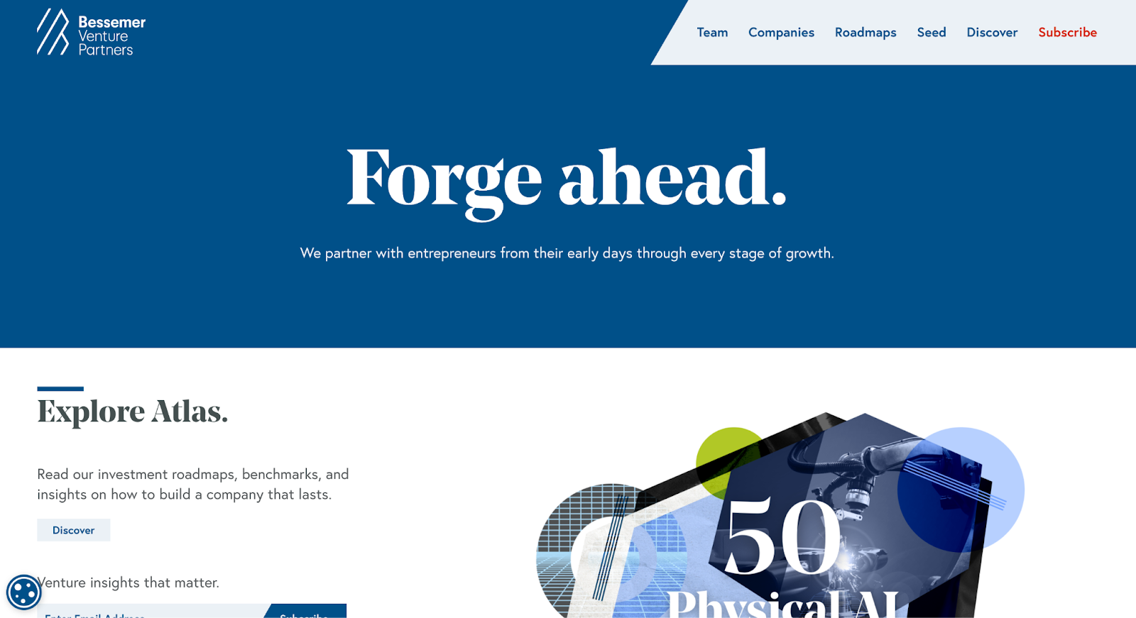
6. Bessemer Venture Partners
Bessemer Venture Partners is one of the oldest venture capital firms, known for backing companies like Shopify, Twilio, and LinkedIn. Its portfolio reflects a long history of investing across cloud, fintech, healthcare, and consumer, combining legacy credibility with a modern approach to presenting investments.
Why it works:
Portfolio connects past, present, and outcomes Bessemer doesn’t just show current investments, it highlights exits and historical wins as well. This gives founders a clearer picture of outcomes, not just activity, helping them understand the firm’s track record over time.
Clear categorization across sectors and stages The portfolio is structured in a way that makes it easy to explore by category. Founders can quickly identify where Bessemer has depth, whether in cloud, fintech, or other sectors, without having to interpret patterns themselves.
Blends credibility with accessibility Despite its long history, the portfolio doesn’t feel outdated or overly complex. It balances legacy with usability, making it easy for founders to explore while still reinforcing the firm’s experience and scale.
Takeaway:
Bessemer’s portfolio works because it shows more than just who they’ve backed, it shows what those investments have led to. By combining historical depth with clear structure, it helps founders evaluate both relevance and outcomes in one place.
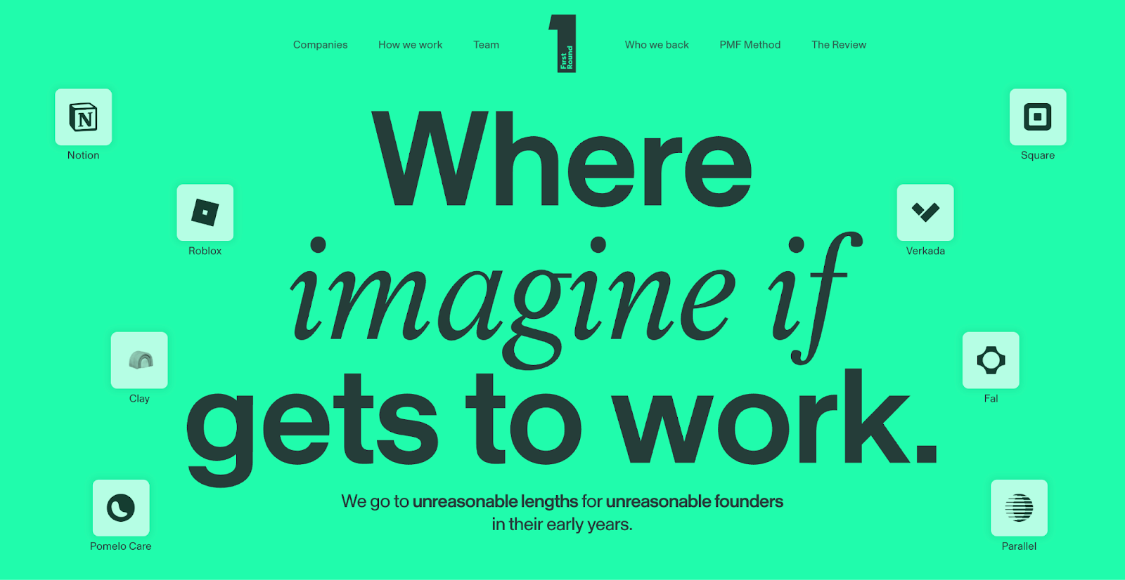
7. First Round Capital
First Round Capital is an early-stage venture firm known for backing companies like Notion, Uber, and Square at their earliest stages. The firm has built a strong reputation not just for investments, but for how it supports founders through community, content, and hands-on involvement.
Why it works:
Portfolio reflects a clear early-stage focus First Round’s portfolio makes its positioning obvious, it backs companies at the very beginning. Founders can quickly recognize whether they’re at the right stage without needing to interpret signals or dig deeper.
Contextual depth beyond just company names The portfolio is often supported by founder stories, case studies, and content that show how First Round works with its companies. This adds meaning to each investment, turning the portfolio into proof of involvement, not just capital.
Strong alignment between portfolio and brand narrative Everything connects back to First Round’s identity as a founder-first firm. The portfolio reinforces this by highlighting the types of companies and founders they support, creating a cohesive story across the website.
Takeaway:
First Round Capital’s portfolio works because it clearly communicates who it’s for. By combining early-stage focus with contextual depth, it helps founders quickly see alignment, not just in what the firm invests in, but in how it supports them.
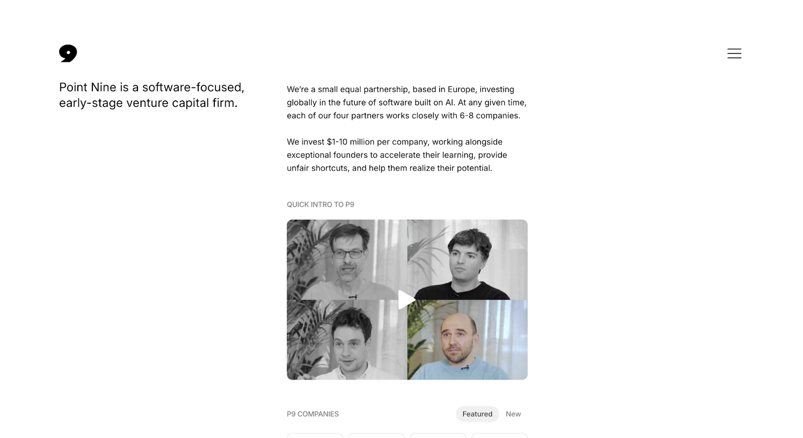
8. Point Nine Capital
Point Nine Capital is a Berlin-based venture capital firm focused on early-stage investments in B2B SaaS and marketplaces. Known for backing companies like Zendesk and Typeform, its portfolio reflects a highly focused thesis rather than broad diversification.
Why it works:
Extremely clear thesis through the portfolio itself Point Nine’s portfolio immediately communicates what they care about B2B SaaS and marketplaces. Founders don’t have to interpret patterns; the focus is obvious from the companies listed.
Simplicity that reinforces specialization The portfolio experience is clean and straightforward, without unnecessary layers or complexity. This simplicity works in its favor because it aligns with the firm’s focused positioning.
Consistency that builds trust Every company in the portfolio reinforces the same narrative. This consistency helps founders quickly understand whether they fit, making the evaluation process faster and more confident.
Takeaway:
Point Nine Capital’s portfolio works because it’s unapologetically focused. By keeping both the structure and the investments tightly aligned with its thesis, it makes it easy for founders to instantly recognize fit or disqualify themselves without friction.
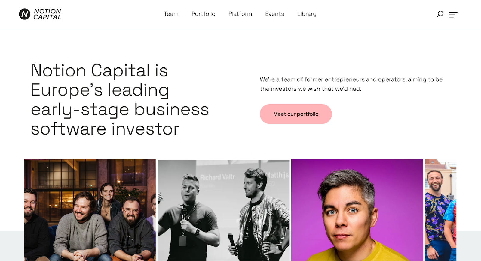
9. Notion Capital
Notion Capital is a London-based venture capital firm focused on B2B SaaS and cloud companies across Europe. Known for backing companies like GoCardless and Mews, its portfolio reflects a clear specialization in SaaS, combined with a structured and easy-to-navigate experience.
Why it works:
Clear SaaS positioning through portfolio structure Notion’s portfolio makes its focus immediately obvious. The companies, categories, and overall presentation consistently reinforce its specialization in B2B SaaS, helping founders quickly identify alignment.
Clean interface with meaningful company-level context The portfolio balances simplicity with enough detail to be useful. Instead of just logos, it provides context that helps founders understand what each company does and where it fits within the broader portfolio.
Easy navigation without overwhelming complexity The experience is intuitive and lightweight. Founders can explore without friction, moving between companies and categories without needing to learn the interface.
Takeaway:
Notion Capital’s portfolio works because it combines clarity with usability. By reinforcing its SaaS focus and adding just enough context, it helps founders quickly understand both the firm’s thesis and where they fit within it.
How to Evaluate a VC Portfolio Website
Most VC portfolio pages look similar on the surface: logos, grids, maybe a few filters. But for founders, the difference between a “good-looking” portfolio and a useful one comes down to how quickly it answers the right questions.
A strong portfolio page doesn’t just display companies. It helps founders evaluate fit with minimal effort. Instead of guessing or interpreting signals, they should be able to quickly understand: “Is this the kind of firm I should spend time on?”
Here’s a simple framework to evaluate any VC portfolio website:
1. Can founders recognize themselves quickly?
The best portfolio pages make it easy for founders to see companies like theirs.
Stage clarity (pre-seed, seed, growth)
Sector or category alignment
Business model similarities
If a founder has to scan endlessly or guess where they fit, the page isn’t doing its job.
Recognition should happen in seconds, not minutes.
2. Is there a clear investment pattern?
A strong portfolio should feel intentional, not random.
You should be able to quickly identify:
What types of companies the firm consistently backs
Whether there’s depth in certain categories
If the portfolio reflects a clear thesis
If everything looks scattered, founders struggle to understand what the firm actually believes in.
Pattern builds trust. Randomness creates doubt.
3. Is there context beyond logos?
Logos alone don’t communicate much, especially for lesser-known companies.
Great portfolio pages add just enough context to make each company meaningful:
What the company does
Why it matters
How it fits into a broader category or theme
Without this, founders are forced to do extra research, increasing friction in an already high-intent moment.
Context reduces effort. Logos alone increase it.
4. Is navigation aligned with founder intent?
Founders don’t explore portfolios randomly, they’re looking for relevance.
Strong portfolio pages make it easy to:
Filter by stage, sector, or geography
Scan quickly and dive deeper when needed
Move between companies without losing context
If navigation feels generic or overwhelming, founders drop off before finding what they need.
Good navigation doesn’t just organize, it prioritizes.
5. Are next steps clear after exploration?
After going through a portfolio, a founder should know exactly what to do next.
Explore the firm’s thesis Learn how the team supports companies Reach out or apply
If the journey ends at the portfolio with no clear direction, momentum is lost.
Clarity in next steps turns interest into action.
A great VC portfolio website isn’t defined by how it looks, it’s defined by how easily it helps founders evaluate fit.
The faster a founder can recognize relevance, understand the firm’s thinking, and take the next step, the more effective the portfolio actually is.
Final Thoughts
Most VC portfolio pages don’t fail because of bad design, they fail because they don’t help founders decide. Across everything we’ve covered, the difference between an average portfolio and a high-performing one comes down to clarity. Founders aren’t browsing, they’re quickly evaluating whether your firm understands their space, stage, and ambition. When that signal isn’t obvious, even strong portfolios lose momentum before a conversation begins.
What actually moves the needle is how easily a founder can recognize themselves and take the next step. Early-stage funds need to make relevance instantly clear, multi-stage firms need to bring structure to complexity, and niche funds need to double down on conviction. In every case, the goal is the same: reduce friction, surface patterns, and guide founders toward a decision without making them work for it.
That level of clarity rarely happens by accident. It comes from understanding how founders evaluate VC firms and designing the portfolio experience around that behavior. This is where teams like Amply stand out, they bring a deep understanding of the VC landscape, audience expectations, and how to translate that into structured, high-signal portfolio experiences. If you want to see how this approach comes to life across real VC websites, you can explore Amply’s design and development services for VC. And if you’re thinking about improving how your portfolio communicates and converts, you can book a call with Amply to explore what that could look like for your firm.
Get your Webflow SEO Google sheet checklist
Short description on the benefits or value you’ll get from using this checklist
Organizes SEO tasks for efficiency
Simplifies keyword tracking and management
Ensures consistent on-page optimization efforts
Thank you! Your submission has been received!
Oops! Something went wrong while submitting the form.
Frequently Asked questions
What should a VC portfolio website include?
Why is a VC portfolio page important for founders?
How many companies should a VC portfolio page showcase?
Should VC portfolio websites include exits and outcomes?
What makes a VC portfolio website stand out?
Do founders actually check VC portfolio websites before reaching out?
How can VCs improve their portfolio website performance?
About the Author
Rajat Kapoor
Copywriter, marketer, and Webflow developer. Rajat focuses on crafting clear, SEO-focused copy for scaling B2B brands.


.png)
.png)


.avif)