B2B Web Design Trends for 2026: What’s Changing and How to Stand Out
Cade Biegel
May 4, 2026
7
min
Key Takeaways
B2B web design trends focus more on clarity and usability than visual novelty.
Design trends should support business goals, not distract from them.
Simpler layouts often outperform complex visual experiences in B2B.
Trust signals matter as much as aesthetics in B2B websites.
Not every trend is suitable for every industry or audience.
Performance and accessibility are now baseline expectations.
Design trends change, but user expectations remain consistent.
Strong B2B websites balance modern design with clear messaging.
Websites have shed their 90s skin, ditching the static brochure vibe for a dynamic sales pitch. They're your brand's digital handshake, the first glimpse potential partners and clients get.
It takes users just 50 milliseconds to form an opinion of your website. That's why your website needs to scream your brand’s value proposition in the first instance it gets. Your website is the gateway to your offering — and a well-designed B2B website is often what earns the first real conversation.
Forget the dusty photo albums of yesteryear. This blog dives into the hottest B2B web design trends of 2026, ready to set your business apart and make it shine.
9 Best B2B Web Design Trends in 2026 (And How to Use Them Right)
This section spotlights some of the top B2B web design trends, featuring both cutting-edge innovations and returning classics.
These include: - Interactive animations - Dark mode - Skeuomorphism - Parallax scrolling - AI-generated designs - Kinetic or dynamic typography - Storytelling - Data visualization - Slide-In CTAs Replace Popups
Interactive animations in web design are dynamic visual elements that actively respond to user actions like hovering, clicking, and scrolling, enhancing the overall user experience. More than just visual aesthetics, they transform your websites into captivating digital experiences for visitors.
You can create this interactivity through 3D animations, micro-animations, parallax effects, and interactive infographics.
3D animations bring depth and realism to your website by transforming static content into visually dynamic and interactive experiences.
Micro-animations are subtle animations tied to elements on your website. They are excellent ways to offer visual feedback and clearly display changes. They present an effective medium to communicate with your audience without using words.
You can also use motion graphics and cinematic effects to further elevate your website aesthetics.
Strategically incorporating these trends, such as tying animations to user actions or integrating 3D elements, empowers web designers to reduce bounce rates and increase user engagement.
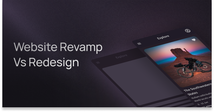
Memberstack’s innovative website displays interactive animations that instantly catch the user’s attention, making them want to explore it further.
2. Dark mode
Anvilogic’s website design by Amply is an outstanding example of a dark mode website. It uses the perfect blend of contrasts and text gradients to offer a great user experience.
Dark mode in web design is a user interface option that presents content with a dark background and light text. It offers a visually distinct alternative to the traditional light-themed layouts. This design trend has been popular ever since Microsoft introduced it in 2016.
Dark mode offers both visual and functional benefits.
Visually, dark mode provides a sleek and modern appearance, reducing eye strain and minimizing screen glare, particularly in low-light environments. The inverted color scheme also highlights content, making it stand out against the dark backdrop. This enhances readability and contributes to a more immersive and focused user experience.
Functionally, dark mode accommodates different usage scenarios, offering a more comfortable viewing experience for those who prefer darker interfaces. Many websites, applications, and operating systems now include a dark mode option, giving users the flexibility to choose based on their preferences or environmental conditions.
Furthermore, the dark mode also aligns with sustainability goals and energy-efficient UI. Darker colors require less energy to light up individual pixels on an OLED display compared to bright or white backgrounds. This results in lower power consumption on devices with OLED or AMOLED screens.
Discussions about dark mode often emphasize UI over UX, overlooking its fundamental purpose. It's intended for use in low-light conditions, prioritizing user experience over aesthetics.
High-contrast dark mode can look visually unappealing on some websites. The key lies in a well-crafted, softened dark mode, not necessarily pure black. In fact, high saturation on a dark background has poor visibility.
In the example below, notice how the blue color slightly mixes with the dark background and strains your eyes.
You must carefully consider contrast ratios, color choices, and accessibility standards to create a good dark mode experience. As a prominent design trend, dark mode continues to evolve, reflecting the industry's commitment to providing diverse and user-centric design options.
3. Skeuomorphism
Remember the stitched leather texture on your old iPhone calendar app? Or the wooden bookshelf interface of the iTunes library? Those were prime examples of skeuomorphism, a design trend that dominated early computing and is making a surprising comeback.
Skeuomorphism uses familiar real-world objects to navigate digital spaces. Initially a literal translation, it aimed to ease users into the unfamiliar world of computers.
Today, modern skeuomorphism applies subtle textures and shadows, not to mimic reality, but to enhance user experience by making interfaces feel familiar and inviting.
A balanced approach here translates to blending classic elements with contemporary tech. This way you can provide your audience with a visually rich, intuitive, and emotionally engaging experience without sacrificing functionality.
4. Parallax scrolling
Parallax scrolling goes beyond mere visual appeal. It is a potent tool for building compelling and immersive narratives. This technique involves layered graphics moving at different speeds, creating an illusion of depth and dimension.
True parallax, like its namesake in astronomy, requires specific elements:
Object: The focal point, the star of the show that moves closest to the viewer.
Reference point: A fixed element providing context and depth.
Background: The distant scene, moving at a slower pace for depth illusion.
Trigger movement: The user's scroll, click, or other action that sets the parallax in motion.
Unfortunately, many websites claiming parallax scrolling lack a distinct "object." In reality, they’re opting for flat backgrounds with layered images shifting at the same speed. While visually appealing, this doesn't capture the true essence of the technique.
Here’s a beautiful example of what a true parallax looks like created by Matthew Waggerfield.
Whether you’re opting for vertical storytelling or horizontal exploration, the outcomes are evident: captivated users. These users delve deeper into your site, effortlessly navigate between sections, and invest more time engaging with your core message.
5. AI-Powered Design Workflows
AI is changing how B2B websites get built, not by replacing designers, but by helping them move faster from idea to execution.
In 2026, tools like Relume are being used to generate wireframes, page structures, and even copy — all based on a simple prompt. Designers then take that foundation and build on it inside tools like Webflow, shaping it with brand personality, strategy, and interaction design.
This approach keeps the creative direction in human hands — but offloads the heavy lifting of starting from a blank page.
It’s a workflow shift:
Use AI to speed up the starting point
Use design expertise to refine, adjust, and make it truly effective
That means faster launches, more experimentation, and more time spent on what actually drives results — clear messaging, intuitive UX, and a site that converts.
Kinetic typography is your go-to technique for communicating ideas with visual flair. This dynamic approach proves particularly effective in conveying complex concepts or emotions that static text might struggle to express alone.
When crafting your brand identity, think in terms of movement. Consider what makes your brand tick, its core values, and its personality.
You may opt for a restrained animation style for a serious image, while a more playful or quirky brand will benefit from vibrant and colorful kinetic typography.
For optimal impact, consider placing the kinetic animation prominently at the top of your website. This focused placement will create a visually distinct element without overwhelming the content.
By strategically placing it, you compel visitors to stop, directing them to key sections like CTA or hero headline. This approach not only grabs attention but also promotes a comprehensive exploration of your website's content.
7. Storytelling
Your audience is overwhelmed with the 2.5 quintillion bytes of data created every day. Storytelling is a powerful medium to visually share your story and stand out from the crowd. It enables you to form an emotional relationship with your audience.
Storytelling websites, often one-page designs, leverage techniques like 3-D visualization, virtual reality, parallax effects, and more to capture and compel their audiences.
This strategic blend of art and science, where data-driven insights inform the emotional journey, ensures each website element resonates and converts. Storytelling designs are not just about building websites; it's the craft of creating unforgettable digital experiences.
Here’s a great example of a storytelling website by ‘Cycle.’.
Imagine a B2B website that cuts through the digital jungle, captivating attention with a single, laser-focused message. No jargon, no clutter, simply a crystal-clear value proposition that speaks directly to your audience's needs.
That's the power of minimalism.
A minimalistic b2b web design grabs user attention instantly with a benefit-driven message. It then guides them effortlessly through your site with streamlined navigation and impactful visuals.
White space, an integral part of such design, boosts readability and ensures that complex concepts are easily digestible.
No more confusing dropdowns or distracting animations–just a logical flow that leads them seamlessly toward desired actions like contacting you or downloading valuable content.
But minimalism isn't just about aesthetics; it's about data-driven decisions. Track user behavior, test different elements, and continuously refine your website based on feedback. This will ensure that your message stays relevant and resonates with your evolving audience.
9. Slide-In CTAs Replace Popups
The days of aggressive popups interrupting your browsing are fading.
In 202, more B2B websites are using slide-in CTAs that appear based on user behavior — like scroll depth, time on page, or exit intent. They’re subtle, non-intrusive, and mobile-friendly — which makes them feel like a natural part of the experience rather than a disruption.
Done right, slide-ins can actually increase conversions by meeting users with the right message at the right time — without breaking their flow.
They work especially well when paired with compelling copy and clean visuals, nudging users to download a guide, sign up for updates, or book a demo — all without being annoying.
Here’s a great example from HubSpot — a slide-in CTA that appears based on scroll behavior. It promotes a helpful resource without disrupting the reading experience
Today, B2B web designs are all about dynamism and innovation. The eight trends we've explored are opportunities to captivate audiences, build trust, and fuel your business’ growth. They are strategic tools for forging deep user connections and ultimately driving conversions.
Make sure to focus on making things easy for users. Every part of your website should feel welcoming and guide people smoothly. Explore and experiment with these trends and watch your website’s engagement and conversion skyrocket.
Need help implementing these trends? Our award-winning B2B web design agency builds high-converting, modern websites for brands that want to grow fast.
Book a discovery call with us and transform your vision into reality.
Get your Webflow SEO Google sheet checklist
Short description on the benefits or value you’ll get from using this checklist
Organizes SEO tasks for efficiency
Simplifies keyword tracking and management
Ensures consistent on-page optimization efforts
Thank you! Your submission has been received!
Oops! Something went wrong while submitting the form.
Frequently Asked questions
What are B2B web design trends?
Are web design trends important for B2B websites?
How often should B2B websites follow design trends?
Do B2B web design trends affect conversions?
Should B2B SaaS companies follow the same design trends?
Are minimal website designs better for B2B?
How do I know if a design trend is right for my website?
Can outdated design hurt a B2B website?
Should B2B websites prioritize performance over visuals?
About the Author
Cade Biegel
Co-founder of Amply, leverages his expertise in design, CRO, SEO, and storytelling to drive accelerated growth for B2B brands through captivating websites and marketing techniques.
.avif)


.gif)


.png)
.png)


.avif)