B2B Website Strategy: Maximizing Conversions for Business Growth
Cade Biegel
May 27, 2026
13
min
Key Takeaways
A strong B2B website strategy starts with clear goals, audience research, competitor analysis, and a clear understanding of what the website needs to achieve.
Your website should support the full buyer journey, from education and trust-building to lead generation and conversion.
Clear navigation matters because B2B visitors need to find the right information quickly, especially on product, solution, pricing, and resource pages.
The homepage hero section should clearly explain what the company does, who it helps, why visitors should trust it, and what action they should take next.
Product and solution pages should focus less on features and more on customer outcomes, use cases, proof, and clear next steps.
Pricing pages convert better when they are transparent, easy to compare, supported by FAQs, and backed by trust signals like reviews or customer proof.
CTAs should be short, specific, visible, and matched to the visitor’s stage in the buying journey.
A useful resources page can support SEO, build authority, educate buyers, and help convert visitors across different stages of the funnel.
B2B website strategy is not just about design. It connects SEO, content, UX, messaging, navigation, and conversion planning into one clear system.
Imagine a website that attracts a steady stream of qualified leads but struggles to convert them into paying customers.
Confusing interfaces, unclear calls to action, or uninspiring copy could be the culprits.
Want to amp up conversion, boost sales, and rake in that profit?
A well-defined B2B website strategy can helpestablish a strong brand positioning, gain a competitive edge, and boost conversions.
With a proper website strategy, you can build it in a way that showcases your brand appropriately and hits the nail right on the hammer—-by correctly identifying and addressing customer pain points.
Because a website is a business storefront. If it’s outdated, confusing, or lacks valuable information, your target audience will move to your competitor.
In this article, let’s jump into the intricacies of B2B website development, including analysis, navigation, homepage elements, and specific page optimization tips that lead to more conversions.
A B2B website strategy is a plan for how your website should attract the right visitors, communicate your value clearly, and move them toward becoming a lead or a customer. It connects your business goals to every decision on your site, from the pages you build and the content you publish, to how visitors navigate and where they're prompted to take action.
In this article, we cover the key components of a B2B website strategy: setting goals, structuring your site, optimizing key pages, and tracking what's working.
What Is a B2B Website Strategy?
A B2B website strategy is a structured approach to designing, building, and optimizing your website specifically for a business audience. Unlike B2C, where a purchase can happen in minutes, B2B buying cycles are longer, involve multiple decision-makers, and require your website to do a lot of the trust-building before a conversation ever starts.
A strong B2B website strategy covers three things: how you attract the right traffic, how your site communicates your value to business buyers, and how it converts visitors into leads. Without a clear strategy behind it, even a well-designed site ends up being a brochure. Nice to look at, but not doing much for your pipeline.
The Foundation: Building a Winning Strategy
Let’s begin with the basics—understanding the foundation of a winning B2B strategy. This involves defining your website's purpose, pinpointing your key offerings, and identifying your target customers.
A. Analysis
Setting project goals
The first step toward building a B2B website is to identify the goals you aim to achieve. This crucial first step ensures your website is strategically aligned with your overall business objectives.
Ask yourself: What do you want your website to achieve?
Do you aim to generate more traffic, build brand awareness, educate potential customers, foster community, or simply optimize your landing page for more qualified leads?
Understanding your target market and competitors is equally crucial. Analyze your ideal customer's needs and preferences, and study your competitors' offerings to identify gaps you can fill.
This will help you create a B2B website that truly resonates with your audience.
SMART goals provide a clear framework for website development. Ensure your goals are
S-Specific,
M-Measurable,
A-Attainable,
R-Relevant, and
T- Time-bound.
For example, instead of a vague goal like "get more traffic," aim for "increase qualified leads by 20% within the next quarter."
Continuously monitor your website's performance and adapt your B2B website strategy based on data-driven insights. By setting clear goals, understanding your audience, and applying a data-driven approach, you can build a B2B website that delivers impactful results.
A good website speaks to its target audience and addresses pain points across each stage of the buyer’s journey. This is possible only when you know your customer and your competition inside-out.
Keyword research & content marketing strategy
73% of B2B marketers rely on content marketing tactics – and for good reason. It's not just about creating content; it's about providing valuable information that resonates with your target audience.
So including and leveraging content marketing strategy in your digital marketing strategy can help you attract and convert leads.
When creating content, the first step is to identify relevant keywords to ensure your website aligns with customer searches. Tools like Google Search Console, Ahrefs, and Semrush can assist in compiling a list of relevant keywords for better ranking for better organic search traffic.
To enhance SEO efforts, in addition to a keyword strategy, explore content formats that resonate best with B2B audiences.
While a blog post is a common content type, well-researched long-form high-quality content, such as whitepapers, case studies, infographics, reports, presentations, and email newsletters can give you an edge over other businesses.
Incorporate relevant keywords in the content, including the meta descriptions to boost your search rankings.
A robust Content Management System (CMS) such as Webflow can streamline your digital marketing strategy.
Content management systems enable you to effortlessly create and publish various high quality content, efficiently organize and manage your content library, schedule content publication, automate workflows, and track content performance and user behavior.
Let's consider IBM for example. They began a ‘Smarter Planet’ initiative and combined insightful articles, social media, and videos to showcase technology's potential in addressing complex societal issues.
This helped them shift their brand positioning from a tech vendor to a company that addresses global challenges. It also helped them in business growth in sectors like healthcare, urban development, and environmental sustainability.
After knowing the base pillars, let us now delve into the navigation end of the B2B website strategy.
B. Navigation
Even with initial goals in mind, having a slow, confusing, or unattractive website can deter visitors — 38% of them, to be precise.
To retain this chunk of potential traffic, your navigation must be seamless and engaging. The site architecture must be intuitive as well. Here are the core principles guiding effective website navigation.
Goals and principles for effective website navigation
As per a recent study by HubSpot, website owners see an increase of 50% in page views and 48% in time spent after enhancing their website navigation. A good website navigation ensures a positive user experience by assisting visitors in quickly finding what they are looking for.
Brand loyalty, conversion rate, retention, and even revenue all depend heavily on user experience.
So, how to include website navigation in your business-to-business strategy to drive business success? Here’s how:
Clear Structure: Organize your site intuitively, prioritizing visitor needs with well-defined categories.
Instant Transparency: Communicate value propositions clearly upon arrival, using language free of technical jargon. Your aim is to simplify the buyer’s journey, not complicate it.
Encouraging Exploration: Engage website visitors with relevant content and prominent calls-to-action for deeper interaction and a simpler sales process.
Effortless Interaction: Implement robust search functionality and intuitive CTAs to streamline user journeys.
Consistent Engagement: Maintain navigation consistency and optimize for site speed across all devices.
SEO Advantage: Prioritize navigation clarity to enhance both user experience and ranking on search engines.
The ultimate goal of your B2B website strategy must be to satisfy and convert visitors. Something as simple as an intuitive website navigation can help you achieve that.
An example of good website navigation
Let us consider Microsoft, a well-known and successful B2B company.
Traditional drop-down menus can feel cluttered and overwhelming. Microsoft's mega menus offer a clear and organized way to present extensive information at a glance, reducing cognitive load for visitors. This enhances accessibility and reduces the chance of them losing their way on the website.
Instead of cramming everything into one long footer, Microsoft divides crucial information into several distinct sections. This improves information architecture and makes it easier for visitors to find what they need quickly, leading to a more positive user experience.
Recognizing not everyone wants to browse manually, Microsoft offers a prominent search bar. This empowers visitors to find specific information instantly, saving them time and frustration.
Additionally, you can use search analytics insights gleaned from this feature for search engine optimization and content strategy, making it a awin-win for both users and the company.
Providing a clear sitemap acts as a navigation roadmap, especially for a large website. Microsoft's sitemap showcases all key pages, guiding visitors effortlessly and ensuring they don't miss important information. This also aids in indexing and discoverability on search engines.
Don’t forget mobile device navigation when building your B2B website strategy. Nearly 55% of the website traffic is the contribution of mobile devices so accommodating mobile visitors into your B2B website strategy is imperative. So ensure that your website has a responsive design.
With that in mind, let's discuss how to strategically build specific sections of your B2B website and landing pages.
Crafting Compelling Pages
Your B2B website strategy is a crucial component of your marketing strategy. Whether you want to revamp your existing site or build a completely new website, whether the goal is generating leads or simplifying the buying process, here are some practical ways to curate your web design.
Homepage
When a potential customer visits your website, the hero section is the first thing they notice. Ensure that it’s clear, concise, and convincing to capture visitor attention and generate leads.
Ensure that the hero section highlights:
Your value proposition: Clearly state what your company offers and how it benefits your target audiences. Don't assume they know!
Credibility: Showcase your unique selling points (USPs) and why visitors should trust you. This could include awards, client testimonials, or industry expertise.
Call to action: Tell visitors what you want them to do next. This could be contacting you through contact forms, downloading a resource, or exploring your products. Make the desired action clear and easy to take.
Best Practices for Design:
Captivating visuals: Use a high-quality hero image or video that resonates with your target prospects and reflects your brand identity. Avoid generic visuals and focus on conveying your message through the imagery.
Strong headline: Craft a concise, attention-grabbing headline (5-7 words) that clearly communicates your value proposition. Use strong verbs and consider highlighting key words.
Informative subheading: Expand on your headline with a subheading that provides more details about your business. Remember, users scan, so keep it concise and optimized for readability.
Prominent CTA button: Use a clear and prominent button with action words like "Get Started", "Learn More", or "Contact Us" to direct users towards the next step. Avoid cluttering the section with multiple CTAs.
Remember: Less is often more. Use impactful visuals, concise text, and a clear call to action to make a strong first impression.
For further inspiration, check out this effective hero section example
Product & Solutions Pages
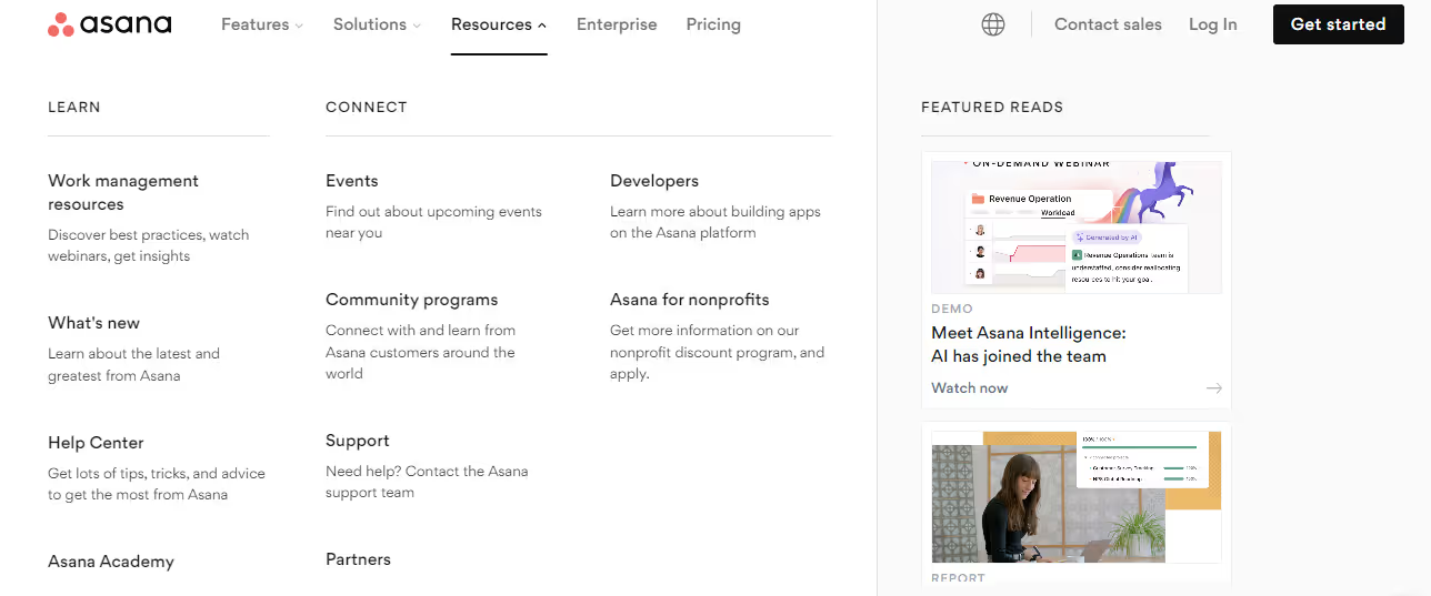
Asana’s product page
Calendly’s solution page
Remember her quote: "Customers don't care about your policies. Find and engage the need. Tell the customer what you can do."
What differentiates the products and solutions page from each other is that the product describes what the business has created and details its capabilities while the solutions page on the other hand is a business outcome that brings the customer measurable value.
While both product and solution pages aim to attract customers, they approach it from different angles.
Understanding these differences is crucial for crafting compelling content that resonates with your target audience.
You only have 15 seconds to grab attention. Make them count by:
Headlining with benefits: Don't just list features; shout out how they improve the customer's life
Showcasing visuals that speak volumes: Use compelling images or videos that connect emotionally with your target audience
Highlighting social proof: Let your satisfied current customers speak for you through testimonials or case studies
Crafting a clear and compelling CTA: Tell visitors what you want them to do next, whether it's contacting sales or exploring a demo
Pricing Page
The next most visited page by the visitors right after you capture their interest in your products and services is the pricing page.
Some tips to keep in mind while designing the pricing page are:
Ensure the design is clean and facilitates easy navigation and quick comprehension
Display custom options tailored to the distinct personas your business targets
Address frequently asked questions to provide prompt responses
Prominently feature a free trial offer, if available
Incorporate customer reviews or social proof to enhance credibility
Highlight top-selling plans to assist visitors in making decisions
Present plan features in parallel for easy comparison
Include pricing in different currencies for a global audience
Consider A/B testing to optimize the pricing page layout and elements. Experimentation is key to finding the most effective approach
Remember, the best pricing page is a clear, transparent, and value-driven experience that is also user-friendly and guides visitors towards the action you desire.
By incorporating these suggestions and continuously testing and iterating, you can create a pricing page that converts interest into paying customers.
CTA Page
A CTA page is an inherent part of your online marketing strategy that helps you convert visitors. No matter at what stage they are in the sales cycle, your CTA simplifies the buyer journey by guiding visitors to a specific action.
Here are some critical factors that you must keep in mind when building a CTA page:
Clarity and brevity: Keep your CTAs short (2-3 words) and action-oriented, using strong verbs like "Start," "Get," or "Download."
Focus on benefits: Highlight the value users will gain by taking the desired action. Instead of "Start your free trial," use "Start your 7-day free trial and boost your productivity." Also ensure that the CTA aligns not just with the target customers, but also with specific stages of the sales cycle.
Use persuasive language: Frame your CTA as an invitation or suggestion, not a demand. Instead of ‘Register now,’ use ‘Join our community of like-minded individuals.
Match the CTA to the audience's needs: Tailor your messaging and tone to resonate with your prospective customers. For a professional audience, use formal language and action verbs like "Schedule a consultation." For a younger audience, use slang or playful language like "Snag your freebie."
Make it prominent: Use contrasting colors, buttons, or other visual cues to make the CTA stand out.
Test and optimize: Experiment with different CTAs and track user behavior to see what works best for your audience and content.
Remember, the ideal CTA should be clear, concise, persuasive, and visually appealing. By following these guidelines and testing different options, you can maximize your chances of driving conversions on your website.
For example, let's look at Shepper’s CTA:
The CTA is merely two words and easy for the reader to grasp. It is coming out in a pop-green color so the user does not have to read through to understand what the website is hinting at.
Resources Page
A library of valuable resources on your new site can have a major hand in converting visitors. However, building that library is no easy feat. Prioritizing the type of resources that will provide the highest ROI is a good place to start. Blogs, academy, podcasts, and case studies are a few examples of content you can try for your B2B website strategy.
The resources page can help you generate sales leads from all levels of a sales funnel. Adding relevant keywords can also your search engine optimization efforts and help you gain organic traffic.
Before delving into strategies, it's important to understand the various motivations for enhancing the resource page of your website:
Positioning the company as a thought leader.
Increasing website traffic.
Providing a roadmap for the buyer's journey.
Improving the likelihood of converting visitors.
Now, let's explore how to craft a resource page that leaves a lasting impact on your B2B audience:
Define your objectives clearly.
Gain insight into the needs of your target audience.
Leverage educational content formats such as e-books, guides, white papers, industry reports, infographics, and podcasts.
Outline the content structure effectively.
Incorporate compelling CTAs to prompt action from your audience.
For example, let us look at the resource section of HubSpot and the range of options it brings for the visitor:
Not only does it provide a vast range of resources for the users to choose from but also categorizes them to make them more relevant.
Start Building your B2B Website Strategy with Amply
A robust B2B strategy is indispensable to achieve conversion success in today’s competitive landscape. Analysis and navigation are pivotal elements that create a foundation and assist businesses work per the user demands.
Website goal-setting, keyword research, responsive design, and content marketing are marketing tactics that assist businesses in building a strategy that resonates with the target audience.
Additionally, delving into specific sections of web design right from the hero page and product and solution page to the resource and CTA page are all essential components of driving conversions.
Throughout your website-building journey, keep in mind that success starts with crafting a user-centric experience. Business growth hinges on providing value to the visitors and realizing their requirements.
If you’re feeling overwhelmed with the intricacies of website building, you can always hire a web developer to take care of them. Alternatively, you can leverage Webflow, a great tool for those with no coding knowledge, to build a website and landing page that aligns with all the crucial requirements mentioned above.
Amply can help you with building a robust and convertingB2B website strategy. With personalized assistance, our development team can help you tell your story and build your new site with Webflow. Ready to embark on your way to conversion success? Book a call with us here.
Get your Webflow SEO Google sheet checklist
Short description on the benefits or value you’ll get from using this checklist
Organizes SEO tasks for efficiency
Simplifies keyword tracking and management
Ensures consistent on-page optimization efforts
Thank you! Your submission has been received!
Oops! Something went wrong while submitting the form.
Frequently Asked questions
What is a B2B website strategy?
Why is website strategy important for B2B companies?
What should a B2B website strategy include?
How can a B2B website increase conversions?
What pages are most important on a B2B website?
What makes a good B2B homepage?
How should B2B product and solution pages be structured?
What makes a B2B pricing page convert better?
Why does navigation matter on a B2B website?
How does content marketing support B2B website strategy?
How do CTAs improve B2B website performance?
How often should a B2B website strategy be reviewed?
About the Author
Cade Biegel
Co-founder of Amply, leverages his expertise in design, CRO, SEO, and storytelling to drive accelerated growth for B2B brands through captivating websites and marketing techniques.
.avif)


.png)
.png)


.avif)