.avif)

Your website is often the first point of contact for potential customers in a complex B2B buyer journey. It’s the centerpiece of your marketing strategy — showcasing your expertise, building trust, and driving growth.
In fact, 94% of initial business perceptions are influenced by your website’s design. And if your site feels like a glorified business card, you're likely losing interest before the conversation even starts.
So, what actually makes a great B2B website?
At a glance, here are a few things the best ones always get right:
- A clear, benefit-led hero section with a strong CTA
- Consistent visuals and messaging that align with your brand
- Smart internal linking that guides the visitor journey
We’ll dive into all of this — and more — with proven best practices, examples from real websites, and practical tips to help you turn your site into a lead-generating asset.
Let’s get started 👇
10 B2B Website Best Practices
Building a stellar B2B website delivers several benefits, from boosting lead generation to enhancing customer experience, brand consistency, credibility, and customer acquisition.
Below is a list of 10 B2B websTap into how B2B buyers thinkite best practices to help you unlock exponential business growth.
1. Establish a strong brand identity
Cade Biegel, Founder and CEO of Amply, emphasizes the significance of a robust brand identity, stating, "Having a strong brand identity can help you punch above your weight when it comes to selling your B2B product."
This insight underscores the pivotal role that brand identity plays in the B2B landscape. It's not just about the logo, but the entire visual experience—fonts, custom and stock images, colors, and even your domain name and brand voice. This consistent visual identity helps your audience feel like they're in familiar territory, fostering trust and ultimately driving conversions.
Consistent brand style can increase business revenue by nearly 33%. Conversely, an inconsistent website design confuses visitors and sends them bouncing, hindering your lead generation efforts.

Though not a B2B website, the Yale School of Art's website is a prime example of inconsistent branding. Inconsistent design elements and, the use of fonts, colors, and visual effects throughout the site create a disjointed and confusing experience for visitors.
This lack of cohesion undermines the institution's credibility and professionalism. It might make prospective students wonder whether the institution is equally silly.

In contrast, Playground’s website uses a words-only hero section with letters changing to bright and bold colors on hovering. These design personalized elements are clear, eye-catching, and tell you exactly what they do.
And guess what?

That same bold and colorful vibe carries throughout the entire site, from their portfolio images to their videos. It's a cohesive experience that makes a strong impression.
This consistency is key for B2B websites too. Just imagine a company that throws random stock photos and mismatched fonts at their website. Not exactly confidence-inspiring, right?
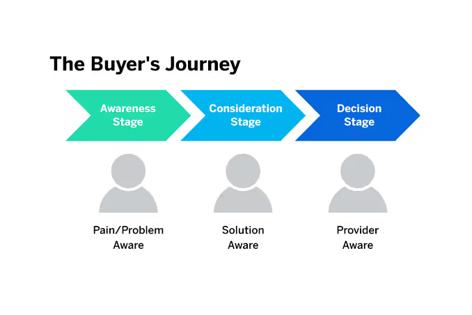
2. Tap into how B2B buyers think
B2B buyers don’t move in a straight line—they research, compare, and vet long before they ever raise a hand. To meet them where they are, your site must anticipate their needs and guide them forward.
Gain customer insights
Go beyond pageviews. Run quick interviews, usability tests, or a one-question survey (“What’s your biggest challenge right now?”) to uncover the real pain points driving your audience.
Address perceived needs and increase value

Speak to their challenges, not just your features. Use social proof—testimonials, logos, badges—to show you solve real problems. Then spell out benefits in concrete terms:
“Save your team 2 hours per week with automated reporting.”
Implement value-boosting tactics
Where it makes sense, introduce scarcity or exclusivity: limited-seat webinars, pilot spots, or early-access demos. And subtle charm pricing (e.g. ₹4,499 vs. ₹4,500) can signal value without feeling gimmicky.
AI-Powered Personalization & Chatbots
Leverage AI to deliver one-to-one experiences at scale and keep prospects moving:
- Dynamic content swaps: Show custom headlines, case studies, or CTAs based on visitor data (industry, company size, referral source).
- Qualified chatbots: Deploy a rules-based or AI bot (e.g. Drift, Intercom) trained on your top FAQs to answer questions 24/7 and route high-intent leads to your team.
- Next-best-action prompts: Use tools like 6sense or Demandbase to detect when someone lingers on your pricing page—and pop up a personalized ROI calculator or demo invite.
By tapping into buyer psychology and layering in AI-driven personalization, your site becomes a tailored buying experience.
3. Map customer journey
Developing a customer journey map is like crafting a roadmap for success tailored to your B2B website. This map gives you a bird's-eye view of how potential leads and customers navigate through your website—from their initial discovery to post-purchase satisfaction.
- Understand motivations: Dive into the driving forces behind your B2B buyers' actions at each stage of their journey. Whether they're hunting for solutions to pressing pain points or staying ahead of industry trends, grasping these motivations lays the groundwork for customizing your website content to meet their needs effectively.
- Address key questions: Anticipate the burning questions swirling in your B2B buyers' minds as they progress. Whether they're pondering product features or pondering implementation processes, answering these queries upfront on your website fosters trust and credibility with your audience.
- Track user actions: Keep a close eye on the steps your B2B visitors take while browsing your website. Are they gobbling up whitepapers, clamoring for demos, or reaching out to your sales team? Understanding these actions unveils crucial touchpoints, allowing you to fine-tune them for a smoother journey toward conversion.
- Identify obstacles: Spot any roadblocks that might impede your B2B buyers' progress along their journey. Whether it's convoluted pricing structures, murky value propositions, or labyrinthine signup processes, tackling these hurdles head-on streamlines the user experience and boosts conversion rates.
- Capture emotional responses: Tune into the emotional rollercoaster your B2B buyers ride as they navigate your website. Are they riding high on confidence and reassurance, or battling confusion and frustration? By empathizing with their emotions, you can tailor your messaging and design elements to evoke positive vibes and ramp up engagement.
"The best B2B websites deeply understand their customer's pain points", remarks Cade.
By sketching out a customer journey map for your B2B website, you unlock a treasure trove of insights into your target audience's behavior and preferences. Armed with this knowledge, you can fine-tune your website to give a positive user experience; And effortlessly attract, engage, and convert B2B leads into delighted customers.
4. Design a clear and clutter-free home page
The homepage serves as the front door to your brand, drawing in, educating, and converting visitors effectively. It is a crucial component of a successful website.
As Cade wisely puts it, "Your homepage is often the first impression customers have of your brand, make sure it's a good one.”
Defining your goals is the first step before diving into homepage design. Think about the message you want to convey and the actions you want visitors to take.
Your goals could include clearly communicating your product's value, engaging and educating visitors, building trust, and encouraging conversions with compelling CTAs.
Crafting the hero section is crucial for making a strong first impression. Start by defining your main value proposition. Speak directly to your target audience, and incorporate captivating visuals and clear CTAs to encourage prompt action.
Highlight customer testimonials, showcase notable clients, and incorporate statistics to demonstrate the popularity and reliability of your solution.
When explaining your product, focus on simplicity and benefits. Instead of using technical language, use a straightforward and professional tone. Use visuals to illustrate features, highlight tangible benefits, and incorporate visual elements like screenshots or videos.
If your product integrates with other platforms, showcase these integrations to demonstrate versatility and compatibility. Feature recognizable logos and emphasize how your product enhances workflow efficiency through integrations.
Finally, close your homepage with a strong call-to-action that prompts visitors to take the next step. Reinforce primary CTAs, offer secondary options, and personalize the message to align with the visitor's stage in the buyer's journey.
Take a look at FareHarbor’s homepage as one of the best design examples of a clean, minimal, and well-designed B2B homepage. Its hero section clearly highlights what the product does with a simple CTA to help visitors take the next step.

5. Create a product page that makes you want to buy
We don’t need to reiterate the importance of product landing pages. Potential customers and clients will flock to your product page to dive deep into your product and decide whether it is worth buying or not.
So your product page, not just your sales calls, will determine your business’ success.
To achieve this, effectively communicate two key elements:
- Accurate information: Provide clear and comprehensive details about features, functions, and specifications. Ensure it's easily accessible and understandable for your target audience.
Instead of listing "file sharing" as a feature, explain how your product allows users to "share large files securely with colleagues and clients, even those outside your organization, with just a few clicks."
- Persuasive messaging: Go beyond listing features; highlight the benefits and how it solves customer challenges. Use persuasive language to tell your brand story and engage and encourage further action.
Instead of stating "boosts productivity," explain how your product "integrates seamlessly with popular CRM software, saving your sales team an average of 2 hours per week on administrative tasks, allowing them to focus on closing more deals."
You can optimize your B2B website effectiveness through product pages by employing these pointers:
- Start with a strong, clear value proposition: Briefly explain what your product does and its value in a single, clear sentence. Capture the reader's attention and establish the core benefit.
- Showcase your product visually: Include high-quality images or videos showcasing your product in action on the same page. Help website visitors visualize how your product can be used in real-world scenarios.
- Highlight the problem & solution: Clearly define the problem your product solves and how it offers a superior solution compared to alternatives. This helps potential buyers identify if your product addresses their specific needs.
- Feature rich visuals and testimonials: Use engaging visuals like infographics or explainer videos to effectively present product features. Incorporate testimonials from satisfied customers to add credibility and social proof.
- Clear CTA: Guide visitors towards the desired action, such as contact form submission, free trial sign-up, or product demo request. Use a clear and compelling sales call to encourage user engagement.
By focusing on both accurate information and persuasive communication, you can create compelling B2B product pages that convert website visitors into loyal customers.
Take a look at Dropbox’s product page, for example. Dropbox effectively delineates its services, featuring a product image as the hero element and providing a clear call to action to guide users forward.
Also, check how Dropbox highlights its USP right in the first line—accommodating all business needs in one place.

6. Make your website friendly for search engines
Your B2B website won’t generate leads if no one can find it. That’s where SEO comes in—not just for traffic, but for visibility to the right audience at the right time.
Here are the essentials every B2B website should cover:
- Keyword strategy: Use tools like Ahrefs or Semrush to build a keyword list that matches what your audience is actually searching for. Don’t guess—research.
- Structured content & internal linking: Organize your content so both people and search engines can follow it. Use clear H2s and H3s, add internal links with descriptive anchor text, and make sure your sitemap is submitted.
- Technical SEO audit: Run regular audits using Screaming Frog or Google Search Console. Fix crawl errors, broken links, and duplicate content. And turn on sitemap generation in Webflow to ensure all pages are indexed. You can follow this Webflow SEO checklist to make sure your site is fully optimised for SEO.
- Page speed optimization: Compress your images, defer scripts where needed, and minimize CSS/JS. Tools like PageSpeed Insights or Lighthouse can help you identify what’s slowing things down.

- HTTPS implementation: This is non-negotiable. If your site still says “Not Secure” in the browser bar, it’s time for a change.
- XML sitemap submission: Submit an updated XML sitemap to search engines to ensure all pages are efficiently crawled and indexed
- Core Web Vitals & Performance Metrics: Google now uses real UX signals to decide your ranking. These aren’t just nice-to-haves—they’re part of the algorithm.
Here’s what to track:- LCP (Largest Contentful Paint) – how fast your biggest visual element loads
- FID (First Input Delay) – how fast your site responds to user interaction
- CLS (Cumulative Layout Shift) – how stable your layout is during load
Fixing even one (like reducing LCP from 4s to 2.5s) can meaningfully improve both bounce rate and conversions
- AEO & FAQ Schema (Answer-Engine Optimization): Search is changing. People now ask full questions—often into AI chatbots or voice assistants. You want your site to be the answer.
What to do:- Add a structured FAQ section near the bottom of key pages
- Use FAQ schema markup so Google and other engines can feature your answers directly in results
- Format answers in clear, conversational language—aim to answer the question in the first 1–2 sentences
- Target long-tail question keywords like: “How to compare B2B website platforms?” or “What should a B2B homepage include?”
- Regular content updates and backlink acquisition: Publish informative content regularly through reliable content management systems. Also, engage in link-building strategies to acquire backlinks from reputable sites in your industry.
- Performance monitoring & analytics: Use tools like Google Search Console and Google Analytics to track organic traffic, keyword rankings, and user behavior, allowing you to refine your SEO strategy over time.

By implementing these technical SEO tactics, your B2B website can establish a strong foundation for search engine visibility and generate leads through organic search traffic.
Remember, SEO is an ongoing process, requiring consistent effort and strategic adaptation to maintain a competitive edge in the volatile digital landscape.
7. Spice up your pricing page
Having a compelling SaaS pricing page is crucial, but it's the "extra touches" that can truly turn visitors into paying customers.
Here are some ways to add some "spice" and make your B2B SaaS pricing page stand out:
- Creative tier visuals: While not mandatory, consider replacing traditional static tiers with interactive elements like tabs, sliders, or even infographics to engage visitors. These can visually showcase the different plans and their features, making them more engaging and easier to understand.
- Gamification: Implement interactive elements that users can "play with," like progress bars for feature unlock or short quizzes that recommend the best plan based on their needs. This can add a fun element to the decision-making process and increase user engagement.
- Personalized recommendations: Leverage website visitor data (with user consent) to suggest the most suitable plan based on their browsing behavior or previous interactions. This personalized approach can feel more relevant and guide users toward the right option faster.
- Social proof and testimonials: Showcase customer testimonials and case studies alongside pricing tiers. Hearing success stories from real users can build trust and convince potential customers of your product's value.
- Money-back guarantees or free trials: Offer a risk-free trial or money-back guarantee to alleviate potential buyers' concerns and encourage them to commit to a paid plan.
- Limited-time offers or discounts: Create a sense of urgency with limited-time offers or exclusive discounts for specific plans. This can incentivize quicker decision-making and boost conversions.
- Video explanations: Include short, engaging videos that explain the value proposition of each pricing tier. This can be a great way to cater to visual learners and provide a more dynamic explanation of your offerings.
Remember, the key is to find the right balance between creativity and clarity. Don't overwhelm users with too much information or gimmicky features. Your goal is to enhance user experience, build trust, and ultimately drive conversions.
Here’s an example of a simple, but elegantly designed pricing page, courtesy of Squarespace. Notice how they’ve highlighted the ‘best value’-ed tier to help visitors make a decision quickly.

8. Enhance the demo landing page
A demo landing page acts as an interactive hub where potential buyers can get a taste of your offerings. It is an important part of the sales journey since you can clearly showcase your value proposition within a practical framework.
It is also a crucial stage of the sales pipeline since it propels prospects from simply being curious about a product to understanding how it works. This helps accelerate the decision-making process.
- Leverage social proof: Use logos of reputable companies or showcase testimonials in text or video format from customers within your target audience. This approach can resonate more deeply with a potential customer facing similar challenges.
- Enhance post-submission value add: Beyond offering resources like checklists, consider providing premium content specifically tailored to the user's chosen demo topic. This demonstrates your commitment to addressing their individual needs and leaves a lasting impression.
- Use sticky forms: Sticky forms encourages visitors to interact with your product and move a step further towards conversion. Test different positions on the page and variations of the form itself (e.g., color, size) to see what drives the most conversions for your specific audience and product.
- Refine call to action: While clarity is essential, explore adding intrigue and urgency to your call to action. For example, instead of simply "Book a Demo," consider wording like "Unlock Your Growth Potential: Schedule Your Demo Today."
- Personalize the booking experience: If your website captures user data with their consent, explore using that data to personalize the booking experience. Pre-populate certain fields (e.g., name, company) and suggest relevant demos and topics, and how to guides based on their browsing behavior.
By implementing these ideas, you can enhance your "Book A Demo" page and encourage more potential customers to take the next step in the sales process. Remember, the key is to continuously test and optimize your page to maximize conversions and drive business growth.
A good example of a demo landing page comes from Thinkific, which tells customers exactly what results they can expect.

Hubspot’s approach is a great example of segmenting qualified leads and getting your customers exactly where they need to be:

9. Improve website navigation for user experience
An intuitive and user-friendly website navigation design is essential for B2B brands. Even if you have exceptional content and features on your website, the value diminishes if visitors struggle to locate them on a poor user interface.
Between 10% and 60% of website visitors will exit a site if they cannot find desired information within 15 seconds. Poor user experience hampers revenue. And navigation forms a big chunk of your website’s UX design.
Here's a checklist of B2B website navigation best practices to optimize your site's effectiveness
Use descriptive navigation labels
Instead of generic labels like "Products" or "Services," opt for descriptive labels in a professional tone that clearly indicate what the page is about. This not only helps with SEO but also improves usability for visitors. For instance, "Digital Marketing Solutions" provides more clarity than simply "Solutions.
Avoid format-based navigation labels
Instead of categorizing content based on formats like articles or videos, organize it by topics that visitors are searching for. Focus on providing answers and in-depth information rather than highlighting the format of the content.
Limit dropdown menus
B2B website design practices like dropdown menus may seem convenient. But they can be frustrating for visitors and encourage them to skip important pages. Consider using mega menus for larger sites with diverse offerings, but ensure they provide a seamless user experience.
Below is a great example of a dropdown menu of the web prototype design collaboration tool Figma.

Add a Call to Action to Your Header
Make it easy for visitors to take action by including a prominent call-to-action button in your header. Use descriptive labels that encourage engagement, such as "Request a Demo" or "Get Started."
Freshsales’s website is among the best design examples of a header CTA.

Group items when there are more than seven
Keep your main navigation concise by limiting the number of items to seven or fewer. Group related items together to prevent overwhelming visitors with too many options.
Consider the order of navigation items
Arrange your navigation items strategically, placing the most important or popular items at the beginning or end of the menu. This capitalizes on the serial-position effect and improves visibility.
Keep social icons out of your header
Avoid placing social media icons in your header, as they can distract visitors and encourage them to leave your site. Focus on keeping site visitors engaged with your design practices and content rather than directing them elsewhere.

Optimize navigation for mobile devices
Ensure your B2B website's navigation is mobile-friendly, using a hamburger icon for mobile menus and making phone numbers tappable for easy contact. Test your mobile navigation to ensure a seamless experience across devices.
Typeform’s B2B website is among the best design examples of a responsive website.


Use analytics to optimize navigation
Continuously monitor and analyze visitor behavior using tools like Google Analytics. Identify areas for improvement and make data-driven decisions to optimize your website's navigation for conversion rate optimization.
By implementing these B2B website navigation best practices, you can create a user-friendly browsing experience that guides visitors seamlessly through your B2B website, ultimately driving conversions.
10. Create a culture of testing and experimentation
The final practice, arguably the most critical, is to keep your B2B website design strategy constantly evolving with incessant testing and experimentation. This translates to consistently testing the site's performance and refining every aspect of your design based on real user feedback. Here's a breakdown of tests and adjustments that web designers should routinely carry out:
- Every week:
- Hunt down broken links
- Use fresh, relevant, and high-quality content on your B2B website
- Put your website forms through a lot of testing
- Every month:
- Conduct a deep scan for any design vulnerabilities
- Optimize each design element to enhance search engine visibility
- Every quarter:
- Get more insights into website usability assessments
- Collect feedback from visitors with surveys; implement necessary changes accordingly
- On an Annual Basis:
- Add a fresh look to your website through makeovers
- Revisit and reassess your website testing and refinement plan
What else can you do?
Assign specific testing tasks to different team members. With that, continuously gather user feedback through surveys. And don’t forget to monitor site traffic patterns closely and fine-tune website navigation for optimal user experience.
How to Optimize Your B2B Website for Lead Generation and Conversion?
Crafting an unbeatable B2B website requires strategic planning and execution. However, it ultimately serves as a dynamic tool to establish meaningful connections between business professionals and their audience.
By prioritizing elements such as customer insights, perceived value, and seamless navigation, businesses can create a digital presence that not only captivates but also converts visitors into loyal customers.
Bringing It All Together with Amply
You’ve seen what goes into a high-performing B2B website — from a clear value proposition and smart structure to trust signals and standout design.
At Amply, we specialize in exactly that. Our team blends strategy, web design, and SEO to build sites that don’t just look good — they generate leads, build trust, and support long-term growth.
If you're looking for a partner to help you turn your website into a serious growth engine, see how our B2B Web Design Services can help.


.avif)