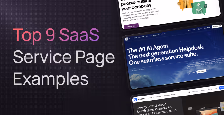
Top 10 SaaS Service Page Examples (Plus Breakdowns) for 2026
Rajat Kapoor
June 11, 2026
6
min
Key Takeaways
Lead with a clear, problem-first headline that shows what your service solves.
Add a strong value proposition above the fold with short, benefit-driven bullets.
Use visuals like screenshots or short videos to make your offering easy to understand.
Build trust early with logos, stats, and testimonials near the top of the page.
Repeat clear, action-focused CTAs throughout the page for easier conversions.
Personalize messaging using tabs or content variations for different audiences.
Include simple pricing or plan comparisons to help visitors decide faster.
Keep the page fast and lightweight to maintain engagement.
Use FAQs and supportive microcopy to handle objections and guide visitors.
Keep optimizing with internal links, performance data, and periodic refreshes.
Visitors size up your service page in seconds. Their next click is either the back button or your signup form. The difference comes down to four things:
A headline that pins their problem in plain language
Copy that proves you understand the fix
Visual cues that guide their eye toward proof and value
A clear, friendly invitation to take the next step
In the guide below, we will break down real SaaS pages that nail each piece, and show you a couple of Amply projects with the same ideas in action. By the end, you’ll know exactly what to keep, cut, or tweak to turn casual visitors into ready-to-buy leads.
Why Your SaaS Service Page Matters
1. It greets high-intent visitors
77 % of B2B buyers will not engage with a salesperson until they have completed their own research. A focused service page gives them the answers they need at the exact moment they are comparing options.
2. It supports self-service preferences
73 % of customers prefer to solve product or service issues on their own. A clear page reduces friction by letting them explore benefits, pricing, and proof without waiting for a rep.
3. It converts better than generic pages
Companies that increased their number of landing pages from ten to fifteen saw a 55 % lift in leads. Specialised service pages deliver the same focus and conversion boost.
4. It shortens the revenue cycle
The average landing page converts at 2.35 %, while the top quartile achieves 5.31 % or higher. Optimising your service page moves you toward the upper benchmark and accelerates pipeline.
Here’s a quick self-check to see if your service page is optimised to bring you leads. Ask yourself these:
Does the first line state the problem you solve in plain words?
Can visitors see a benefit and a call to action without scrolling?
Do you back claims with proof such as logos, data, or testimonials?
When your service page answers these questions clearly and backs them with proof, visitors can understand your value and feel confident about moving forward.
In the next section, we’ll look at the specific page elements that make that experience possible.
Key Elements of a High-Converting SaaS Service Page
1. Headlines That Hook
Lead with the problem or outcome. People scan more than they read. Usability tests show visitors decide whether a link is relevant after the first 11 characters.
State your value within ten seconds. Users often leave a page in 10–20 seconds unless the value proposition is crystal clear.
Keep it short and front-load keywords. Aim for 7–10 words; readers usually notice only the first two.
Here’s a quick idea you can implement right now: Try a problem-promise format for your service page’s heading. For example, “Manual billing slowing growth? Automate invoices in minutes.”
2. Clear Value Proposition
Explain what, who, and why in one tight sentence. Skip jargon, and write as if you were talking to a colleague.
Follow with a three-point benefit list. Bullets are easier to scan on mobile.
Link to deeper resources only after the core message lands. This keeps the fold clean and focused.
3. Visual Storytelling and UI Highlights
Pair each benefit with a supporting screenshot or short looped video. Showing the product in context builds clarity faster than text alone.
Guide the eye with contrast blocks or subtle arrows. Directional cues lift engagement without feeling salesy.
Mind the weight of your media. A one-second delay in load time can cut conversions by up to 7 percent.
4. Social Proof and Trust Signals
Lead with a customer-logo bar or review rating. First impressions set credibility. Knowing that other brands already trust and use your service makes it easier for new clients to trust you.
Add an in-line testimonial near each CTA. Placing testimonials on sales pages can raise conversions by 34 percent.
Include hard numbers where possible. “Saved 12 hours a week” is stronger than “saves time.”
Reassure on security and integrations. Badges and partner logos remove hidden objections your potential clients might have.
5. Strong, Action-Oriented CTAs
Use verbs that spell out the next step: Your CTAs should clearly explain what happens when they click that button. Use CTAs like Get a demo, Start free, See pricing.
Make the button stand out. Your CTA button should be easily visible to the readers.
Repeat the CTA after key sections. Visitors should never need to scroll far to take action.
With these elements in place, your service page meets visitors’ questions in the order they arise; problem, proof, and path forward, setting the stage for higher conversions.
Our SaaS website best practices article covers these and more best practices in depth, to help you optimise your website for even better conversions.
And now that you understand what a service page is, why it’s important, and what elements a good service page should have, let’s look at some really good examples of service pages that do it right.
Top 10 SaaS Service Page Examples
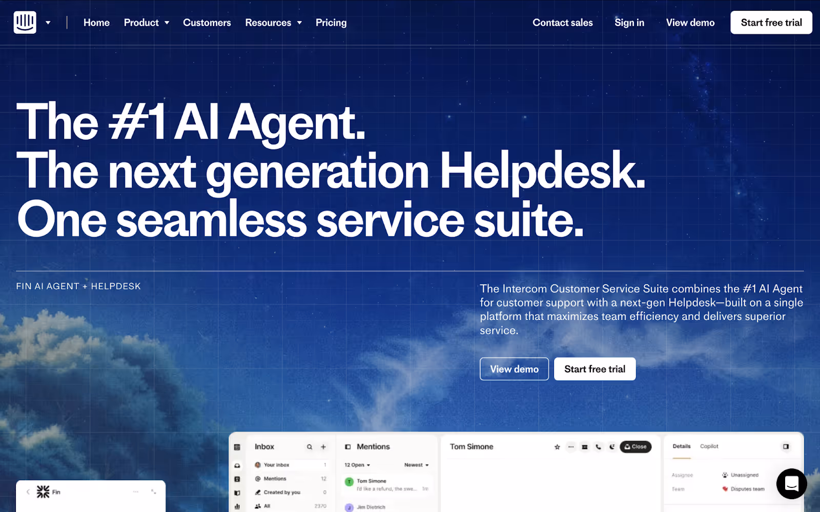
1. Intercom Customer Service Suite
Intercom offers a unified customer messaging platform powered by AI to help support teams manage live chat, email, and help-center interactions in one place.
What their service page does well:
Clear positioning: The hero headline “The #1 AI Agent. The next-generation helpdesk” tells visitors exactly what they get and why it matters.
Guided visuals: Layered UI mock-ups and a simple flow diagram show how chat, email, and self-service fit together.
Built-in proof: A logo bar and testimonial snippets appear before each major call to action.
Repeated CTAs: A high-contrast Start free trial button shows up in the hero, mid-page, and at the footer so there is always a next step.
Why it works:
Intercom’s page leads with authority and outcome then walks visitors through a visual story with proof points placed right before every call to action. The result is a low-friction path from first glance to trial signup.
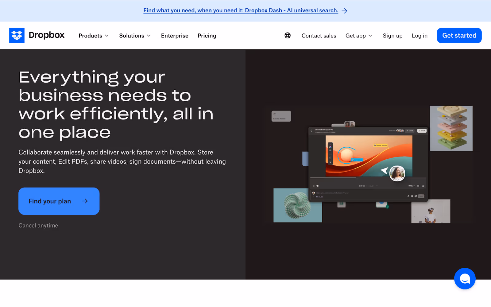
2. Dropbox Business
Dropbox Business offers secure file storage, sharing, and collaboration tools that keep teams in sync.
What their service page does well:
Outcome-led headline: “Everything your business needs to work efficiently, all in one place” sets clear expectations immediately.
Side-by-side pricing: Four plan cards display features, audiences, and “Buy now” or “Try for free” CTAs for quick comparison.
Supporting visuals: A hero screenshot and simple icons under “Do more with Dropbox for business” help visitors picture the product in action.
Trust builder: The “More than 575,000 teams use Dropbox” statement and rotating customer quote reinforce credibility before the final CTA.
Why it works:
Dropbox nails clarity—its headline and pricing layout remove uncertainty while visuals and social proof build confidence. Repeating CTAs keeps the path to signup always visible.
3. Slack Connect
Slack Connect extends Slack’s collaboration platform to partners and clients, letting teams work together across organizations in shared channels.
What their service page does well:
Use-case headline: “A better way to connect with people outside your company” immediately frames Slack Connect as the solution for cross-company collaboration.
Data-backed proof: Three concise stats (4× faster onboarding, 64 % reduction in emails, 2× faster approvals) give measurable reasons to explore further.
Illustrated feature sections: Colorful isometric graphics paired with brief copy explain secure connections, partner workflows, and automation integrations.
Role-based callouts: A “Built for roles of all types” grid shows how IT admins, sales, and marketing teams each benefit, making the page feel personally relevant.
Trust and next steps: A rotating logo strip (“Join the 350,000+ organizations…”) followed by “Get started” and “Try Slack Connect” buttons ensures visitors see proof and action options together.
Why it works:
By combining a clear problem statement, quantifiable benefits, and role-specific messaging, Slack Connect speaks directly to its varied audience. Engaging visuals and frequent CTAs keep the momentum from stat to sign-up simple and compelling.
4. Jira Service Management
Jira Service Management provides AI-powered IT and service teams with a unified platform for incident, change, and request management.
What their service page does well:
Benefit-first headline: “Unlock high-velocity teams with AI-powered service management” explains the outcome and tech in one line.
Audience tabs: Role filters (IT support, DevOps, customer service) let visitors jump to the copy and visuals that matter most to them.
Interactive visuals: A clickable screenshot demo in the hero helps prospects explore workflows without leaving the page.
Proof with impact metrics: Customer logo strip sits above a quick stat call-out (“67 % faster incident response,” “200 % more agent efficiency”).
Clear paths to action: “Try it free” and “Explore AI ITSM” buttons appear in the hero and again in the footer for easy access.
Why it works:
By combining a focused headline, role-based navigation, and real-world metrics, Jira Service Management guides each visitor to the information they need. Interactive visuals and repeated CTAs then make taking the next step feel simple and relevant.
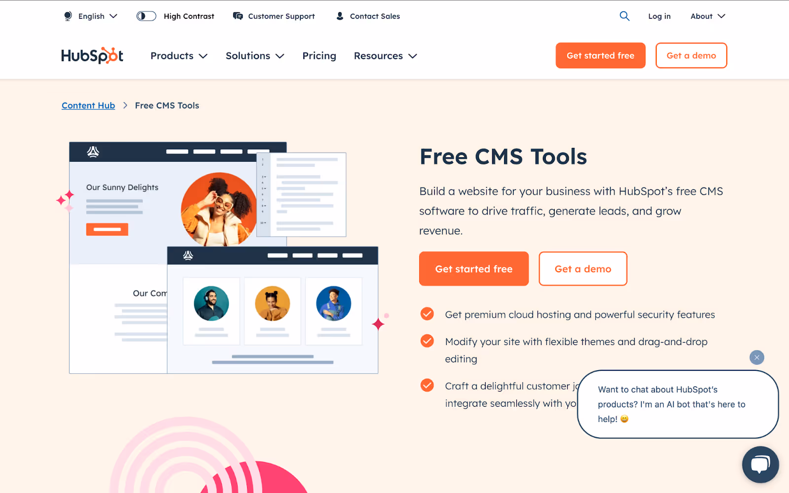
5. HubSpot CMS Hub
HubSpot CMS Hub provides free, user-friendly website building and content management tools that integrate directly with HubSpot’s marketing and CRM platform.
What their service page does well:
Focused hero offer: The headline “Free CMS Tools” paired with “Build a website for your business” makes it clear this is a no-cost entry point.
Dual CTAs: “Get started free” and “Get a demo” cover both self-service and sales-led paths.
Benefit bullets up front: Three concise points highlight hosting, drag-and-drop editing, and CRM integration—so visitors know exactly what they get.
Social proof: Logos of recognizable brands (“ClassPass,” “WWF,” “Calm,” “Coca-Cola”) sit just below the fold to reassure first-time visitors.
Layered sectioning: Each subsequent block pairs a short headline and image or screenshot, guiding the eye through capabilities without overwhelming them.
Helpful resources: A “Related Resources” row and FAQ accordions keep deeper learning and common questions within easy reach.
Why it works:
By leading with a clear, free offer and backing it with immediate value bullets, HubSpot captures interest right away. Strategic CTAs for both do-it-yourself and demo requests serve varied buyer intents. Layered visuals, social proof, and built-in FAQs then lower friction and keep prospects moving toward the next step.
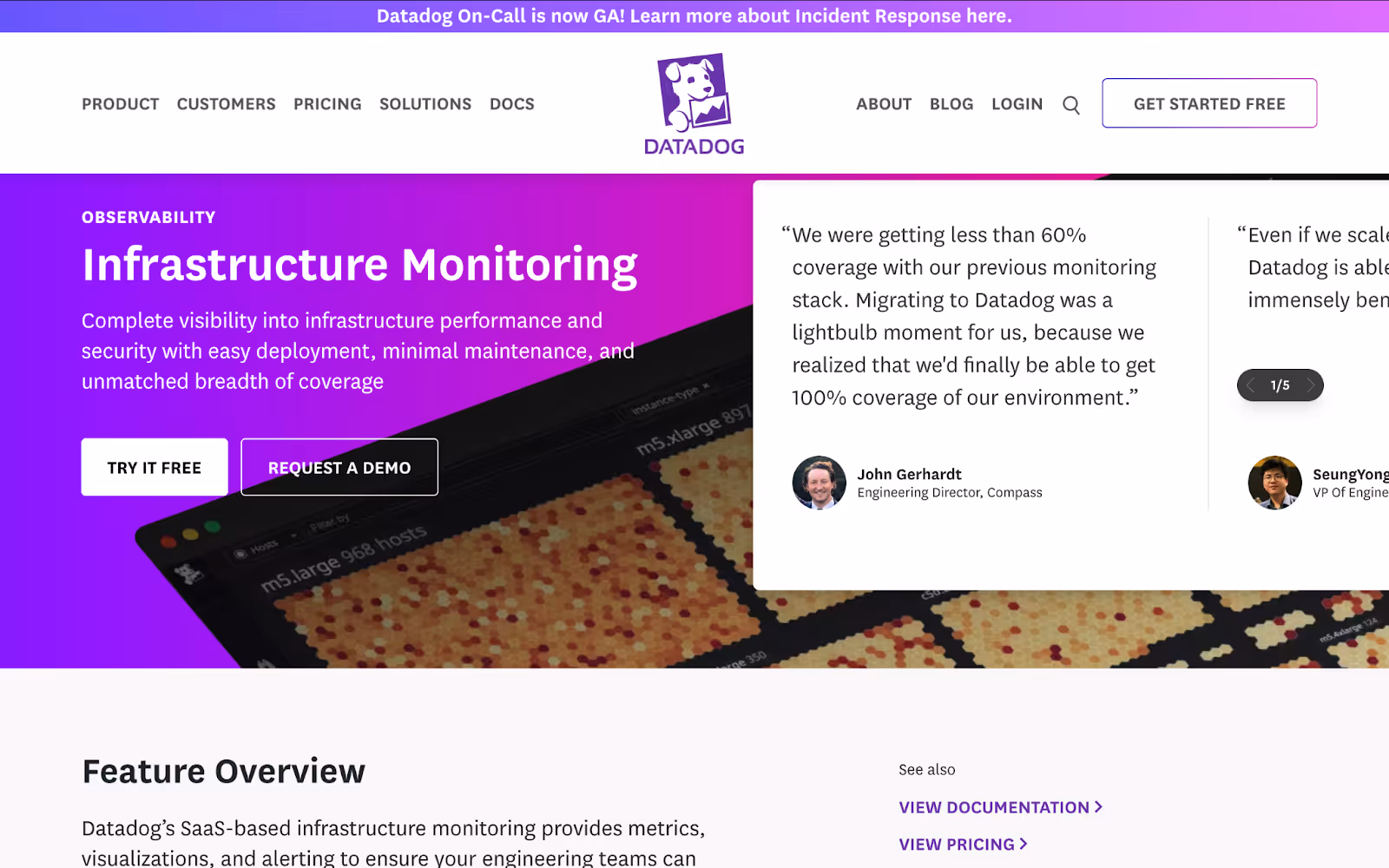
6. Datadog
Datadog provides a SaaS platform for real-time monitoring and analytics of infrastructure, applications, and logs to help teams detect issues before they impact users.
What their service page does well:
Outcome-focused hero: “Infrastructure Monitoring” paired with “complete visibility into performance and security” tells visitors exactly what they gain.
Dual CTAs: “Try it free” and “Request a demo” cover both self-service and sales-led paths.
Structured feature overview: A brief intro paragraph is followed by clearly labeled sections (Observability, Deep Visibility, Troubleshooting, Cloud Security) that align with different user needs.
Paired visuals and copy: Each benefit block shows a relevant UI screenshot next to a concise description, helping readers connect text to product context.
Resource and proof integration: Customer success stories and technical docs sit just above the final “Start free trial” button, giving quick access to proof and deeper learning.
Why it works:
Datadog’s page balances clarity and depth. The hero makes the promise, the structured sections speak to varied user goals, and visuals tie benefits to real screens. Dual CTAs and embedded proof ensure prospects always have a clear next step.
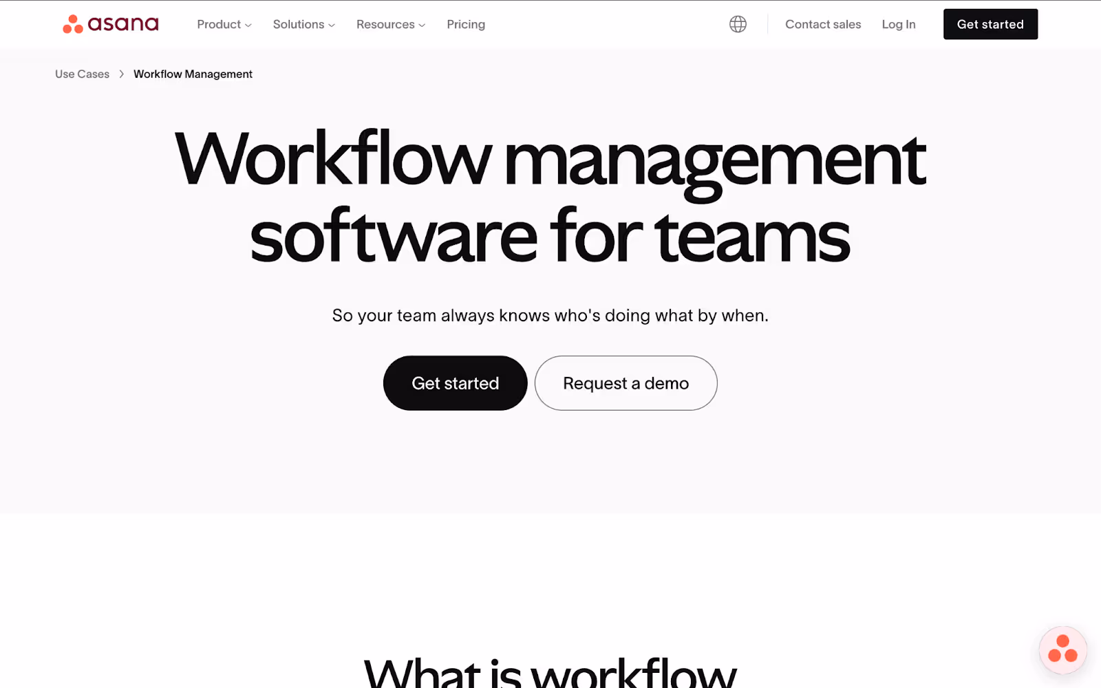
7. Asana
Asana offers workflow management software that helps teams plan, track, and execute projects in one collaborative space.
What their service page does well:
Direct headline and dual CTAs: “Workflow management software for teams” paired with both Get started and Request a demo buttons serves both self-service and enterprise buyers.
Defining the offer: A clear “What is workflow management?” section educates newcomers before diving into features.
Use-case examples: Expandable workflow scenarios (marketing campaigns, product roadmaps) show real team applications and link directly to corresponding UI screenshots.
Practical tips block: A “Tips for establishing great workflow management” grid offers actionable advice, reinforcing Asana’s expertise and adding immediate value.
Proof and FAQs: A logo strip of trusted customers leads into a short testimonial, followed by accordion FAQs that address common objections before the final CTA.
Why it works:
Asana balances education and persuasion. The page meets visitors at their awareness level—explaining what workflow management is—then transitions into concrete examples, tips, and social proof. Strategic callouts and repeated CTAs ensure users always have a clear path to try or buy.
8. Healthmine
Healthmine offers high-touch member outreach services, guiding health plan members through key actions—like risk assessments and appointment scheduling—via personalized calls and digital support.
What their service page does well:
Outcome-focused headline: “Connect the disconnected” sums up the benefit in two words, then a subhead explains how Healthmine’s team guides members through every step.
Human-centered visuals: A welcoming hero image of a member conversation reinforces the personal touch focus.
Trust signals with hard numbers: A clean stats row—4.7 average rating, 95 % call success, 170 + languages—provides instant, quantifiable proof of service quality.
Scannable service details: The “What’s included” section uses accordions and icons to break down each offering, making it easy to digest complex service components.
Clear, low-friction CTA: A full-width “Let’s chat” form sits at the end, inviting visitors to start the conversation without hunting for contact info.
Why it works:
Healthmine’s page balances empathy and evidence. The headline and imagery speak to the human side of professional services, while the stats row and detailed service breakdown build credibility. Ending with a simple, prominent form ensures prospects know exactly how to take the next step.
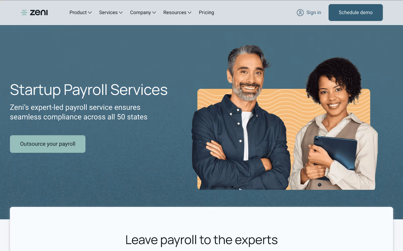
9. Zeni
Zeni provides outsourced payroll services tailored for startups, handling everything from onboarding to compliance so founders can focus on growth.
What their service page does well:
Outcome-oriented headline: “Startup Payroll Services” paired with “Leave payroll to the experts” immediately frames Zeni as the solution to a common pain point.
Benefit icons: Three clear icons under the hero highlight “Full-service payroll, tax filings, and compliance” in plain language, making the core offerings obvious at a glance.
Balanced visuals and copy: A mix of friendly photos and UI screenshots shows both the human support side and the intuitive dashboard experience.
Detailed feature sections: Organized blocks for “Employee onboarding and termination,” “Payroll system management,” and “Compliance across all states” break down complex services into scannable pieces.
Extended value props: A “More than just Payroll Services” row introduces Zeni’s additional offerings—Fractional CFO and Taxes—showing depth beyond the core service.
Simple, persistent CTA: A “Get started” button appears in the hero and again mid-page, while a brief FAQ block near the end addresses common doubts before conversion.
Why it works:
Zeni’s page speaks directly to startup founders’ needs by front-loading the most critical benefits and breaking down services into bite-sized sections. Consistent CTAs and an FAQ block ensure prospects always know how to proceed and have their top questions answered.
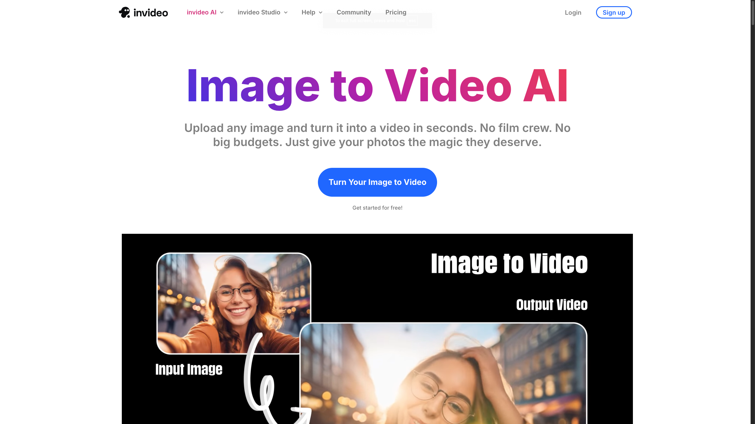
10. Invideo
Invideo helps teams create videos faster using AI-powered tools for editing, generating, and repurposing content. Its image-to-video tool is especially useful for SaaS teams that want to turn static product visuals into simple explainers, feature walkthroughs, or campaign assets without starting from a blank timeline.
What their service page does well:
Clear use case: The page focuses on one specific job: turning images into videos. This makes the offer easy to understand for teams that need quick visual content.
Simple workflow: The page breaks the process into a few clear steps, helping visitors understand how they can go from a static image to a finished video.
Visual product education: Instead of only describing the tool, the page shows how static assets can become more engaging video content.
Helpful SaaS application: For SaaS companies, this approach works well for product demos, feature explainers, launch assets, and onboarding visuals. Capture screenshots or short loops of your product in action, focusing on the key feature you want to highlight. If you're working with static visuals, you can turn screenshots into videos to better demonstrate workflows and help visitors understand your product faster.
Why it works:
Invideo’s page takes a simple, specific use case and connects it to a practical outcome. For SaaS teams, that matters because service pages often need to explain abstract products quickly. By showing how static product visuals can become short videos, the page gives visitors a clearer way to understand features, workflows, and product value without adding friction.
How to Craft Your Own SaaS Service Page
Now that you’ve seen some really good examples of high-converting service pages, it’s time to create your service page. Here’s how you can do it step by step:
Audit your audience and goals
List the main personas who will visit this page (for example, IT managers, marketing leaders, or developers).
Note their biggest questions and objections.
Decide on one clear goal (demo sign-ups, trial starts, or contact requests).
Draft your value statements
Write a one-sentence headline that names the problem you solve and the outcome you deliver.
Follow with a tight subhead or bullet list that explains what you do, who you help, and why it matters.
Keep every point in plain language. Aim for 7–10 words per line.
Gather visuals and proof points
Capture screenshots or short loops of your product in action, focusing on the key feature you want to highlight.
Collect customer logos, testimonials, or stats that show real results.
Use directional cues (arrows, contrast blocks) to draw attention to proof elements.
Build and iterate your page design
Lay out your page with clear sections: hero, benefits, visuals, proof, and CTA.
Keep your design consistent across the page and site.
Run A/B tests on your headline, button text, and hero image to see what drives the best click rates.
Track scroll depth to find sections where visitors drop off.
Tweak copy, visuals, or CTA placement based on your data. Small updates over time add up to big lifts.
Ready to Build Your SaaS Service Page?
A strong service page explains what you offer, earns trust, and makes it easy for visitors to take action. Small changes in how you write headlines, show visuals, and place CTAs can make a big difference in signups or demo requests.
If you’re working on a new service page or looking to improve your current one, the Amply team is here to help. We design and build SaaS websites that combine clear storytelling with solid results. Check out our SaaS website design services, or book a call to talk about your next project.
Get your Webflow SEO Google sheet checklist
Short description on the benefits or value you’ll get from using this checklist
Organizes SEO tasks for efficiency
Simplifies keyword tracking and management
Ensures consistent on-page optimization efforts
Thank you! Your submission has been received!
Oops! Something went wrong while submitting the form.
Frequently Asked questions
What is a SaaS service page?
What should a SaaS service page include?
How do I design a high-converting SaaS service page?
How long should my SaaS service page be?
Can I reuse content from my product page on a service page?
How do I measure the success of my SaaS service page?
About the Author
Rajat Kapoor
Copywriter, marketer, and Webflow developer. Rajat focuses on crafting clear, SEO-focused copy for scaling B2B brands.
A complete Webflow maintenance checklist for monthly, quarterly, and annual tasks, including performance, SEO, CMS, integrations, and more. Keep your site sharp.
Handing your Webflow site to an agency doesn’t mean giving up control. Here’s exactly how to do it right: access, assets, integrations, and boundaries.
Rajat Kapoor
10
min
Our Portfolio
Explore Our Resource Collections
Amply Academy
Learn Web design, webflow, and web design best practices, all tailored to help you grow your B2B business


.avif)