


In this guide, we'll look at what goes into creating a highly effective navigation for your SaaS website and share examples and a template for the three main types of nav that you can use to get started designing your own killer SaaS site navigation.
What Goes Into a Great Nav?
Navigation is one of the most important elements of a B2B site. Your users will go to your navigation first to find the information they are looking for whether it be education on your product, finding solutions catered to their use case, or looking for thought leadership to help them do their jobs better.
A well-thought-out and easy-to-navigate nav can have a huge impact on the way your audience consumes the content on your site and ultimately will affect the story they are told when visiting your website.
The key characteristics of a successful navigation design include:
Purposeful IA (Information Architecture)
You should be very deliberate with how you structure your site and navigation. Be sure that everything you include in your site's navigation has a purpose and is of value to your users. You shouldn't throw every page of your site into your main nav—that's what your footer is for😉—but instead follow this best practice for organizing your B2B site navigation:
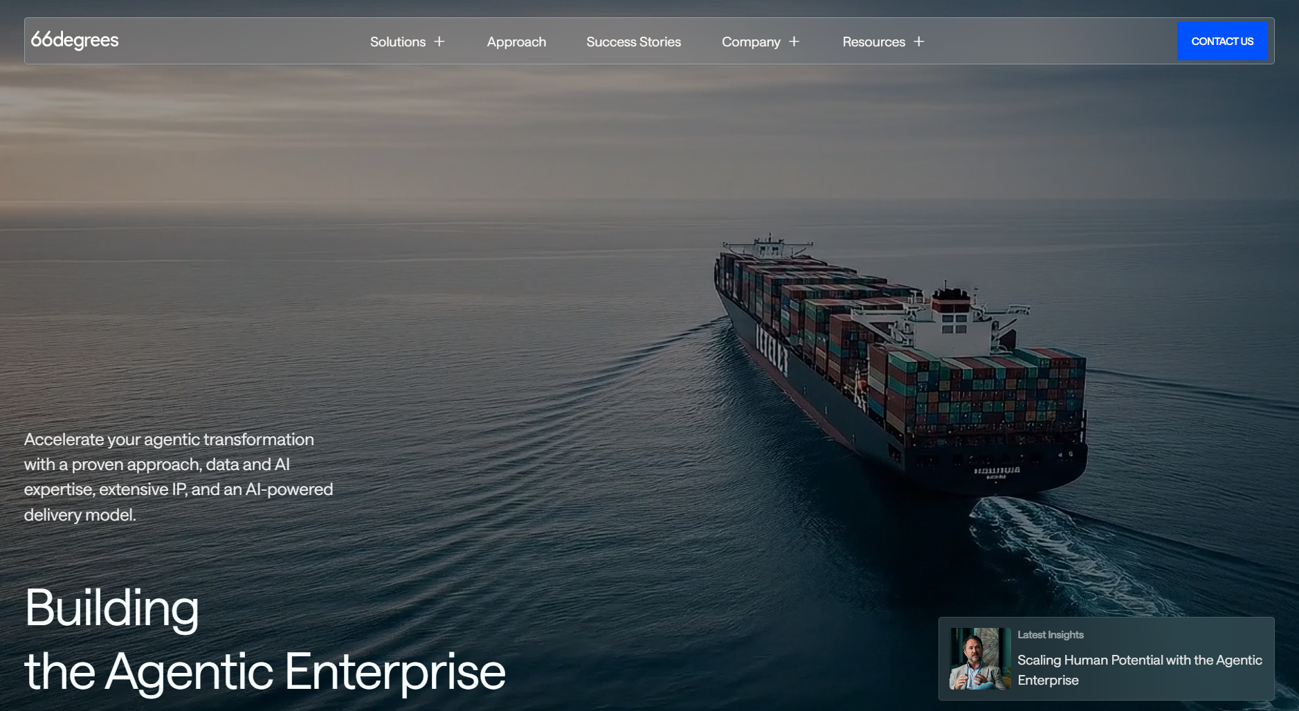
- Place your product/platform and solution dropdown menu in the first two spots. Those first two items in the nav always get the most engagement.
- After those, include the following categories in an order that best represents your brand: Resources/learn, customers, partners, About/company
- The last items on the right of your nav should be your sign-in and CTA buttons. Your main CTA in the nav should be clear and easy to find at all times, consider a stick nav to increase conversion on your main CTA.
Clear Hierarchy of Elements
When we talk about hierarchy in navigation, we mean the way elements in the navigation are laid out, how they are visually represented, and the relationship they all have together when seen as a whole.
Having a clear hierarchy of your navigation elements is paramount to designing an effective navigation experience for your users. Without a proper hierarchy of elements, your users will be confused about which items are clickable links vs labels, miss hub pages of your site, and ultimately leave your nav without finding what they were looking for.
Relevant Titles and Labels
Most B2B brands employ one of two tactics when naming the items in their navigation.
The first is organizing the nav by product/platform + solutions. This is the most common way to organize your navigation with a product or platform section and a section dedicated to your solutions broken down by use case, role, industry etc. Because this is so widely used and is the most accepted and anticipated navigation we generally recommend that B2B brands follow this paradigm when organizing their navigation elements to reduce friction for the B2B users visiting your website.
The second approach is to use more industry or product-specific terms to label your navigation sections. For example, using your category name in place of "product" or using "who we serve" in place of "solutions" will certainly help you stand out and in some cases provide a bit of clarification or even education about what you do and who you do it for, but generally this approach introduces friction in the navigation process as it is outside the norm. We suggest only using this type of organization when there is a clear brand or business case for breaking the norm.
Regardless of your approach, be sure your link text and labels are clear on what to expect when the user clicks and that they are easy to scan and not too long.
Ease of Use
A great site nav is easy to use and unobtrusive when it comes to interaction. Avoid using overly flashy or complex animations or transitions in your navigation. You really want the user to be able to get in and find what they are looking for easily without a lot of distractions.
If it makes sense for your brand to use some subtle transitions or animations for the drop-downs and hover states be sure they are tasteful and don't distract the user as they interact with your navigation.
Navigation on B2B sites can fit into three different categories or types:
Simple Dropdowns
- This type of navigation is characterized by main navigation items having a direct link to stand-alone pages or a simple drop-down list of a few pages under main navigation items.
- This type of navigation works best for small to medium-sized sites with straightforward page organization (information architecture). Maybe you have a single product or "how it works" page with a handful of solution pages contained in a drop-down under "solutions"
- Simple drop-downs work great when you are being especially intentional with where you want to direct your users or when your site is lighter on the content side of things.
Example: Pathlight.com

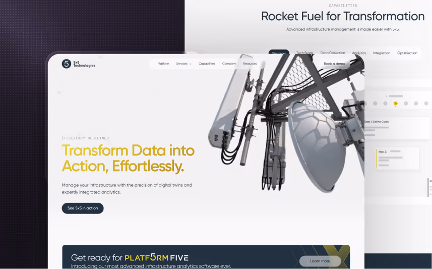
Fat Navigation
- This type of navigation is characterized by larger drop-downs (oftentimes spanning the width of the site) with many sub-navigation items in each dropdown.
- Fat navigation is the most common type of navigation for medium to large-sized B2B websites as it can facilitate a good number of sub-navigation items as well as a wide variety of types of links.
- Fat Navigation is great for when you have a breadth of product, solution, and resource pages and/or are looking to feature certain pages of your site in the navigation to increase traffic and exposure to those pages.
Example: Usergems.com

Mega or Nested Navigation
- This type of navigation is similar to the Fat Nav but taken to 11. Each main nav item dropdown has additional tabs or sections with their own sets of sub-navigation items.
- Mega Navigation is less common among medium to large-sized B2B sites and most commonly found on larger enterprise sites with multiple product lines or brands under one umbrella.
- This type of navigation is great for sites with multiple user-types and product lines associated with the various user types. It's really the kitchen sink of navigation. And while a mega nav is effective at providing many user journeys from one place, the challenge is to design the experience in a way that each unique user can easily find what they are looking for among the many options of navigation items.
Example: Monday.com

Now that you know what goes into a killer navigation for your site, download our SaaS Site Navigation template and get started building your own.


.svg)


.svg)


.avif)


.avif)


.svg)


.avif)
%20and%20What%20Makes%20Them%20Work.avif)

.avif)


