

Your SaaS website is getting traffic, but not enough is happening after that.
Leads aren’t coming in consistently. Demo requests are low. And despite multiple design iterations, the numbers haven’t moved much.
If that sounds familiar, you’re not alone. After reviewing 100+ SaaS websites at Amply, we’ve seen the same patterns: unclear messaging, buried CTAs, weak trust signals, and user journeys that just don’t convert.
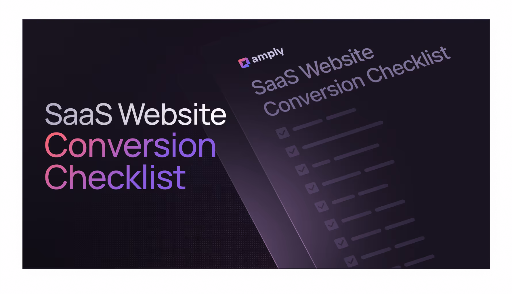
That’s exactly why we created this SaaS Website Conversion Checklist, a clear, actionable framework to help you figure out what’s holding your site back and what to fix.
This post walks you through the same process we use in every audit. Whether you’re planning a redesign or just want to make your existing site work better, you’ll find what to look for, what to avoid, and how to approach conversion optimization in 2025.
Why Website Conversion Still Matters in 2025
In 2025, SaaS companies are spending more on traffic than ever, but traffic without conversion is just a cost.
It doesn't matter how good your ads are, how many SEO pages you publish, or how active your team is on LinkedIn. If your website isn't turning that attention into demo requests, signups, or qualified leads, growth stalls.
Most SaaS websites convert between 2% and 5% of visitors. The best-performing ones reach 10% or more. The difference isn’t usually the product. It’s the way the site communicates value and moves visitors to act.
If your homepage, pricing page, or product section leaves people confused or hesitant, they leave. You don't need a full redesign. You need to understand what’s getting in the way.
That’s what this checklist is built to help you uncover.
7 Reasons Your SaaS Website Isn’t Converting (And How to Fix)
Most SaaS sites lose conversions in a few predictable places. Here’s what they are -
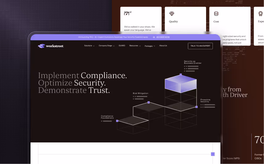
1. Is your first impression clear and confident?
Most users often leave the site within 10 to 20 seconds if they don’t immediately see something relevant or useful.
If your hero section doesn’t clearly show what you do, who it’s for, and what the next step is, people won’t scroll any further.
Here’s what to check:
- Your headline says what you do, in plain language
- Your subheadline explains the outcome you help your users achieve
- Your hero visual supports the message, not just decorates the page
- Your CTA is clearly visible and tells the user what happens when they click
- There’s no noise. No autoplay videos, carousels, or confusing distractions
If your first impression doesn’t land, nothing else on the page gets a chance to work. Need examples of how best SaaS do this? We broke down a few top B2B SaaS websites here.
2. Does your value proposition speak to outcomes
Most SaaS websites talk about features, but the best ones talk about what those features actually do for the user.
Your value proposition shouldn’t just explain what the product is; it should also explain why it's valuable.
It should help a visitor understand how it fits into their workflow, what it helps them achieve, or what problem it replaces.
Here’s what to check:
- Your main messaging focuses on benefits, not just features
- You explain the “why” of your product, meaning what pain it solves or outcome it creates
- You show how it works in a simple, scannable format (visual, short video, or diagram)
- You highlight what makes you different, even if it’s just your approach, support, or focus
- Your value is clear to someone unfamiliar with your category
If someone in your target audience lands on your site and still has to ask, "But what does it actually do?" your value prop isn’t working yet.
3. Are your CTAs visible and persuasive?
A good CTA isn’t just about making it look clickable; it should also tell visitors exactly what happens next.
If your calls to action are hidden, vague, or inconsistent, even great messaging won't convert.
Here’s what to check:
- Primary CTA is easy to find and uses action-focused copy like “Start free trial” or “Book a demo”
- CTAs are placed logically, not just at the top or bottom of the page
- Secondary CTA is available for visitors who aren’t ready to commit yet, like “Read case studies”
- Micro-conversion options are available for early-stage visitors, such as newsletter signups or downloadable resources
- CTA design stands out visually and clearly signals that it’s clickable
Even small changes to copy, placement, or timing can make a big difference here.
4. Are you showing enough proof?
People don’t just read your messaging. They look for signs showing they can trust it.
If your site makes bold claims but offers no supporting evidence, visitors hesitate, even if your product is genuinely great.
Here’s what to check:
- Testimonials or customer quotes are visible near key decision points
- Case studies or results are easy to find and speak to specific outcomes
- Client or partner logos are recognizable and add credibility
- Social proof elements like user count, customer logos, or G2 ratings are up to date
- Trust signals are near the pricing page or signup flow, where hesitation is highest
Proof doesn’t need to be dramatic. It just needs to be clear, believable, and placed where it matters.
5. Is your UX slowing people down?
A clean design doesn't help if the experience is slow, frustrating, or hard to use. This matters even more on mobile.
Conversions drop quickly when visitors can’t find what they’re looking for, get stuck trying to interact, or leave before the page finishes loading.
Here’s what to check:
- Your site loads in under 3 seconds, especially on mobile
- Navigation is simple and clear, with no dead ends or confusing paths
- CTAs and inputs are easy to tap, without layout shifts or hidden buttons (learn more about Website accessibility)
- Animations feel purposeful, not distracting or disruptive
- There are no broken links, missing images, or incomplete sections
UX issues are rarely spotted from the inside. But they're one of the most common reasons visitors leave before converting. You can learn more about SaaS website best practices here.
6. Are you tracking what works?
You can't improve what you aren't measuring. If you're not tracking the right data, it’s impossible to know what’s helping conversions and what’s holding them back.
Here’s what to check:
- Each page has a clear H1 and proper heading structure, so the content is scannable and SEO-friendly
- Meta titles and descriptions are in place and reflect what the page is actually about
- Google Analytics, heatmaps, or session recordings are set up and actively used
- You’re tracking key conversion events, like form submissions, CTA clicks, or signup completions
- You’ve reviewed actual behavior, not just assumptions, using tools like Clarity or Hotjar
Without this data, you're left guessing. With it, you know exactly where people drop off, what they engage with, and what needs attention.
7. Are You Losing Conversions on Your Pricing Page?
For most SaaS companies, pricing is one of the highest-intent pages on the site. It’s where visitors make their decision. It’s also where a lot of them drop off.
The problem usually isn’t the price itself. It’s how the page communicates value, removes uncertainty, and guides action.
Here’s what to check:
- Your pricing is easy to scan, without overwhelming tables or vague plan names
- Each plan has a clear CTA, not just a button that says “Choose” or “Contact us”
- There’s guidance for visitors who aren’t sure, like FAQs, feature comparisons, or toggles
- Trust signals are nearby, such as testimonials, client logos, or support details
- The layout works on mobile, with no broken columns or squeezed tables
If you want to go deeper on this, we break it down fully in our blog on SaaS pricing pages that actually convert. You can also take inspiration from these pricing page examples that we broke down in one of our earlier blogs.
Final Thoughts
Most SaaS websites don’t need a full redesign. They need a clearer message, better structure, and fewer friction points.
You don’t have to fix everything at once. Start by using the checklist to spot what’s working, what’s not, and where your site might be getting in its own way. Once you are done with the basics, you can start working on maximizing your conversion rate optimization.
And if you’re working on a revamp or want help improving how your site converts, our SaaS website design agency can help you get there.
Frequently Asked Questions
Q1. What is a good conversion rate for a SaaS website?
Most SaaS websites convert between 2% and 5% of visitors into leads or signups. The top performers often reach 10% or higher. Your actual benchmark depends on traffic quality, pricing, and how clearly your site communicates value.
Q2. How do I know if my SaaS site is converting well?
Look beyond just traffic and bounce rate. If a healthy portion of your visitors are completing key actions like booking a demo, signing up, or requesting a trial, you’re on the right track. If those numbers feel low, your site likely has messaging, UX, or trust gaps to fix.
Q3. What’s the best way to audit a SaaS website for conversions?
Use a structured framework like the SaaS Website Conversion Checklist. It helps you review your site section by section, so you’re not guessing where things are going wrong.
Q4. What tools should I use to track SaaS site performance?
Start with Google Analytics 4 for traffic and conversion events. Pair it with a heatmap or session recording tool like Microsoft Clarity or Hotjar to understand how users interact with your pages.
Q5. What’s the best way to improve my SaaS website’s conversion rate?
Focus on clear messaging, persuasive CTAs, visible trust signals, and fast, mobile-friendly pages. Small changes like moving a CTA or simplifying copy often lead to meaningful gains.
Q6. Do I need a full redesign to improve conversions?
Not always. Many of the fixes that move the needle are structural or content-based. A full redesign might help, but it’s often not the first step.
Q7. Does this checklist apply to both homepages and landing pages?
Yes. The checklist works across most SaaS site types, including homepages, product pages, pricing, and campaign-specific landing pages.


.svg)


.svg)


.avif)


.avif)


.svg)


.avif)
.avif)


